Slovak, Swedish Jerseys Revealed
 Tuesday · Nov 5 · 2013 | 9:34 PM PST
  23 Comments
  Images from Slovak Ice Hockey Federation
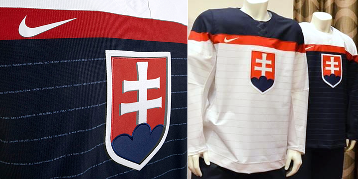
Slovak national anthem forms Olympic jersey pinstripes
Earlier today, the Slovak Ice Hockey Federation unveiled the jerseys Slovakia will be wearing at the 2014 Olympics in Sochi this winter. If they look a little familiar, you're not imagining it. The white jersey, at least, is very similar the new U.S. look — unveiled by Nike in August.
What sets them apart, however, is the pinstripes. And those aren't just any pinstripes. Look closely.
 Photo (right) from @Tomas_Kmec
Those stripes are actually formed by the words to the Slovak national anthem. It's a very clever feature introduced by Nike. I've been impressed by the variety of ways in which the designers have managed to make each national team jersey unique in some way — while simultaneously disappointed at some of the unnecessary similarities. But more on that another time.
If you want to see more of the jerseys, it looks like a couple of Slovak radio DJs showed them off in a YouTube video. Check it out.
By the way, I plan to write up full reviews of all the Olympic jerseys once they're each released. A lot of you are asking me what I think of them, and it's hard to say without seeing the whole lot of them.
I'm still hoping for an official press release from Nike, actually, which came with great photos for the U.S., Russian, Canadian and Czech jerseys. But haven't seen one yet for Slovakia. (UPDATE (11/6): I spoke a few hours too soon. Here it is!) That brings us to Sweden.
Sweden is all kinds of rebellious about Olympic jerseys
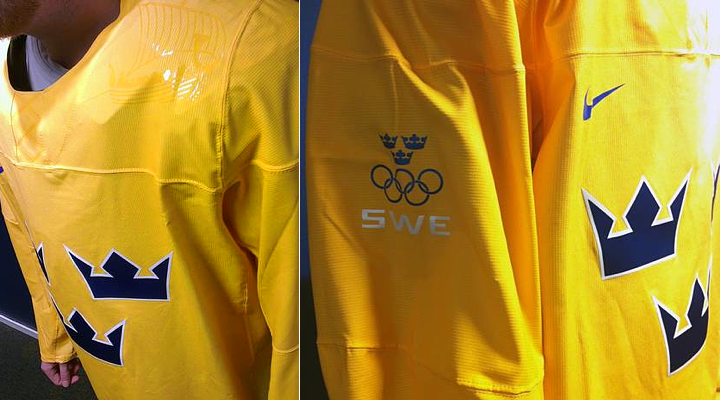
 Photo from Tre Kronor (via Facebook)On Oct. 25, Tre Kronor — the Swedish men's ice hockey team — shared this photo (right) of their country's new Olympic jersey on their Facebook page.
But like Slovakia, the unveiling didn't accompany any official word from Nike (that I could track down). So there's still a blue jersey out there that we haven't seen yet.
The Swedish tabloid Aftonbladet also revealed additional photos which they called "exclusive." (Scroll down to see those.)
The photos give us a better look at the detail on the shoulders — which includes a glossy version of the ship seen in the Swedish Ice Hockey Federation's official logo.
But here's the really interesting thing about them. The Aftonbladet article quoted federation's marketing manager, Tomas Bjernudd, as saying they had to fight Nike over proposed sweeping design changes.
Apparently, there was pressure from Nike to change a lot. Bjernudd didn't get into specific details, but said they had to stand their ground as far as keeping the classic three crowns on the front of the jersey.
Could you imagine what they'd be wearing if this guy didn't get in Nike's way? Good for him and the Swedish Ice Hockey Federation.
Though it hasn't been unveiled yet, I have to assume the blue one is exactly the same as this with the yellow swapped for blue and vice versa.
So what do you think of these jerseys? We've now seen jerseys for the U.S., Russia, Canada, Czech Republic, Slovakia and Sweden. That leaves Finland, Slovenia, Norway, Austria, Switzerland and Latvia as the other countries participating in the 2014 Olympics.


Reader Comments (23)
Those Slovak jerseys are.. AWESOME
Here's an extended gallery of the Slovak jerseys:
http://sport.sme.sk/galeria/2555/nove-hokejove-dresy/?bu=art-6995232
They receive positive feedback here in Slovakia (at least in internet polls). From my point of view, I am glad that the jersey design has remained simple (compared e.g. to Czech or Russian Olympic jerseys). Pinstripes featuring national anthem is cool detail.
Contrary to what has been written about Swedish fight with Nike, official press release from Slovak Ice Hockey Association declares that the association was able to come with own design ideas and that actually pinstripes idea came from the association, not from Nike.
I've been a pretty big fan of all the olympic jerseys thus far. Maybe not so much the materials used but for sure the designs.
As a swede, I would personally hurt somebody if they removed the three crowns from the swedish jerseys. The national team has been called just "three crowns" since forever. I'm just happy they didnt fuck up pur jersey like they did with Finland and Czech Rep.
Slovakias was OK. I'm no fan of the pinstripes but they look good overall.
Nike should'nt be allowed to design any more jerseys after this. Hope next olympic design ends up with reebok.
I'm glad Sweden said no to Nike. Someone had to. Also, I wonder how happy Sweden is about having a boat hidden on their shoulders of their what looks like rain gear jerseys. It may just be the lighting but that is what the material is reading to me.
Here is the jerseys that Finland is going to were. AWEFUL, worst jersey of all!
Check the link: (http://www.aftonbladet.se/sportbladet/hockey/landslag/article17795021.ab)
If the Czech and Canadian jerseys are any indication, I bet Nike tried to map the Swedish flag as a jersey:
Blue jersey, blue yoke with yellow horizontal shoulder stripe across and acentral vertical line down the left side; sublimed crown on each shoulder.
I guarantee that was the prototype...
EDIT: Finland just proved my theory.
It the same articel from Aftonbladet you can see Finlands jerseys.
Like both of them. Also, Finland's were released today. Puck Daddy has a pass/fail up for them.
I don't know man, I think all the Olympic jerseys revealed thus far are pretty terrible. However, I do have to praise them for being quite unique. It's pretty clear that a lot of thought has gone in to these designs, so I'll to applaud them for that.
I think the main issue that people have with this year's Olympic jerseys are just simply because Nike has decided to break the mold and throw all current, and past jersey design trends out the window. Which, in a world of countless "traditional" and simplistic designs, isn't all that horrifying. As bad as the jerseys may look, at least it's a change.
once again, the Swedish jerseys are the very best. Good on them for standing their ground and not changing much.
Same cheap, plastic, bargain bin look as earlier jerseys. Just awful.
Regarding the Swedish jersey: Tre Cool!
Look man, I don't mind these crazy designs. Good, awful, whatever. Trying something new is alright.
But those goddamn fake lace-up collars gotta go. They NEED to go. Right now, with the way the collar is cut and seems to hang over the pads, those jersey cuts look cheap and kinda like stiff garbage bags. Look at that sweden jersey! Terrible.
What were they thinking?
Did Slovakia get away without shoulder embellishments?
Is it just me or the lighting, or the Swedish jersey looks like a raincoat???
Don't forget about Germany and Japan in the Women's competition... Those should be interesting designs, espcially Japan's
Where's Sweden's blue jersey?
Come on Nike, now you're just getting LAZY!
I don't know if its the lighting in the pics but Sweden's jerseys look like there made out of plastic like a rain coat
Re: Plastic
I've seen a similar material from Nike. It does feel very plastic like. If you look at the emboss (they use this on some other products), it seems as if they're heated into the fabric - like the top layer is pressed with heat to give the effect. This would also smooth the material. As you can see, the details are smoothed.
I have a few hats with the detail. Those are 84% nylon. Nylon is a form of plastic, it's a synthetic fiber. I'm curious how these would breath or if it's a hybrid. The shoulders being a nylon and the body being a polyester.
I'll say this- Slovakia might not be unique, but I like the look better for them than the US. They can keep it. I also think the pinstripes adds some punch to an otherwise bland layout. And the anthem forming the stripe is a nice touch! No surprise, it apparently came from Slovakia and not Nike.
And bravo to Sweden for pushing back at Nike. This garbage has to stop somewhere, and I only wish the other countries, including my home US, had added to the chorus. The plastic bag look, the dumb lacing and shoulder accents, the halted striping, it's all so ridiculous. Save this stuff for the Oregon Ducks Nike, and leave hockey alone.