Rangers, Hawks Reveal Stadium Jerseys
 Friday · Dec 20 · 2013 | 9:59 PM PST
  33 Comments
 Photos from New York Rangers
Rangers set to sport white at Yankee Stadium
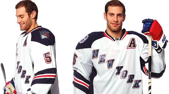
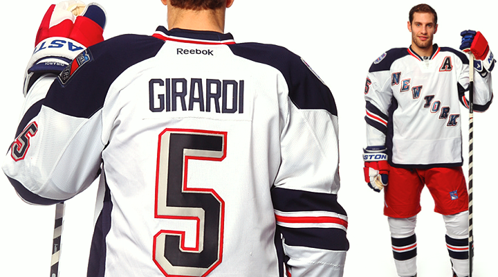
The New York Rangers unveiled their NHL Stadium Series uniform today. And if you read last night's blog post, you weren't surprised by what you saw.
Our first taste came by way of a goofy video starring Dan Girardi. He enters the Rangers locker room to scope out the new jerseys hanging in the stalls. He's then horrified to find that in his stall is a Yankees jersey — not again! Yuck, yuck, yuck. No.
For a white jersey, it's pretty slick. White jerseys tend to be bland, if you ask me, so I was impressed by how this one turned out. (Not so much with Pittsburgh.) I really like the sleeve striping. It's a style not seen with any other team and it's uniquely New York.
On seeing the full uniform, one of the comments that was repeatedly expressed on Twitter was how much it reminded folks of the Hartford Wolf Pack — the Rangers' AHL affiliate. Well, yeah. The Wolf Pack's original uniforms were modeled after the Rangers' Lady Liberty jerseys in 1997.
In other words, they're not copying a minor league team so much as digging into their own recent history a little. Personally, I wish they would've gone a little farther.
This was the perfect opportunity to resurrect the Statue of Liberty logo that graced the team's third jersey for 10 great years between 1997 and 2007. The perfect opportunity! One game, not intended for throwbacks. Plus in terms of striping and colors — navy blue, specifically — this jersey was tailor-made for Lady Liberty.
Like I said, it's not a bad jersey, but I might've actually paid for one myself if it had that logo on it. (A Brad Richards one, of course!)
 Photos from Chicago Blackhawks
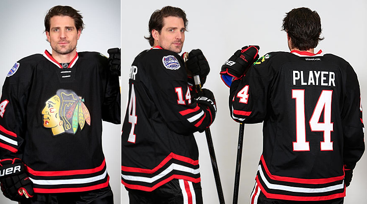
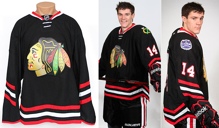
Chicago goes "back in black" for outdoor game
The Chicago Blackhawks caught us by surprise this morning when they suddenly announced plans to unveil their Stadium Series jersey later in the day. Two hours later came a teaser photo. Two hours after that, we got the whole jersey. (They just beat Sharking at its own game. Remember Hurricaning and Sabering?)
Like the Rangers, the Hawks gave us a cheesy video — this one set to the first 20 seconds of AC/DC's "Back in Black." The music plays under behind-the-scenes video of Patrick Sharp and Andrew Shaw sporting the new sweater for a photo shoot.
Once again, though, last night's post previewed this look. The Hawks are essentially bringing back their black third jersey from the late '90s. It was a good one. The biggest difference here is in the striping.
 Photos from Chicago Blackhawks
Some will no doubt bemoan the half-stripes on the sleeves. But for whatever reason, I think it works here. Those colors really are striking. The only thing I'm still not sold on is the whole angled thing. Will it really make a difference in terms of visibility, as all the marketing mumbo-jumbo claims?
But there is one thing I really dislike about this jersey. It's front and center.

Compare this screen-printed mess with the traditional stitching of a Blackhawks crest. You're right, there is no comparison. If Reebok is trying to cheapen their product, they're on the right track. Good luck getting anyone to drop $300 on something that looks like it came out of an ink-jet. I hope this doesn't become a trend.
For now, I'll chalk it up to the rush job. As we heard from L.A. Kings management, these jerseys were all pumped out within a matter of months by the same design team. That's just asking for a poor product. Hopefully future events like this will be better planned.
Your turn to weigh in! What do you think of these new sweaters?


Reader Comments (33)
I don't remember what the Sharks did, or didn't do.
Hawks one is easily the best SS jersey so far, that being said, I think the chrome logo looks the worst on that jersey. The different shades of black and gray don't play well with the black jersey, and the silk screen crap is just horrible. Luckily the rest of Chicago's jersey is so solid to make up for it.
I realize the chrome effect connects all these teams to the Stadium Series but it's ugly, looks cheap and takes away from the overall quality of other design aspects. This is to jerseys what the glowing puck was to televised games,
Surprisingly to myself I think the Rangers jerseys came out excellent. I like that they are bringing back that hint of the liberty jersey, but I honestly am happy they didn't go full throttle with that. They did the front crest thing for the Winter Classic and now its time for their classic diagonal wording to get some playtime outside, especially considering this is such a big showdown with such a classic rivalry.
Some people voiced displeasure with the sides being colored in, but I think it adds structure to it as opposed to the Penguins jersey that just looks like the player is wearing a big fluffy white comforter with a head hole in it. It is an away jersey, but it still justifies the Rangers knick names the "Blueshirts".
This is just a really neat jersey and I can't wait to get my hands on it.
Whoa, whoa, whoa. Game worn shirts are actually going to have screen printed logos? I wouldn't even buy a replica if it wasn't embroidered. That's offensive to literally all of my sensibilities as a fan. It like when you see people with those cheap knock off jerseys that don't have legit striping or anything. A screen printed jersey reeks of cheapness.
Well, exactly what I thought, a missed opportunity for me to add to my jersey collection with a fourth Hawks jersey cause this one SUCKS !
Minor league-esque screen printed logos are a giant NO-NO !
Noticed on Girardi's pants the lack of white and blue striping around the legs and up the sides, even in the winter classic the rangers wore their regular pants, so this is something new also to be noted.
I certainly hope that the front lettering and shield shoulder patch isn't the cheap printed lettering we see on replica jerseys names and# in stores, but it looks like it's going in that direction even in the authentic. The only way to get the takle-twill name&# is to buy your jersey blank and send it for proper lettering, unless you go to MSG and spend 275 bucks on one, and who knows what quality back lettering they'll be offering for this SS jersey
Is that lighting or does the Blackhawk logo look a lot lighter? Talk about whitewashing.
striping on the rangers jersey is amazing
Being a Penguins fan, it's difficult to admit that the Rangers jersey looks amazing. It's classic but with the correct new twist to it, plus I like how there's no piping going on with it, it's so clichéd and overdone.
I really like the rangers jersey, definitely the best of the whole bunch in my opinion ( although I hope the nj rumours are true). On the whole I've been very disappointed with these jerseys. I am of the opinion that teams shouldn't be punished for experimenting, for example even though buffalo's New Jersey is horrible, I give them credit for trying. Unfortunately, to seems reebok missed a chance to really play around and what they produced was just rushed and fairly uninspiring.
The Rangers' jersey is alright for a couple Stadium Series games. It is something different and I think it is nice to see a team like the Rangers add something new to their three awesome uniforms once in a while but, I don't see why they couldn't have put a waist stripe that matches the arm stripes on the jersey and stuck a chromed Lady Liberty logo on the front. I think that and removing the side panels would have looked a lot better but that's me. As for the Hawks, the chromed Blackhawks logo is just not the same compared to the actual crest they use. Besides that, I like the jersey and for a black jersey, the colors are quite striking. Just wondering, is it the photos or is the Blackhawks' crest slightly angled up on the jersey?
First, as a Rangers fan, I still don't understand why so many NYR fans are bashing this thing. I think they did a great job, and for a one day game, how much more could they do without being too drastic?
Chris, I know you're obsessed with the Lady Liberty logo, but I'm glad they didn't do it. I may be in the minority but the novelty of that sweater wore off quick on me.
NYR is the best stadium series jersey so far, blackhawks is a simple & a classic look, so both would be winners if they'd not got the cheap looking shiny screen printed logos, i would be buying all of these stadium series jerseys (apart from the fugly ducks jersey) if not for that. i can get a classic ccm black chicago jersey that will be cheaper to buy & look SO much better!!
I'm willing to bet that the cheap printed crests are here to stay. Anything to save a few bucks, and somehow a reason to justify higher-priced shirts (yes, shirts, for they certainly are not sweaters, not even jerseys). They'll justify it as "new technology" even though it will look and feel like a 1980s replica. They might be made through a newer, different, process, as some have said, but the look and feel is the same. It started with the names and numbers on the backs of mass-produced replica jerseys (even approximating the look of stitched tackle-twill numbers), then it moved onto the shoulder patches (which had been embroidered or real patches even on replicas since the 1990s), and so now it evolves to cheap front crests.
Relative to the screen printed logos: WHY, Reebok, WHY? This makes no sense. At least as far as I can tell.
Is there a legit reason to go with a screen printed logo?
I have an extensive jersey collection and am always looking to add new ones. However I will not be adding any of the SS jerseys.
And the best Stadium Jersey belongs to the Blackhawks. Seems like they can never go wrong, even with the chrome logo. While in my opinion the Rangers is the worst. I'm not a fan of "New York" spelled on the jersey. It would've been better with the Lady Liberty or even the chromed logo as the center crest.
i hope bauer or ccm makes a run for it when reebok's contract is up. i feel like everything reebok does is gimmicky. This pseudo edgy, sleek aerodynamic fad is just that, a terrible fashion trend in hockey. i personally can't wait to see how my devils try to stick it to reebok.
This entire "silver bullet" series collection is what it is,a disposable wear it once and be done with it jersey.I'm shocked there isn't a Coors Light logo plastered somewhere on them.That being said,I actually think the Rangers one turned out the best and I have a feeling the Devils one is going to look pretty sharp,too.Man,I can't believe I just wrote that as a Pens fan.
Being a New Yorker and fan of the ny teams, I love the fact it says "New York" in the ranger's jersey. The Yankees have New York and an NY, the rangers have heritage and this, and the giants have an ny on their helmets. It's more classy and awesome to see New York or ny than a teams name. I would've loved to see lady liberty return as well since she is special to NYC just as the ny name and lettering. But liberty did have her moment so now we move to different jersey designs.
Case in point, the isles have a ny logo on their jersey. Not the isles logo or islanders in text but an ny they could keep around and keep in use maybe down the road in Brooklyn. New York vs New York. That's how we see it and that's what it is.
Absolutely disgusting for an original 6 club......... Ugghhh.........
Again, would look a lot better without the chrome logos, especially the B-Hawks
Both have solid jerseys, especially NYR, but think that is certainly the wrong "logo" to put on the jersey. That's the type of jersey for a Liberty Head, or at least the shield.
Could they not have given The Blackhawks players a jersey with their actual name and number on it?!
That looks so stupid, I'm embarrassed to know it physically exists, let alone the fact that they made them wear a jersey that actually says "PLAYER" on the back..
Rangers jersey is slick tho, I'm a fan.
Rangers and Devils win in terms of "stadium series" jerseys. Penguins is plain ew, and blackhawks jerseys look cheap. Ducks one is pretty bad as well, the gold doesn't flow with the orange. Islanders and Kings are both meh, could have been worse, but def could have been way better. REEBOK = FAIL
Reebok ruined the hobby for jersey collectors, plain and simple.
Not sure what the point is of taking the piping off the Rangers' pants. It's a classy, distinctive element of the uniform. The plain red is just blah.
Those Rangers jerseys are absolutely amazing. The Blackhawks, however... Severely underwhelming. I was never a fan of their black thirds with the same design, and frankly these bore me.
Not For nothing, The Rangers are nodding to the Liberty Jersey with the Lettering, the exact same coloring of the White Liberty letters. I think they are saving the Liberty for a full resurrection of the Liberty soon. One can only hope.
This chrome vinyl or whatever they're using is cheap looking and reminds me of something that you'd see on their premier jerseys which are god awful as they stand. The ss series jerseys all remind me OF the early 90s alternates with gradients which make me think these may become cult classics in the next decade or two like the kings burger king and ducks wild wing jerseys
While the graphic design of the Rangers jersey looks great, and the Ducks orange is not unattractive, I am absolutely with the majority opinion here in terms of the crests and numbers... As someone who owns close to 75 hockey sweaters, screen-printed crests and logos and numbers are a complete travesty of justice, particularly when taking into account how much an authentic sweater costs. These are contrary to EVERYTHING professional jerseys stand for, and it's disgusting to see Reebok try to gimmick up sweaters just as poorly as Nike has with the Olympic abortions.
HOW DARE THEY mess with the chain stitching of the Blackhawks sweater? How DARE THEY take away multi-layer tackle twill crests and numbers? KISS-Cut numbers is one thing (I actually think they're pretty damn cool) to be fresh and save a little bit of material and money, but printing? HECK NO. I tolerated the printed numbers on the 2011 & 2012 ASG sweaters, but it's an all-star jersey... These are way too special to be given the crap treatment that Reebok has forced upon us.
Thank GOD the Flyers got proper treatment on their 2012 Winter Classic. And in all fairness, it looks like the Senators got fair treatment on their Heritage Classic sweater. But these stadium series sweaters are a frakkin' joke in terms of quality. I'm glad my Flyers aren't a part of it.
Too bad the Rangers aren't going with their 1978-99 white jerseys (or at least give a nod to such with a red-white-red collar). That would look really classic as the Devils wore their green (and red) for much of that time. Also surprised that the Rangers are wearing different pants for the first time since 1945 (other than 1976-78 solid blue and a few corresponding vintage nights 25 or so years later).
Sorry for the somewhat excess ( )
i'm so disappointed with the cheap crests. i really really really want the kings sweater. it looks so great, except for that crappy logo.... uugghhhhh!!!
i can't put any faith in the "rush-job" excuse. yeah, that probably why it looks so terribly bad, and maybe if there'd been more time someone could have stepped up and said, "why are we making some this ugly?" but it not just the execution but the very core idea of the design that's flawed. these events always have a throwback feel to them and the public loves that. additionally the sweaters themselves feel, what with the laces and the older colors and whatnot, so why in the world would they choice some spacey chrome future loooking logo? it's just dumb.
@Bickleton Wigglesworth III, the "rush-job" that supposedly happened with the Stadium Series is an excuse. They could have come up with way better stuff. Just look at the Winnipeg Jets. From what I heard, they had less than four months to design their look and if they could come up with their decent look in such a short period of time, even though I think they probably had their design already planned beforehand, I guarantee the Stadium Series teams could have easily come up with far better stuff, even though I do think the uniforms that they came up with are mostly half decent looks, besides the cheap and washed-out looking chrome logos and the cutoff stripes as well as the angled and stretched out numbers. The idea of having an event for teams to try new things is a great thing in my opinion because I'd much rather see stuff like Buffalo's third jersey appear in the Stadium Series when I know they will only last a game or two over having to put up with them for a ridiculous three years, like what the hockey world is doing right now with the Sabres. That way, teams get to promote new ideas as well as new, good/ugly/ridiculous looks while teams can have decent alternate uniforms, like the Rangers.
I really like the colors of the Rangers Stadium Series Jersey but I'm not a fan of the New York diagonally on the front. They had done that recently with Heritage jersey. I would have like to see the the Rangers shield emblem they used from 1976 to 1978 on the front of the jersey. Either that or the Lady Liberty would have worked with the "chrome" look of the stadium series much better.