Stadium Series: What's Left?
 Thursday · Dec 19 · 2013 | 10:10 PM PST
  19 Comments
Rangers to unveil Stadium jersey Friday afternoon
The time has come to catch up on the three remaining NHL Stadium Series jerseys that have yet to be released. I'm now able to share with you some details about what's to come.
To begin, the New York Rangers announced this afternoon that they will unveil their outdoor jersey on Friday afternoon. It's been rumored it would come this week. Now it's official. Word is, the release will happen online around 3 PM ET via their website. I assume we'll get some photos and a nice video — like the other teams have done.
Fan snaps sneak peek of jersey ahead of unveiling
But you don't have to wait until tomorrow to get your fill of pre-release details.
For one thing, a photo of the jersey was leaked tonight by Reddit user "SMIRTLE," who wrote: "At MSG for a basketball game and happened to pass by a gift store where the unreleased winter classic [sic] jerseys are lying on the floor!"
He obviously meant Stadium Series, not Winter Classic. But the point is, you can see parts of the jersey from his cell phone shot. A nice little sneak peek.
New sweater includes mix of past jersey features
As it happens, I was able to get a look at the full front and back of the Rangers' Stadium Series jersey today. So I'd like to give the diehards an idea of what to expect tomorrow.
The jersey features elements of each of the above uniforms previously worn by the Rangers. I'll explain with some bullet points.
- It's white. (That's obvious from the leaked photo.)
- The Rangers' tradition of diagonal text running down the chest continues. But instead of "RANGERS," it says "NEW YORK." (That design was used back in the early '80s as well as for a 9/11 tribute sweater.)
- In this case, "NEW YORK" will be blue, outlined in silver and red. It's been chrome-ified.
- The color scheme harkens back to the Lady Liberty third jersey from the 2000s. That is, the navy blue and silver are back. No royal blue on the jersey.
- Also, the sleeve striping is based on that NYR sweater. In this case, a thin red stripe lies between two thick navy blue ones with some white space between them. (That's also visible in the leaked photo.)
- The template most closely resembles the Ducks' jersey. Navy blue on the shoulders and down the sides with one solid blue stripe at the base. The new lace-up collar style.
- The Rangers' shield logo is featured on the left shoulder. The Stadium Series patch on the right.
- The name and number style matches what we saw on T-shirts last month. (And on the white version of the Lady Liberty jersey above.)
- The back numbers are elongated and the sleeve numbers are angled.
One more note. You may recall the Rangers — despite playing on their "home field" at Yankee Stadium — are designated as the "visiting team" for both outdoor games. Their opponents, the Islanders and Devils will count these as "home" games. And as is standard, the road team wears white while the home team dons their dark uniforms.
I can't imagine I've left any stone unturned here, but if you have any questions, feel free to ask. Or, you know, just wait until tomorrow afternoon.

Devils fight back against Stadium Series modernization
Speaking of the New Jersey Devils, they are the one team I don't have solid information on. But in this case, I trust the rumors. And you probably will too once I lay it all out.
Knowing as we do Lou Lamoriello's stance on jerseys — that is, the Devils wear red, white or, begrudgingly, a throwback and NOTHING else — it's no surprise to hear that New Jersey will apparently be sporting their red and green retros this winter.
They've been used on or around St. Patrick's Day in recent seasons since 2010.
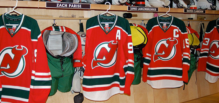 Photo from New Jersey Devils (2010)
This goes against the decidedly modernized jersey designs being implemented for the Stadium Series. And it's speaks to Lamoriello's sweater conservatism in a big way. Was he able to fight back against the powers at Reebok and the NHL?
But there's a twist. Even if the colors and striping survive, it sounds like we're still getting that chrome crest. There are some battles you just can't win, I suppose. I'm eager to see how it all comes together. The Devils have not announced a public unveiling date yet.
Neither have the Blackhawks.
UPDATE 12/20 (10:34 AM): The Blackhawks tweeted this morning that they're "gearing up for a special unveiling this afternoon!" So it looks like we'll get the Rangers' and Hawks' jerseys around the same time — today.

Hawks bringing back black for Stadium Series
Here's one we should've seen coming. Instead of a red Stadium Series jersey for the Chicago Blackhawks, they'll actually be wearing black. (That's going to be one dull-looking game at Soldier Field, I'm afraid to say.)
As far as the design itself, there's good news and bad news. I'll start with the bad. The template lives on and it does some unpleasant things to one of the game's most universally loved sweaters. The good news — it's still kind of a throwback and it's one of the best-looking Stadium jerseys!
Remember the Hawks' black third jersey? It debuted in 1996 (like the Burger King and Wild Wing monstrosities, in fact) and lasted until the Age of Reebok in 2007. It was brought back the following year in the Edge cut before being replaced by the 2009 Winter Classic jersey.

It's back! Imagine this jersey on the new Stadium Series template. It doesn't totally ruin it, but it does make it less awesome. The stripes don't wrap completely around the sleeve and there's no black space at the very bottom of the jersey. Then there's the chrome thing. And the angled and elongated numbers.
The classic yellow "C" patch is emblazoned on the left shoulder — although I believe it was spared the chrome treatment. Of course, the Stadium Series patch is on the other shoulder. The new modern collar laces are also in play here. They're white.
This one will easily be the least-hated jersey among traditionalists who dislike the new-fangled template. And I'd say it was the best thing the Blackhawks could've hoped for given the parameters of it.
Which of the three jerseys are you looking forward to most?



Reader Comments (19)
Interesting if you're right about the chrome logo on the Devils jerseys. Maybe the elongated numbers become a possibility too if the league won the crest battle against Lou? Though please not the angled TV numbers. I'm not buying the "better readability" argument for those.
Based on the sneak peak, the rangers' looks like it's going to resemble the Hartford Wolfpack more than the rangers
Really don't get this big "future" look, it's all 90's looks that people hated back then. Reebok sucks. The retro look is obviously awesome always , you. Can grow from learning from the past, .......... No more shoulder patches....... They don't make you cooler. Work on your stripes
Seems like this Rangers jersey is going to be a real home run!
... get it?
The NYR jerseys, both from the description and the sneak photo, look forgettable and certainly not enticing for a consumer. After a surprisingly good Winter Classic version and the current heritage version, this is a pedestrian incarnation that combines lack of imagination with bad design trends. The fact that it, indeed, does seem to resemble the Rangers farm team's set is, perhaps, a sad coincidence as the 2013-14 Rangers are playing at the AHL level.
As a Devils fan, I must admit that I am biased that their current set is the best looking shirts in the league and they're timeless.
The throwback being brought out once a year is OK, because it is a part of their history.
I admire Lou immensely because he's doing something that no marketing or PR or merchandising person would ever allow and that's a tradition. He's building a legacy for a relatively new franchise and that's more than I can say for newer teams who are on their third or fourth set of jerseys.
as a NHL traditionalist, I love that the Devils stick to their home/away sweaters and colours. I also like that they follow hockey traditions and keep the uni #'s under 35, except for stablished susperstars... hard to say anything nice about NJD, coming from a long time Ranger fan
As a Ranger fan, I hate to see them leave out the Statue of Liberty logo once again, despite all the opportunities they've had to bring it back. However, I believe using elements from the white Liberty jersey, which is my favorite jersey of all time, is definitely a step in the right direction. I'm also getting fed up with Reebok and their tyrannical grip over what teams do with their branding and uniforms. Let the organization do what they please with their look. Except Buffalo. They've lost that privilege after this year's disaster.
You forgot to mention that the Rangers current third jersey says New York on it
Well played Lou, well played. I can only imagine the interactions between the NHL/Reebok and Lou.
NHL - How about you try...
Lou, before sentence finishes - No.
NHL - not even if we give you back that draft pick from the whole Kovy thing?
Lou - No.
NHL - Ok. Then take this silly logo and you must wear it.
Good for the Devils. Fight the power !
Ah, I'm happy to hear about the Ranger's jersey. I absolutely love the Liberty jerseys, that would've made for a nice home/away set, but that team should never drastically touch their current ones ever...hm, perhaps they could've used them as a third and fourth alternate like Anaheim did for two years? Anywho, it's a classic and awesome concept for a modern vision of the Rangers' identity. The colors clash with each other perfectly, the logos (both the one on the chest and the modern NYR shield on the shoulders), and the jerseys are just eye candy to look at. I actually bought a navy blue Starter one and am getting it on Christmas. I am excited.
Point being, this makes me happy, to see somewhat of a throwback to those jerseys. While I would be instantly sold if they had the Liberty head on the front of the jersey, I'm still happy to see them acknowledged. I hope they can bring back the navy blue jersey fully one day.
It's weird that, not only is the front logo not the primary logo, as so far it has been that for every team, but it's not "RANGERS" either. Either way, we get a somewhat throwback to the eighties and 2001. It's good to see a change, and "New York" hasn't been on the front in a long time. Though, I wonder if the shield will ever see the front of the jersey, Maybe not in a very long time, since the late 70's jersey was so poorly received before being reverted back to the original classic jerseys since.
As a big fan of throwbacks, as well as the classic Devils' "Christmas" jerseys (had to say it, it's the season, after all), I'm happy to hear that it's what we'll most likely be getting.
I'm also happy to hear that the Hawks will be bringing back the black 90's alternate. Also, to clarify, the inaugural alternate jerseys that include Burger King and Wild Wing debuted in the 1995-96 season, whereas the black Hawks (no pun intended) sweater debuted in the following season, 96-97, but the former jerseys debuted in the second year of the season. Just something I felt like saying, sorry.
I'm curious to see what it really looks like though, but I think I'll be pretty satisfied with what we'll seem to get.
As for the chromifications...I'm indifferent, leaning towards not liking it. I don't think it's necessary...but if it's a one time thing, and nothing more, that's fine.
It's one minute until the Hawks(possibly) and Rangers jersey are revealed! I can't wait!
The Rangers reveal video was funny but the jerseys look pedestrian at best...
It's the Wolfpack!
These look ALOT like the Hartford Wolf Pack...just with chrome New York...
just a quick note on Nascarfan's post: the crest on the Kings jersey is not their primary logo (anymore).
Lou always does it right. Proud to be a Devils fan.
I call for an open revolt against the NHL if they make NJD wear that stupid chrome logo!!!
@NASCARFAN160, last time I checked, their alternate jersey says 'NEW YORK' on the front of it. :p I also agree, it is nice to see them try something different once in a while.
I'm very proud of my Devils.
Fighting against those futurist look jerseys...
The vintage trend was a very good thing for those outdoor games since playing outside is kinda retro... but this?
I like the fact the Kings decided to go grey, I like the fact the Penguins wanted to stick to their modern colours and not another shade of blue, I like the fact the Hawks kinda brought back their black alternates who always been praised by their fans, but not on those horrible jersey template!
...and the chrome logos they look like something made out by a teenager that just learned how to play with Photoshop filters...
Born in Montreal, I always liked the fact the Canadiens kept the same jerseys over the years since they joined the NHL. Thank you Lou for building a legacy inspired by teams like Montreal. Wearing that red and green jersey for St-Paddy's once a year is way sufficient and sticking to them for the outdoor game is what it should be!
Please don't let them make you wear those awful chrome logos. I know the Canadiens would've never accepted anything like this!
Thank God the Canadian teams + the Red Wings don't have a lack of imagination and go once again with a nice retro look!
...the four of them will go with amazing uniforms for the Winter and Heritage Classics!
Damn you Reebok and your stupid ideas!