Mourning Purple
 Wednesday · Mar 20 · 2013 | 2:33 AM PDT
  30 Comments
It's a sad day today. The beginning of a new era in the NHL. One in which no team employs that great color between blue and red. Sixteen teams wear blue. Thirteen wear red. None wear purple.
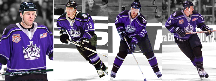
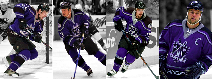
I am of course referring to the fact that the Los Angeles Kings officially retired purple from their color palette last night. They did so by wearing their third jerseys one final time as they defeated the Coyotes 3-2 at Staples Center.
But even as we mourn this death, I am hopeful. Hopeful because the last time the Kings extinguished purple (yes, it's happened before in 1988), it was resurrected briefly less than eight seasons later — albeit in the form of the ill-fated "Burger King" third jersey none of us can forget.

Then just two years after that, in 1998, the Kings launched a rebrand that incorporated purple back into their black and silver look. And the next season, their new third jersey put them back in full on purple once again — just as they were when founded in 1967.

Now that was a one-of-a-kind hockey uniform. And as much as it was a creation of the late '90s, it still looked great! But in 2002, the Kings decided the crown made a better primary logo than the royal coat of arms and pulled a little switcheroo.

So it was the same sweater with a different logo for the next five years. In 2007, Reebok was responsible for killing the purple when they introduced the generic Edge template — whose sole goal was the destruction of any and all creativity in hockey uniforms. Mission accomplished.
Since then, we've never again seen the Kings in purple sweaters. It got a whole lot worse in 2011 when the black and silver third jersey — reminiscent of the Gretzky days — got a big promotion. It set off a series of events that culminated last night with the end of the second purple era.
It was nice knowing you, purple. Rest in peace. (Because you'll be back soon enough.)


Reader Comments (30)
I kind of like the purple, only for it's uniqueness. But as a Kings fan, I must say, for whatever reason, when purple is out of the uniforms, we are a better team. The gold and purple days are full of nostalgia, but the Kings were never very good in those days. Likewise, the black & purple era saw a lot of frustration and unrealized potential. But the original silver & black with the Gretzky trade represented a new era of Kings hockey. We went to our first cup wearing those colors. And then as soon as the new black jerseys were made the primary, we win our first cup. Coincidence, you say? I think not.
Won't the Kings still be occasionally wearing their beautiful throwback purple & gold unis?
My take is that they are only retiring their black and purple third jerseys, but not getting rid of purple all together. I think they'll start wearing their classic "forum blue" (purple) and gold as a third jersey next year. They've already worn them at select games in the last couple of seasons and their popularity is far greater than the current black and purple thirds.
The heritage Jersey is still Purple and Yellow.. Are they retiring those too ?
I'm fine with the black/silver look. They should only wear the purple/gold as a throwback jersey.
Or hell, wear the purple/gold regularly and make the black/silver your throwback. Either way, just make up your mind and get some consistency.
I watched the game on TV last night and the purple stripping was barely distinguishable from the mostly black jersey, unless they were showing a close-up shot. I don't think the purple and gold throw backs look good on TV either. Maybe its my TV or the lighting at Staples Center.
It is my understanding that the Kings will still be doing Ledgends' Night promotions in seasons to come which means the all "Forum Blue" unis will still be around & purple isn't dead yet. Lets hope!
Yes, it is a shame that purple has been dropped. If the King's mission was to become plain and boring, they did an excellent job of it. The Edge templates have totally destroyed all creativity and unique designs for hockey jerseys.
Purple isn't officially retired from the team. The forum blue and gold alternates are supposed to be promoted to the alternates next season. This is simply the retirement of the black and purple jerseys.
i never liked this look. i could never get passed the tackiness of "los angeles" written across the crotch. also, combining the purple with black and silver made it seem sort of dull.
They should go back to the old purple and gold full-time, with home purples and road golds. Death to the mandatory whites. Keep the black and silver as a third, though, by all means - not a lot of teams have the history to pull off a full-time alternate in a completely unrelated color scheme.
I think the kings current 'LA' logo is terribly uncreative. It just sucks. Bring back the old beauties.
http://0.tqn.com/d/proicehockey/1/0/2/F/72500895.jpg
I wish Jerry Buss were around to tell each and every one of you that Forum Blue is NOT purple, and never will be.
I'm kind of bummed about this. Purple looks great as an accent color (though maybe not a primary) and they are probably missing out. Hopefully the Ducks will bring a third jersey of the classic "duck mask" logo with the purple and teal and we can see it again on the ice!
While I don't have 'much' of a problem with the Kings going back to the 'Grayscale' unis, I do have a problem with their weak brandmark. As some people have pointed out, those colours were of an era of prosperity (I.E. Oilers/Islanders current colour schemes) and now that they've actually won something noteworthy in the form of the Stanley Cup, it is all but cemented that it will be the look from here on out.
My biggest complaints though:
I've never cared for their weak logo in the 80's (Didn't they just use a not too subtly modified Chevy logo?)
The terrible need to tell everyone they are from 'Los Angeles' on both the home and away jerseys during the rebirth of purple. (Isn't your logo supposed to identify/sell you to the masses?)
Finally, their bastard child of the Chevy logo and reiteration of Los Angeles... the 'Pencil Point' logo. (How do you put 'LA' wordmark as the prominent piece and relegate a King's Crown below it?)
A crown (especially after you have been deemed supreme ruler over the other teams) should be on your head not at your feet. Look at Sacramento Kings alternate logo and the Kansas City Royals logo, two similar logos but still different. Are you telling me they couldn't have somehow subtly incorporated 'LA' into a crown or crowned crest logo?
Keep the crown logo but 'inscribe' the (seemingly needed) 'Los Angeles' in the interior band of the crown.
Ok, I'll get off my soapbox now =)
I don't care what color they wear....just as long as it is reflected in the Stanley Cup as it is hoisted on the last day of the season.
i never cared for the "LOS ANGELES" at the base of those purple sweaters but besides that they were great. and i love the coat of arms logo! my favorite hat is a purple kings hat with simply the silver sunglasses-wearing lion on the front.
The purple only looks good with the old fashioned gold. Love the current LA uniforms. Those black, silver and purple ones were atrocious.
Those purple jerseys were amazing. Sad to see the remainder of those great jerseys go.
As a Kings fan since 1 BG (Before Gretzky) I am both sad, and pleased, to see the purple iterations go. I like tradition, but seriously, those years were the worst years of all. Being reminded of the promise, and players, lost to injury is no longer necessary. Those burdens were borne long and hard until the Cup was won. Now, we have earned the right to put away those painful memories as specifics, and relegate them as one general memory of an era assigned to the dark ages before Stanley's Light came to shine.
Put it this way: if I want to see some purple and think Kings, I'll pose the Stanley Cup lit in bright, fresh purple and just stare at that, instead.
This move is strictly black-for-black's sake, and as typical, creatively bankrupt. If your team didn't have black in the uniforms before, say, 1980 - then there is no need to have it in them now.
Hope they keep the old school purple and gold around, and common sense prevails and they become their standard home sweaters.
I will cherish my Adam Deadmarsh jersey forever now! Go Kings Go!
The purple and blacks were always ridiculously ugly anyway, thank god they're dead.
Now, the purple and golds, those are beautiful. And it sounds like they're being promoted to more regular use. Which is wonderful, and deserves celebration.
I mean...it's fucking purple....
It's always bothered me when people refer to the original batch of Edge jerseys as a "boring template" or something to that effect, as though all the teams were forced to wear the same design. True, a lot of those initial Edge jerseys were pretty ugly, but they were no more a standard template than the sleeve-stripes-hem-stripes-and-maybe-a-shoulder-yoke look that pretty much every team had in the '80s and early '90s. Go to NHLUniforms.com and pull up the 2007-08 season, and then take a look at the 1991-92 season, and tell me which one looks more like the teams followed a standard template.
@Daniel, you are exactly right except the 1991-92 season had most teams in much better looking uniforms, at least in my opinion.
I'm starting to think that purple is not going to be used at all:
RT @LAKings: After a long discussion with Grimace, we've decided to retire purple from our color scheme. See us in them one last time next week.
If they were using the forum/gold unis in any capacity, wouldn't purple (and yellow) be part of their scheme?
I liked the second purple era. Especially the coat of arms logo. It will be missed.
Wait... Grimace... Like the purple McDonald's Blob?... has decided to retire purple from the colour scheme. Oh, the irony!!
Awww man....Kings always need SOME purple in there. I dont care if its just a few stripes here and there, anyway, the more modest, the better, especially with a color like that. They just dont look right in black silver and white. Purple is the color of royalty, and therefore Kings....bring it back!!!