Entries in los angeles kings (33)

Monday
Dec092013

More on the L.A. Stadium Game

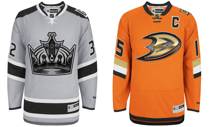
Taking another look at the new Kings, Ducks uniforms

It's been a bit slow around here lately. Not necessarily because there's nothing to report, but rather I've been a little busy away from the blog. While I try to make time to put together a few more posts this week, I wanted to look back at the Ducks/Kings Stadium Series jerseys.

First, the images above are the official artwork from Reebok. They show the full jerseys, including the waist stripes (or lack thereof) which weren't visible in the images posted on the blog last week. The TEAM LA Store is currently taking pre-orders online if you're interested in buying.

I also wanted to do a bit of a link dump. Both the Ducks and Kings shared a lot of information related to these Stadium jerseys.

If you're not interested in reading through all those articles, I've pulled a few fascinating facts below.

Stadium Series jerseys available in January

While you can currently pre-order any of the three unveiled Stadium Series jerseys, you can't take any of them home yet. According to the Ducks' press release, the jerseys will be available in stores and to ship in January. The Islanders' Stadium Series jersey order form, says "early January." No specific date has been made public yet — that I'm aware of.

Elongated numbers intended for fans in the cheap seats

The Kings' "The Facts" article explains the elongated numbers on the jerseys.

Player numbers on the back of the jersey are enlarged, making them more visible to fans in outdoor venues. Sleeve numbers are angled on five of the Stadium Series jerseys aligning player arm position with visual angles typical for fan viewing of the game in motion.

Honestly? I've never had a problem reading the sleeve numbers because of the angle. Let's just admit this is more about form than function. I guess the idea is that when the player is bent forward with arms outstretched to grip his stick, the angle of the numbers will be more horizontal. I have my doubts.

On the other hand, the elongated numbers make perfect sense now. There's so much real estate on the backs of jerseys that isn't being used. And because these stadiums weren't designed with a 200-foot hockey rink in mind, fans are forced to sit pretty far away from the action. The numbers can't be any wider, so making them taller makes sense.

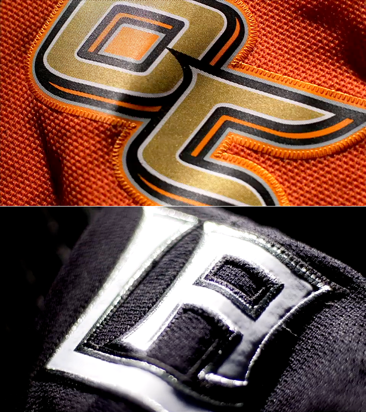
The chrome crests use "high tech" printing

The chrome logos are cheesy but I suddenly understand the need. From the Kings' "The Facts":

This new technology fuses print and embroidery manufacturing process, allowing the logo to be displayed as a high-resolution image incorporated into the crest. This technology also reduces the weight of the crest, promoting a lighter jersey for improved athlete performance.

Ok, "weight of the crest" again? First the stripes weigh too much (San Jose!) and now it's the crests. Come on. But whatever it takes to make the players happy, right?

The first line of that quote is a crock. "Fuses print and embroidery"? No. Look at the photos. It's a printed crest stitched onto the jersey. Nothing about these crests are embroidered. And that explains the chrome logos. I'm guessing when Reebok experimented with printing crests, they realized it looked cheap.

So the logos required a little digital texture and beveling to give the same impression you get when looking at an embroidered crest. Unfortunately, however, it's probably a safe bet that printed crests are the way of the future when you take cost and player comfort into consideration.

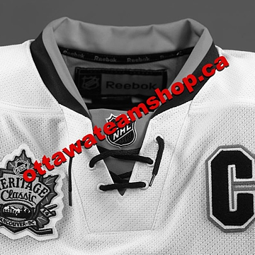
The odd lace-up collar design explained

Once again, we'll turn to the Kings' "The Facts" piece:

The construction of the lace-up collar streamlines the cut and sew cosmetics of the collar for a seamless feel and better wear and performance, while still delivering the timeless style of the traditional hockey visual cue.

Now they're not even trying to hide their manipulation of us. It's just a "visual cue." But if we're being honest, the lace-up collars we see today are form over function anyway. They don't serve any purpose other than aesthetics. Which is fine.

I actually like the look of these new collars. They're just clean and unique.

Stadium Series jerseys were designed in 3 months

Teams usually spend a year or two developing new jersey designs. These were slapped together in just three months, according to Kings COO Kelly Cheeseman (a real name!). He was the focus of the Kings' "Q&A" article. He says the Kings' jersey design was a collaboration between the NHL's marketing department, Reebok, and the team's staff. (Note the lack of fan input. Not unusual, but the design seems to be going over well anyway.)

Feel free to weigh in on these new details in the comments.

Tuesday
Dec032013

Kings, Ducks Unveil Stadium Jerseys!

Video stills from NHL

Dodger Stadium game will feature orange versus grey

The 2014 Stadium Series jerseys to be worn by the Anaheim Ducks and Los Angeles Kings were unveiled this morning. While we await more photos, check out this unveiling video. Or if you can't watch the video, I grabbed some stills for all to enjoy.

Both teams are sticking with their recently unveiled chrome logos. This suggests the other Stadium teams will likely do the same. However, that may not be the case with the Rangers and Devils. I've heard the Rangers will have a "NEW YORK" script on their jersey while the Devils will simply wear their red and green throwbacks. But I'm sure we'll find out soon enough.

As rumored, both jerseys have new ligature shoulder patches. We saw L.A.'s on a T-shirt not too long ago. And Anaheim's "OC" logo was barely visible on another shirt. Both are great extensions of the existing brand identities. But you can definitely tell these two jerseys were designed together. That's good if they were only intended for use during this one game. But if the two teams continue to use them as alternate uniforms, it could be awkward.

The close-ups of the sleeve numbers look a lot like the teaser videos released over the weekend. 

And here are the nameplates. Anaheim's is unique with the letters looking very thin on the inside.

Looks like this new collar style is here to stay. We first saw it on the Islanders' Stadium Series jersey. Now the Ducks and Kings are repeating it. It's modern with a hint of retro. Personally, I like it.

Remember, the big game is Jan. 25, 2014. Don't miss the NHL's first orange-versus-grey game!

Monday
Dec022013

One More L.A. Stadium Preview

Video stills from Anaheim Ducks (via Instagram)

Ducks, Kings release new jersey teasers a day before unveiling

The Anaheim Ducks released a video clip via their official Instagram account tonight, showing details of their 2014 Stadium Series jersey. The full uniform will be unveiled Tuesday morning at 9 AM — just like the Kings' — according to the video.

The first shot is a close up of the sleeve, not unlike the teaser we got from the Kings on Friday. And if the knit of the jersey is anything to gauge by, it seems the Ducks may be sharing the Islanders' angled sleeve numbers and stripes. It's hard to say for sure.

Video stills from Anaheim Ducks (via Instagram)

The next shot shows the front of the obviously orange jersey just below the crest. A sliver of it is slightly visible at the top of the frame. Take note. It doesn't look liked the chrome webbed "D" we've been seeing. One rumor suggested the shoulder patch from the Ducks' third jersey would be used here. Could that be what we're seeing? Or will it be something entirely new?

The final shot seems to show the back of the jersey — though it's not clear to me. It could be the back of the sleeve. But some gold and white stitching is visible on the orange fabric, leading me to think we're looking at an area with numbers.

But that's not all...

Video stills from Los Angeles Kings (via Instagram)

The Los Angeles Kings also released another teaser video on Instagram — that's the place to be for jersey teasers these days! It's one shot, five seconds. A rack focus on what looks like the sleeve.

A lot of fans have been saying they see grey in the Kings' teasers. I didn't at first, but more and more I'm seeing how that could be possible. A game of orange and grey jerseys would definitely be unique in the history of the NHL. Could look really sharp.

Both jerseys will be released just over 12 hours from now on their respective teams' websites. Check back tomorrow after 9 AM PT as I hope to have photos up right away.

Saturday
Nov302013

New Kings, Ducks Sweaters Coming

Both teams will unveil Stadium Series jerseys on Dec. 3

The Los Angeles Kings and Anaheim Ducks will unveil their 2014 Stadium Series jerseys on Tues., Dec. 3. We now have confirmation of this from both teams as well as an Instagram teaser video from the Kings. I grabbed a couple of stills to share.

Video stills from Los Angeles Kings (via Instagram)

There are only three shots in the 14-second video clip. The first seems to show the side and under arm of the jersey. The color and lighting seem to suggest the jersey is primarily white — rather than black as we suspected. The final shot of the video is a graphic confirming the day and time of the unveiling on the Kings' website.

Video still composite from Los Angeles Kings (via Instagram)In between was another shot where the camera tilts down the sleeve of the jersey. It's a close-up, so for all the details we see, we don't get to see much of the bigger picture.

The image to the right is the first and last frame of the camera move stitched together — so you can see all of what was shown in a single image.

The lighting is very dramatic and makes it difficult to distinguish colors. But given the outline stitching on the numbers and the visible stripe below, it looks like part of the sleeve is black.

It's probably not unlike the sleeve design we see on the Avalanche and Panthers uniforms.

The sleeve stitching seems to be similar to what we saw on the Islanders' Stadium Series jersey, but I'm really hoping Reebok hasn't decided to paint all the teams with the same brush (i.e.: template).

I'm definitely hoping the tilted sleeve numbers and stripes don't become a thing. As a one-off, it's fine. But it's not something to be repeated over and over.

If you can make more sense than I can out of what we're seeing, please feel free to share in the comments.

Let's move on to the Kings' Dodger Stadium opponent now.

Prior to the holiday weekend, all we knew about the Ducks' Stadium Series jersey is that it will be orange — as confirmed by Ducks' media guy Adam Brady. Then Thursday afternoon, Brady confirmed the unveiling date after being asked by a fan.

This morning, Icethetics reader @EricTheHawk tweeted some details he'd heard about Anaheim's new threads. He wrote the following:

Potential scoop? I spoke w/ employee at Ducks team store yesterday who said Stadium jersey essentially an orange version of 3rd.

Said he'd seen designs, and the one Ducks most likely went with basically flips the orange and black on the current third look.

Take it for what it's worth, but he seemed knowledgeable & was excited to see (didn't know) when final design would be released.

If true, this would definitely get us out of the common template issue, but it doesn't sound all that creative. Bear in mind this is only one report from someone who was unsure of the final look.

That brings us to speculation. Some fans have started looking a little more closely at a piece of Stadium Series merchandise for answers. The Ducks' "Hockey Bear" T-shirt, to be specific.

Image from Shop.NHL.com

Folks have been wondering whether the bear is wearing the Ducks' Stadium jersey. It's orange. And it has sleeve and waist striping not unlike what we saw with the Isles. This doesn't sync up with the report of it being an orange version of the third jersey — unless the employee was merely referring to the webbed "D" crest.

Another thing to note on this T-shirt is the shoulder of the bear's jersey. This is the highest resolution I could find, but if you look closely, it looks like "OC" in the Ducks' font. An orange jersey. Orange County. May be extrapolating a bit, but who knows.

Now, two questions for Ducks fans: 1) Has anyone bought this shirt? If so, would you mind sending me a better photo of the bear? And 2) have you ever seen the team use this "OC" logo anywhere before?

We have 72 hours to speculate. All will be revealed on Tuesday morning.

Thursday
Nov212013

Sabres, Sens and Stadiums Redux

Several recent stories require follow-ups so I'm squeezing them all into tonight's post.

Sabres release 2013-14 third jersey schedule

Believe it or not, there are still skeptics out there. Those who don't believe the gold third jersey unveiled by Buffalo Sabres in September was the real deal. Those who thought that Steve Ott business was just a prank. Wishful thinking, I suppose.

Either way, this faction will finally and officially be proven wrong on Sunday when the Sabres debut their controversial new threads. The team released its 10-game third jersey schedule today. You can see it in the graphic below.

Photo from Buffalo Sabres

The schedule begins and ends with Detroit, a new divisional rival for the Sabres in the Atlantic Division. The jersey will not see action on the road this season.

Before I move on, it should be noted that the genesis of this design is explained for the first time in today's press release. Take a look:

The third jersey, which was revealed via the team’s social media platforms in September, was designed by the Sabres’ creative team in collaboration with Reebok. Challenged by Sabres ownership to use gold as the primary jersey color for the first time in team history, the design team looked at jerseys and uniforms from across the full spectrum of professional sports for inspiration. The result was a two-tone jersey with gold as the primary color on the front and navy blue on the back. This design concept is believed to be a first for the NHL.

"Believed to be a first"? The NHL's jersey history is fully documented. There aren't any mysteries. (In fact, if you've never been to NHLUniforms.com, I highly recommend it.) Point is, this is definitely a first, for better or worse.

Now, to Ottawa.

Senators start offering up Heritage teasers

We're now a week away from the Ottawa Senators unveiling of their 2014 Heritage Classic jersey and the ancipated teasers are well underway. In fact, we've gotten two this week.

Photo from Ottawa Senators (via Facebook)

This photo (right) was posted to the Sens' various social media platforms, including Facebook, Twitter and Instagram.

It's a gray-scaled photo of the top portion of the sweater. Because of the lack of color, though, it's tough to tell whether the jersey is white or "vintage white" — but I still made a vintage white graphic for the top of this story.

I'm not sure that's a great color for a jersey, however, so it's probably white in reality. A future teaser may answer that question for us before next week.

The "C" on the chest is the only element that gives anything away. But so far, it's looking like a reverse of the black Heritage third jersey the Sens have been wearing for a couple years.

In other words, it'll probably look a lot like this concept by Mat Ware.

But this wasn't the Sens' first teaser. On Tuesday, they gave us a bizarre video of Erik Karlsson and Jason Spezza recounting their reactions to seeing the sweater for the first time. As teasers go, this was one of the worst I've ever seen. And there have been some bad ones this year.

Video stills from Ottawa Senators

Nonetheless, it's worth reporting, so let's get through it. Erik Karlsson went first. He said:

It's different. I think it looks good with the color that it is. And it actually looks like it is old. The combination is a little bit older than probably what team uses nowadays. The first time I saw it I right away thought of something old. But still good looking.

I like it. I like it a lot. I think it tells a lot of history with the way it looks. I think the numbers on the back are looking a little better I think than maybe the red and the white. It's a little more special. And everybody on the team says the same thing. It's a great looking jersey that right away gives away a lot of history.

Based on Karlsson's description, it doesn't sound as similar to the black jersey as we're expecting. He makes specific note of how "old" it looks (perhaps it could be vintage white after all?) and the numbers on the back (different from the third jersey?).

But then again, I'd be very surprised if Karlsson put as much thought into hockey sweaters as we do here, so I don't want to put too much stock into what he's saying just yet. The photo below was shown while Karlsson was speaking.

Video still from Ottawa Senators

Could it be anymore clear? 

Then Jason Spezza expressed his take:

It's something that, to me, seems like a hockey jersey. It's a traditional jersey. I like the way it looks and I think it's been good for us. It's a great jersey. I think they've done a great job with it. It's something that the players will like, the fans will like. It kind of ties in to the whole "heritage" aspect of it all.

I think whenever you can take a modern jersey and put a bit of a traditional twist to it, I think it's a cool thing. It's something you can tell is well thought out. And it's nice to tie to the two generations together.

What stuck out to me was "it's been good for us." Yet they've never worn it before. So either it is the reverse of the black jersey, or Spezza misspoke. The following photo was shown while he spoke.

Video still from Ottawa Senators

When I first watched this video, I was thinking the jersey could be full-on barber pole with stripes top to bottom. But today's teaser photo killed that theory, of course. In fact, there's not a single stripe visible in the teaser.

One more thing caught my eye. This old Senators sweater was also shown during the interviews.

Video still from Ottawa Senators

Is it possible the Sens could revive this script on the new sweater as opposed to falling back to the big black "O"? It would definitely stand out and wordmark-based throwbacks seem to be trending lately. What would you prefer?

Video still from Ottawa Senators

Canucks sticking with Millionaires sweater?

While we're on the subject of the Heritage Classic, an email sent to Vancouver Canucks fans today regarding tickets was decked out in Millionaires colors. That combined with the lack of any talk about a new Vancouver jersey is making it look more and more like that's what the Canucks will wear on March 2. And that's definitely a good thing.

More clue-laden Stadium Series gear shows up

Since we last spoke (two days ago), more 2014 NHL Stadium Series gear has appeared online. First, we've gotten front and back looks at the New Jersey Devils' T-shirts. Take a look.

Photos from Shop.NHL.com

This version doesn't make use of the chrome logo, as you can see. Turns out this series of shirts includes two versions for every team — one with chrome, one without. Here's what I mean.

Source unknown

This might be a good time to point out some news about the Devils' Stadium Series jersey. Beat reporter Tom Gulitti tweeted the following on Wednesday morning.

So it sounds like those St. Patrick's Day jerseys will be returning — and perhaps "futuristic" doesn't accurately describe all seven Stadium Series sweaters. Time will tell for sure.

Now on to more treats from Shop.NHL.com.

Photos from Shop.NHL.com

This blue hoodie gives us a look at the Islanders' elongated numbers — a lot like what we saw Tuesday with the Rangers, Blackhawks and Penguins, but not the Devils, interestingly. And if you're still wondering about the California clubs, they too have elongated numbers.

Photos from Shop.NHL.com

Of course these shirts are confusing because both are black. So maybe these shirts don't say as much about the jerseys as we thought. Plus, we already know the Ducks will be wearing orange. The question then, is about the numbers. Will they look like this after all?

Let's wrap this thing up with a few unusual Stadium Series shirts.

Photos from Shop.NHL.com

What's with the "Hockey Bear" on the Ducks shirt? Is that a thing I'm unaware of? (UPDATE: Everyone is telling me it's a nod to the state flag of California. I can see that. And it fits thematically with the others.) The other two at least make a little sense to me.

Anyway, these jerseys should be unveiled soon so we can stop all this speculating.