


Review: Hurricanes' New Uniforms
 51 Comments
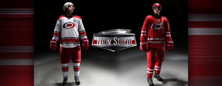 All images from Carolina Hurricanes videos
Trying something new today. This lengthy post is my review of the new uniforms unveiled Tuesday by the Carolina Hurricanes. It's not that I've never shared an opinion on the blog, but making time to do a proper analysis has often eluded me.
The Hurricanes released a handful of great videos documenting at the new design itself, the process of creating it and even the team's own 16-year jersey history. For this review, I'll be using the wealth of great content in the unveiling video, which breaks down every element of the uniform detail by detail.
So let's get started. There's a lot to cover.
At the time of the unveiling, I was sitting on an airplane with a weak wi-fi connection. Needless to say, the live steam of the event wasn't so much a stream as an occasional trickle. But I still ended up getting the gist through fleeting glances and frozen shots.
In my initial reaction to seeing the two uniforms side by side on the stage, what struck me was how red they were. The Hurricanes have always worn red, but somehow the seemed... redder.

And there's the reason why. The Canes describe the new design as "clean and unencumbered." A lot of the the secondary colors and striping are gone. To some, it came seem plain or boring. To others, an example of a classic hockey sweater with no clutter and a striking crest. To me, it's a little bit of the former. I'll get into why shortly.
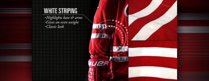
Great hockey jerseys are anchored with bold stripes around the elbows and waist. Or at least that's what we've come to accept as an essential element. The Canes have always had that. Only now, the black and silver from their palette is missing. That alone isn't a problem. What is? The striking resemblance to one of the most well-known hockey uniforms on the international stage.
Two evenly-spaced white stripes on a red sweater? That's not Carolina. That's Canada. Many Icethetics readers and tweeters pointed this out with side-by-side comparison graphics making the rounds almost immediately after the unveiling. Canes captain Eric Staal was present for the unveiling and, modeling the sweater, he almost looked like he was wearing his national team threads.
So the Hurricanes have to a lose a few points for this and a few more for dropping what made their sweaters unique — those storm flags that used to line the waist. I will grant simplicity is king. But not at the expense of losing your identity. The Canes said this whole uniform redesign was prompted by the need to move the brand forward. It feels like a move backward to me.
The sign of a great "brand jersey" is one where you can still tell which team it belongs if you remove the crest. Take off the swirling storm and this could/should be Team Canada. With the old one, the storm flags around the waist made it clear this was the Canes. Why did that have to go? I would've strongly made the case to keep that and lose all the other stripes.

Right or wrong, the lace-up collar is one of those elements that instantly gives a hockey sweater that classic feel. Some consider it odd for young teams to sport old-style sweaters. What works for the older teams isn't necessarily the simplicity but the age of their look. It's been around so long we just accept it as a given. And love it for its staying power.
Perhaps that's the goal for Carolina. I know they want a jersey that can be around for years to come. But I can't help but feel they've sacrificed their identity a little to do it. They're not the "red team." They're not the "old classic team." They're the Hurricanes, and they were born in 1997. They should own that instead of trying to be something else.
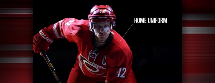
That said, the lace-up collar is found only on the home uniform. The white road jersey uses Reebok's standard V-neck collar. In the making-of video, we saw that the original red prototype didn't have the laces, but basically, Kirk Muller convinced them it would make the jersey more interesting. It did.
One more observation on the collar. It's the only part of the jersey that's black. Sure, there's the crest and the trim on the letters and numbers, but it feels unbalanced to not have a black stripe somewhere as well — like they've done with the non-matching white jersey.

The crest introduces a new technology from Reebok that helps the giant patch weigh less. Hurricanes marketing VP Doug Warf talked a little about this in the documentary. It's not that it was necessarily binding players, but it was the biggest in the league. So along with the lightweight material came a change in size.

The size of the logo was reduced by 15% from the previous jersey. That paired with the minimal waist striping gives the illusion that the crest sits much higher on the jersey, leaving more of an open space between it and the stripes. This doesn't bother me. And the more I look at the full uniforms, the better I like the smaller crest. It doesn't overpower the sweater the way it used to.

The video also points out that the silver in the crest — now the only place you can find silver on the Canes' uniforms — has been changed to a matte finish. So it's less sparkly now. Your first instinct might make you say, "isn't a 'matte silver' just grey?" But actually it still has that metallic luster. The difference now is it doesn't look like it has glitter on it.

At this point, the video switches to the back of the road uniform — but that jersey is focused on more in the second half. We get to see the new letters and numbers. The Canes describe it as a "clean, sans-serif font" that can "remain for upcoming years." Sounds to me like an oxymoron. In sports uniforms, the longest-surviving font has been the classic block style. Many teams have their own unique spin on the concept, but rarely do you find sans-serif fonts that stand the test of time.
That said, there's nothing that stands out about this type, so it's probably a safe choice. The good news: It's visually more appealing than the oversized, rounded italic font they had been using. The bad news: It's blander. Bland isn't a dealbreaker, it just doesn't do much for your brand. Despite its ugliness, at least the old italic font made you think of the driving winds of a hurricane. (Or maybe that was just me.)

Speaking of bland choices, the shoulder patches weren't carried over to the new look. The Canes say it's about "siimplicity" and "timelessness" but I disagree. A jersey with shoulder patches can be timeless. But if they didn't like the torn storm flag, perhaps a redesign was in order. Instead, blander.

Here's a new term from Reebok. They call this the "Hanger Effect." It's a design detail on the inside of the collar that is only visible when the jersey is hanging up — not when it's being worn. That means it's meant for the fans who are going out to buy them. As we can see, it's that warning flag stripe I was talking about before.
It's clearly a nod to the team's own tradition. Which begs the question, why hide it? It's a solid, simple design that, as a brand, they can own. I still can't quite understand why they would dilute their identity this way. Not every team has this sort of built-in design aesthetic. Take advantage of it.

The pants and gloves are now a solid red, without any extraneous design features. This is a good look. When trying to simplify your uniform — and this is definitely a team that needed it — a clean look for these pieces of equipment is always a plus.

So now we move to the features of the road uniform.

Right off, I love the squared off shoulder yoke. It's a unique look you don't really see with any other NHL teams. Only the Devils come close, but theirs is black so it's not as visually striking. And speaking of black, it's great to see the Canes kept it with this uniform.
The biggest thing we notice is that the overall design is completely different from the red sweater. Typically, teams tend to design their white sweater as an inverse of their dark one. Here, the Canes have changed everything but the crest and font style.

Making the uniform unique on the league stage is the shoulder yoke — which is not only squared off but also extends down below the the nameplate. The Canes proudly draw attention to the fact that they are now the only NHL team with the nameplate inside the shoulder yoke.
They aren't the first — Buffalo did it back in their black-and-red days — but they are the only ones doing it currently. Could it be the start of a trend? I wouldn't mind. It's a nice look. (And it saves the equipment manager from having to keep track of two sets of lettering.)

Black numbering. I'm not sure why this is a plus. Or why it was even deemed necessary. The Canes have always worn red numbers, trimmed in black. Now they're black trimmed in that matted silver from the crest. Is this an overcompensation to keep black in the uniforms? Especially considering the red jersey barely features it.
I don't want to say this hurts the design. Overall, the black numbers look good on the sweater. But would red numbers have looked just as good? I'm going to call this a lateral move.

Finally, there's new striping on the road whites, which the Canes are calling "bold." If they mean that it's thick, solid colors, I can agree. But apart from that, in my mind, there's nothing bold about recoloring the Vancouver Canucks' striping pattern. Moreover, these stripe sizes would've provided the perfect opportunity to keep the warning flag stripe — around both the waist and sleeves.
They say it "further establishes [a] traditional look" but all it really does for me is move them away from their unique identity. The graphic also says the look is a "unique compliment" (think they meant "complement") to the new home threads. Again, it's different, but that doesn't mean unique.

I know reviews are supposed to end with a tallying of the score and a final grade. But I think trying to assign an objective number to a uniform design is a waste of time and in the end doesn't serve a purpose. You've seen the pictures and read the reasoning but you'll form your own opinion. and you've got my full review here in about 1,800 words.
Then again, I know everybody likes a good nutshell. I can do that.
The good:
- Cleaner, uncluttered design
- Simpler, straighter font style
- Unique shoulder yoke design on the white jersey
- Warning flag effect on the collar
- Going outside the box with non-matching jersey set
The bad:
- Losing the warning flag stripe from the waist
- Losing the shoulder patches
- Slightly too much red, not enough black
- Unoriginal striping patterns (Team Canada and the Canucks)
- Where is this team's unique identity?
Again, I don't feel right trying to assign a score. I'm both impressed and disappointed with different aspects of the Hurricanes' uniform redesign. I know we'll be stuck with it for some years to come now, but it's not about getting used to anything. The design is what it is and these are the things I think work and don't.
But there's an old foul-mouthed adage about opinions. I'm sure you know it. These opinions are mine. I'm curious to hear yours. The best comments below will be backed up with reasoning and explanations. The rest will probably be ignored by your fellow readers.

Reader Comments (51)
What about the Rangers? They have a squared off shoulder.
Every single thing about these uniforms is awful. Too much red. Lacks any distinction in the league. Borrows heavily from team Canada.. etc etc The worst thing is that with all the old secondary elements like the storm warning flags gone it draws more attention to that mediocre toilet bowl logo. All I want to do is flush that terrible jersey down the drain.
The all-red uniform is a huge miss for me. This is exactly what happens when everyone praises "timeless" or "classic" looks because to NHL teams it apparently tells them to create something boring and unoriginal. No more unique hurricane flag trim? That's what I think of when I think of the Hurricanes even more than their swirl logo! I don't count the hanger trim as a real thing, it's only there so it can't be said that they totally got rid of it -- but really they did. The white is fine albeit unremarkable, especially the numbers that may as well be written in Times New Roman they're so boring.
I don't like cluttered or illegible, but between these unis and the Lightning jerseys of last year, there has to be a better way to toe the line between clean and boring. I thought the Stars were much more successful both in design and the presentation from what I could tell watching online!
Thanks for the great updates, Chris!
As a Canes fan, I cannot agree more with this review. You hit everything, both positive and negative. My strongest feelings were:
1. Losing the warning flags is a loss of what distinguishes your aesthetic. It's always a bad plan.
2. The yoke is a really nice look on the whites. I think it adds more visual balance.
3. Reds are too red/generic.
I appreciate someone who is actually versed in this language making points that I was thinking but couldn't totally express.
All in all, I would say that the more I look a these the more I can handle them, there just still really bland. You really said it best yourself, if you took away the crest and name/number font, and it was just the jersey, I would think that Team Canada left Nike to sign on with Reebok. Either that or the Maple Leafs decided a national pride/heritage jersey needed to exist as there third.
The home jersey feels too "stock" to use a jersey sales industry term, while the away feels too much like we have all seen it before too much. Adding the storm flag to the striping would vastly improve the overall feel to the sweaters. After that I would either move the logo down and make it maybe 5 or 10 percent bigger. the current size /positioning lives a really large amount of main color between the bottom of the logo and the top of the stripes and it just creates a very odd(and i feel like a somewhat harsh) negative space to the front of the sweater.
Overall I feel that the choices to make the sweater cleaner aren't bad, but a few minor tweaks would make the sweaters A LOT better. Sadly though, it's the lack of those minor tweaks that hold these uniforms back.
Any way the 'Canes spin it, the home sweater is just a red sweater with a couple white stripes in it. Regardless of the marketing tag lines, they failed to continue with their tradition and roots and could have found a way to incorporate the warning flags in a simplistic and ever lasting way into the main portion of the jersey (shoulder patches?).
A fail in my eyes.
The whites are fine, at least the red shoulders ads something and saves them from being Mayor of Blandville like the reds.
The NHL also needs to reward the home fans with the various colors of the visiting teams and go back to the home whites. Everyone keeps talking about tradition and retro, is Montreal, Toronto or Boston at home in their white jersey's not more vintage than that?
"The sign of a great 'brand jersey' is one where you can still tell which team it belongs if you remove the crest."
Hear, hear. Truer words were never spoken. I've been trying to think of a way to articulate the problem of the jersey not at all suggesting "Hurricanes" except for the logo, and this sums it up pretty nicely. I've said this before, but the main problems-the blandness, the ditching of the storm flags, the adoption of another teams' identity-in and of themselves wouldn't be a problem but when they're combined, it's the perfect storm of unoriginality (pun totally intended).
I'll take a stab at a score: 1-1/2 maple leaves (well intentioned, not atrocious, but a huge step back)
Great summary. We share similar views on this jersey. I'll email you the letter that I sent to Jim Rutherford, Hurricane's president and GM, regarding the new uniforms.
I'm mostly underwhelmed with Carolina's new unis. They're not horrible, but they could have been much better.
I agree with the need for more black.
The home unis are better than the roads, but I guess that's to be expected.
Good job Chris, I love your site and your comments. Quick question for you, do you know who make the design of the new uniforms ? Is it made by the team or they use an external firm ?
The good: Nothing
The bad: No warning stripes, home jersey has no black, unique look trashed for uncreative ripoffs of other teams.
Final grade: 0/10
Carolina's new uniform is neither overwhelmingly good nor bad. I agree that the team's traditional shoulder patch with the hockey stick and ripped warning flag is a good one, but I am happy to see an uncluttered design like what the Red Wings and Canadiens sport. While I too can see the obvious similarities to Team Canada and the Canucks, that disappointment is erased by the absence of the riduculous apron strings which still desecrate the sweaters of the Blues, Sabres, and Capitals. I am happy that the Hurricanes elected not to add those nor any other unnecessary and/or diagonal striping. Overall, I think they will look good on TV. 7/10.
i think the road uni is a winner, but the home is a dud.
I agree with your review, except for one important thing: the storm flags. They were clunky and just ugly. Sure, it was part of their identity, but it sucked, so getting rid of them is a great move. (Adding them to the collar for tradition works, so A+ for that move.)
Overall however, is it a copy and paste of the team Canada jersey (designed by Nike). I think Nike would have a strong case in a copyright infringment lawsuit. Could be nice to ask them for comments.
I'm sure readers of this blog would appreciate a full page side-by-side comparison between the Canes' and Team Canada's jerseys. A crestless version made with photoshop would be interesting.
Another idea: why not have a tournament (like in the good old days!) of the best red jersey in the league ?? (Ottawa, Montréal, Chicago, Carolina, Detroit, Calgary, Washington, Florida, Minnesota, New Jersey - I would leave our Phoenix and Colorado).
Both the Canes and the Stars jerseys in my opinion took a step back. Canes home jersey looks like the modern team Canada jersey. Just plain and unoriginal for both, very disappointing.
I like the change, like you said Chris, simple is better. I do agree they should of kept the warning flag, at least the logo on the shoulders. I'm glad the ugly reebok piping is gone, I hope more teams dump it and the ugly reebok "yoke" that connect with the long elbow stripe. the only thing I don't like is the red yoke on the white uniform. A lot of teams seem to be adopting that trend, just like dark blue uniforms and that ugly "vintage white." Other than that, I really like the Hurricanes "New Storm." I'm sure you'll do a review on the Stars but I just want to say I absolutely love their rebrand.
I was instantly reminded of Ohio State's home uniform when I saw the away set: http://upload.wikimedia.org/wikipedia/en/f/f3/CCHA-Uniform-OSU.png
I like these new sweaters. I was never a fan of the storm flag pattern. It always seemed cluttered to me and it definitely wasn't the Hurricanes identity. I think their new sweaters are much cleaner and better than they were before. The only thing I think they could have done better was use the striping pattern of their white road uniform on the red home uniform. Even if it is identical to that of the Canucks, it looks more elegant and more unique to me.
I am still not sure how I feel about them changing the numbers. While I always made fun of their NASCAR-like numbers that they used, they were also quite unique within the league.
So, these are the new Hurricanes jerseys. When I first heard about a possible change, I simply thought they were finally abandoning the contrasting piping on the shoulder yoke and being done with it. I mean, why mess with a good thing, right?
Well, the Carolina Hurricanes have tinkered with it, and I agree with you Chris, they messed with something that wasn't necessarily broken to begin with. In doing so, their home jersey is essentially Team Canada/the Toronto Red Hurricanes, and the white one, while nice, isn't exactly an overall improvement.
The Hurricanes tried to simplify their look, while not a problem in and of itself, why, as you put it Chris, sacrifice their already unique identity? I have a sneaking suspicion that we'll see a merging of these two looks in a couple of years, when they see that their jersey sales drop into the bottom five in the League.
i have to say I largely agree with your assessment of the changes. I'm going to miss the Hurricane striping. People may not have viewed it as "classic" or whatever that means exactly, but when you saw it you saw Carolina and you saw Hurricanes. That was them. And they've lost it. There's not much that stands out anymore and that's the most disappointing. It's not that they're bad jerseys, but they're just there. And that's it.
I would have preferred to see the white jersey mirrored into the red jersey as I feel it's much better. Again they're not bad, but they're also not the Carolina Hurricanes to me.
Good review. I hope we get a review of the Stars and even more in the future.
Couldn't agree more. As much as I disliked their old jerseys, they at least LOOKED like a distinctive team. I briefly caught a glimpse of the jersey and swore I was looking at a picture of Staal in Canada threads before I noticed the logo. This really should be a mistake that someone should have nipped in the bud.
I also can't stand their decision to change the design of the road jerseys. Why not keep the striping the same? How are they trying to shove a 'look' down Carolina fans throats when the 'look' isn't even consistent?
Aesthetically, they look nice. As an identity, they failed miserably; and they really should have taken the opportunity to clean up that mess of a logo while they were at it.
Return the warning flags, clean up the logo, unify the home and road jerseys and we'll have a great look for the Hurricanes. I'm really looking forward to having a whack at a redesign myself this weekend.
I'm really hoping that Carolina brass has another set in case of emergency that corrects all these flaws and were just hoping these would go over well. Kinda like Tampa Bay when they tried to ditch the bolt.
Oh, and as a Flames fan I'm PISSED that another team thinks they can stroll in and rock the solid red. Go home Hurricanes, we do it better :)
Exactly how long is the contract on these jerseys? If they put the flag stripe on the waist and added the shoulder patches I would like them a lot better! Though I think if the flag stripe was on the arms as well that would be too tacky. They'll probly remove the alternate for 2015-16 and give us a new one in 2016-17. Maybe we'll get to play in a stadium series game (maybe Washington) and then we can wear our old jerseys as throw-backs, then that could be our alternate. I know I sure won't miss a single black jersey game next year so I can pretend this never happened.
Will they remove the center ice flag stripe red line as well? I hope other teams will wear colored alternates while playing in Raleigh so the canes can wear the white one. All in all I think this was a half step forward with the away jersey and 3 steps back with the home jersey!
I enjoyed the review Chris, a good read.
Its safe to say the majority of hockey fans that patrol the pages of this blog on a frequent basis would agree that traditional jerseys, like those worn by original 6 teams, and a few others, are the benchmark of hockey jerseys. It would seem that some franchises have recognized that public opinion, and are now attempting to mimic that ideal jersey. When reebok changed the look of the league in 2007, I agreed with many people that it was for the worse. However, even though many of the jerseys that came out that year were indeed ugly, or just unfavorable to the typical traditional jersey lover like myself. They did produce a few unique looks that strayed away from the traditional jersey. Which helped create individuality among some teams (definitely not all of them, I mean, Pittsburgh and Ottawa are still wearing basically the same jerseys thanks to rbk edge)
My point is, at least the edge era did produce jerseys that varied from the traditional look. I disapprove of this trend to mimic the traditional jerseys of hockey by teams with little history. There is a lack of creativity, originality and no desire to create a singular look. I do not want all NHL teams to basically look the same. I do not like this "new storm"
As Chris said, They should own their own history instead of trying to be something else.
First, thank you Chris for the unprecedented coverage in Dallas and the very thorough review here of the Canes rebrand.
My first thoughts were the new crest is cool and the new typeface is fine, but arguably the second most important color to the team identity, black is all but non-existant on the home unis. It makes the black on the road striping look like it doesn't belong. The past jerseys' use of silver, original striping, and warning flags were really cool and unique stylings for Carolina so if anyone started to think that the flags looked too bold or gawdy than why not put them in one of the smaller bands of the striping and/or on the visible side of the collar where you can actually see them???
I appreciate when teams try something new (even if its vintage), but you gotta be unique especially if you're a younger organization and you certainly can't rip off the designs of the world's most well known national team. Some minor tweaks to the Canes existing unis would have been much better. Just don't get where 2 years! of research and development went into the NewStorm duds. The more I see them the more I dislike them. I'm glad the Stars organization listened to the fans and key people around them before finalizing their rebrand.
Battman - you realize that there is no real "tradition" behind home whites, right? The League's gone back and forth between home whites and home darks a few times through its history. As for the teams you mention, all three of those wore darks at home before they ever put on a white jersey.
As a Canes fan I'm a little disappointed to see the secondary logo gone from the shoulders - I think that'd do a lot for the home jerseys. I'm liking the aways more than the homes as of right now - the homes just seem a little incomplete to me without the inclusion of silver and black from our color palatte.
I image its been said already, but even the number seem, feel, remind me of, reflect Team Canada
Really, I think the jerseys themselves are really nice looking. However, I am one of those people you all hate who enjoys boring/classic/traditional style jerseys with very little color. Simplicity rules my life. I hate complicated.
Having said that. Even though the jerseys look really good, the problem as most people are mentioning is that they don't have a unique identity. Well at least the red one doesn'. And as it was stated earlier, for an NHL team you should be able to take off the logo and still know which team the jersey belongs to. And you can still do this with a traditional style jersey.
The problem is with the red jersey mainly. Because you take away that logo and you see Team Canada. Seriously, take the logo off in your mind and that is all you see. I really don't have a problem with the striping pattern on the white one. Yes it takes from the Canucks (who are my own team by the way), but really, that doesn't bother me. You could take that logo off and the jersey is unique enough. I wouldn't think of another team.
So overall, the jerseys look good, but unfortunately the red one is Team Canada with a different logo which is not good.
The jerseys are nice. They're not cluttered. They're simple, and they still keep the identity.
As a Canadian, and a Team Canada sweater fan, I have no issues with the Canes using this design. It's not possible these days to have a simple design without borrowing elements from other clubs. When new concept jerseys start becoming original, that's when they usually become too cluttered and ambitious, and then they get retired a year after. These are good.
I also have a dfficult time reading this without thinking about hypocritical the review is. No identity? Unoriginal? Take the crest off and you won't recognize who the sweater belongs to?
Sounds like you're describing the new TB Lightning kit, which I'll remind everyone you gave a glowing review on.
I don't have much to add to what has already been said, but I didn't care for the Hurricane stripe on the old jerseys. It looked trite and dated. The only thing worse was the black jersey with the tropical storm warning flag as the main crest rather than the hurricane warning.
I do like the iconography of the flags. Vexillology? If they really wanted to have fun, here is my two cents. Though they may already be doing something like this, they should start the pregame with the tropical storm warning flag in the stadium and projected on to the ice. Wind machines if they have them. The bigger the better. Then when the team comes out, upgrade to the hurricane warnings and blare the siren.
As for the uniforms, what I would do is no sleeve striping and take those simple hurricane warning flags and put them on the arms. They are simple enough in terms of visual appeal, and if sized and situated properly could work on both a home and away uniform. Provided the checks are proper you have the added benefit of the storyline being the last thing an opposing player sees before he receives a strong check is the hurricane warning flags and then the next thing that happens is he gets hit by a hurricane. That serves the brand identity, I think.
Excellent Summary. With the reviews complete, this is what I see happening moving forward:
2 or 3 seasons from now we will see the Canes introduce shoulder patches on both Home & Road jerseys.
They will also introduce a Red 3rd jersey that includes a simpler Warning Flag stripe. This 3rd jersey will be revered by their fans, and will ultimately become their fulltime Home uniform.
After that, possibly follow what the Kings did, and make a white version of their 3rd jersey (now Home jersey) to have matching Home and Away uniforms (complete with Warning Flag striping!)
David, the new uniforms were designed in-house. I believe the names of the designers are Andrew Rowman and Kathryn Baxter and were overseen by Brad Warf. There are quite a few videos on the 'Canes' website about the entire process.
never has so much been written about so little
I strongly disagree on the pants. This is not a good look and another clear downgrade. There is far too much red in this uniform. There needs to be some contrast in the pants. The Red Wings break up all that red with a white stripe on their pants. Team Canada uses black pants to contrast their bright red sweaters.
The Hurricanes old pants with the black stripe at the bottom was unique and it broke up the red. It made that uniform ten times better. The amount of red in the new uniform uniform is visually fatiguing.
is it me or does the logo on the 'canes jerseys look too high up??
I wish teams would just step away from this whole "simple look" thing. Hockey jerseys are supposed to be exciting and unique. Same goes for the new Dallas Jerseys too, but too a lesser extent. The Dallas jerseys aren't bad, but I wouldn't quite say they're good. They're just too simple, like the Hurricanes jerseys.
I think the thing that really kills it for me is the fact that the red jersey IS the Team Canada jersey. The biggest mistake they could've made was getting rid of the warning flags, because they were iconic and unique. No other team can do that, it was original and exclusive to them. Also, I don't mind mismatching home and away sweaters, but to me they just look really awkward together. I think it's the black detailing on the away jersey that throws it off, it just looks forced.
Judging by the reaction on the Hurricanes' website and the initial poll (with 50+ people or so), the "New Storm" is a flop
And after looking at this link on the sporting news, I wonder why
http://www.sportingnews.com/nhl/story/2013-06-04/carolina-hurricanes-uniforms-new-jerseys-eric-staal-jordan-cam-ward-dallas-stars
These look like cheap knock-off threads that you can buy for $10 in a little shop outside the arena. I completely agree that the lack of identity is what dooms this design, along with the imbalance of colors on the home and road uniforms. I was neve particularly fond of the Canes' old uniforms, but now that these duds have arrived, I'm beginning to miss the old ones and appreciate their uniqueness. I can honestly say that I think this is the worst uniform set in the league. Extreme blandness can be much worse than having too many stripes. I give the home set a 1.5/5 and the road set a 2/5 for a total score of 3.5/10. It's quite pathetic that this was the final result of this lengthy process.
I swear to everything holy that the logo has been rotated clockwise to appear more level. Or am I cray?
Going for a traditional look should mean a look that's traditional for the team. Anyhoo...
You couldn't have written a more thorough and agreeable review.
And, first off, let me say this. R.I.P. The Hurricanes initial and unique identity, 1997-2013. It was one of the best uniforms in the league, and from now on will always hold a special place in my heart. This is a major downgrade, as far as I'm concerned. "Classic" just does not work with a team like the Hurricanes. Their first season was in the late 90's, and their identity should always reflect that, in the same way that the Rangers, Hurricanes, Red Wings, Blackhawks, etc. reflect their eras. Now, albeit, old teams like the Oilers, Bruins and Sabres all had really good jerseys in the late 90's, imo. It doesn't have to reflect off their origin era. But, for a team like the Canes, it just will never work.
My first and main gripe is the storm flag pattern. That was my absolute favorite design elements of their uniforms, and it is what made them truly unique. Moving it to a part where it won't be visible on ice is just a horrible idea, and completely ruined the identity in general. The only saving grace left is the logos and alternate uniform, but this is sadly what we'll be seeing most.
Another thing I despise is the unoriginality and lack of creativity. As if the "classic" and "timeless" didn't already work terribly enough with the Canes, this is just too inspired and too similar. And bland, at that. Way too many red-based teams in the NHL, imo. The Wings, Hawks, Devils and Canes (1997-13) wore it best, and the Canes made it better adding grey to the palette. But going minimalist here is just a terrible idea, the logo just looks out of place. Too much red. The only team that should be wearing that amount of red is the Wings. The pants are horrible, the gloves are too.
The only sweater I kind of like from this set would be the road. The colors work well, albeit not working too well with the team itself... Though, being uninspired once again takes it away from me.
The only thing I do like about the new set is that the storm flag pattern still exists, even though it's kind of sad, yet clever. But mostly sad.
Sigh...you will be remembered, old Canes' uniforms. And thus ends a creative era...
Also, as a side note, what will this mean for their AHL team the Checker's? They basically have had the same uniforms than the Hurricanes, maybe they'll update it to the Canes' new threads respectively. Though, out of love for them, I hope they never do that.
To everyone who has "complained" about the league changing the the home sweaters to the coloured ones and wanting the "traditional" whites back: The NHL has changed, on average, the home/road sweaters about every 30 years. The change to home whites was made back in the early 70s. Before that it was changed several times once both sets were mandated by the league. So there is nothing inherently traditional in home whites. In fact before tv coverage started most teams only had one uniform set. It was black and white tv that necessitated the white alternates. By the way, who knows which team was the last to add the white sweater?
You can argue with me all you want, but these jerseys are beyond boring. I'm glad I bought the black 3rd jersey when I had the chance.
Glad they're going to keep the black 3rd jersey. At least one of their jerseys is going to be interesting.
As a Hurricanes fan I have to say I do not like the new change. I am a big fan of the classic look as long as the team that does it has a real purpose for it. The hurricanes did not have a real purpose to change to this other than "hey it's time for a change". We lost the warning flags which to me is a huge disappointment. The hurricane gales was the only pattern left in the NHL and we got rid of it. I would have liked to see it on the side of the pants, the fact that we put it on the inside of the collar is such a cop out. The home uniforms need some black. Just add some black somewhere and the look of the jersey will dramatically improve. The aways I love (outside of missing the gales).
What is wrong with Tampa and Carolina trying to look traditional. They had their own unique traditional look to them and now they just look uninspired.
Jerseyman - it's an optical illusion. The logo was resized - a smaller logo + less patterns on the jersey make it look higher, but it's in the same location. Take a look at an old Canes jersey being worn by a captain or an alternate captain for reference and you see the top edge is pretty much where it's always been.
Ive posted before being critical and i will again. I dont understand how anyone can like the Dallas jerseys over the Hurricanes. One common theme on this site, is classic wins, everytime. Clutered, uneven, multiple color jerseys lose everytime. Montreal, Detroit and Toronto, all have perfect jerseys. The Devils have perfect jerseys. Why? Classic looks. The old Phoenix jerseys and all the jerseys Florida and Pittsburgh have toyed with over the last ten years lack big time. Why? Not classic. They complicate the logos, or add to the color palettes or clutter the jersey. Carolina went the total classic look. Clean lines, shoulder yokes, stripes and a smaller logo. I think people have a problem with it because its too close to Detroits looks, but then again, how much of a difference is there between, Tampa and Toronto? NJ and Ottawa? Edmonton and Islanders? On to the Dallas jersey, yes i am happy they went back to the North Stars/North Dakota look. But that logo is attrocious. Design principals exist for a reason, and that logo breaks alot of them. Its not balanced, it is simple, but manages to look very busy. i remember the outrage when the Ducks changed their logo to a D, everyone hated it and still does. The dallas took everything that the Ducks did wrong and copied it. Carolina wins, Dallas loses
I disagree with the popular opinion here, I absolutely love these jerseys. Wait until the Hurricanes are playing, this set will look so sharp on the ice. I will say, having both Canucks and Canada jerseys in my closet, it's possible I love them because of a familiarity effect haha.
More of the Canes' rebranding efforts: pic.twitter.com/JxO3VgHMm1
It looks like their farm club in Charlotte is going with a similar uni set, but instead of 2 white stripes on the red jersey, it is one white and one black. They also don't have the lace up on the white jersey.
http://www.gocheckers.com/news/checkers/?article_id=1572
I think the red jersey looks a little better with the addition of black. Although I would have preferred a wider white stripe with narrow black stripes, similar to what they have on the white jersey.