 All images from Carolina Hurricanes videos
Trying something new today. This lengthy post is my review of the new uniforms unveiled Tuesday by the Carolina Hurricanes. It's not that I've never shared an opinion on the blog, but making time to do a proper analysis has often eluded me.
The Hurricanes released a handful of great videos documenting at the new design itself, the process of creating it and even the team's own 16-year jersey history. For this review, I'll be using the wealth of great content in the unveiling video, which breaks down every element of the uniform detail by detail.
So let's get started. There's a lot to cover.
At the time of the unveiling, I was sitting on an airplane with a weak wi-fi connection. Needless to say, the live steam of the event wasn't so much a stream as an occasional trickle. But I still ended up getting the gist through fleeting glances and frozen shots.
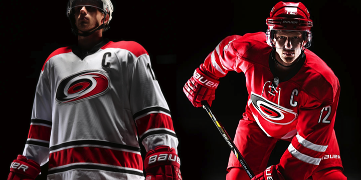
In my initial reaction to seeing the two uniforms side by side on the stage, what struck me was how red they were. The Hurricanes have always worn red, but somehow the seemed... redder.

And there's the reason why. The Canes describe the new design as "clean and unencumbered." A lot of the the secondary colors and striping are gone. To some, it came seem plain or boring. To others, an example of a classic hockey sweater with no clutter and a striking crest. To me, it's a little bit of the former. I'll get into why shortly.
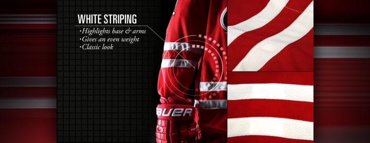
Great hockey jerseys are anchored with bold stripes around the elbows and waist. Or at least that's what we've come to accept as an essential element. The Canes have always had that. Only now, the black and silver from their palette is missing. That alone isn't a problem. What is? The striking resemblance to one of the most well-known hockey uniforms on the international stage.
Two evenly-spaced white stripes on a red sweater? That's not Carolina. That's Canada. Many Icethetics readers and tweeters pointed this out with side-by-side comparison graphics making the rounds almost immediately after the unveiling. Canes captain Eric Staal was present for the unveiling and, modeling the sweater, he almost looked like he was wearing his national team threads.
So the Hurricanes have to a lose a few points for this and a few more for dropping what made their sweaters unique — those storm flags that used to line the waist. I will grant simplicity is king. But not at the expense of losing your identity. The Canes said this whole uniform redesign was prompted by the need to move the brand forward. It feels like a move backward to me.
The sign of a great "brand jersey" is one where you can still tell which team it belongs if you remove the crest. Take off the swirling storm and this could/should be Team Canada. With the old one, the storm flags around the waist made it clear this was the Canes. Why did that have to go? I would've strongly made the case to keep that and lose all the other stripes.

Right or wrong, the lace-up collar is one of those elements that instantly gives a hockey sweater that classic feel. Some consider it odd for young teams to sport old-style sweaters. What works for the older teams isn't necessarily the simplicity but the age of their look. It's been around so long we just accept it as a given. And love it for its staying power.
Perhaps that's the goal for Carolina. I know they want a jersey that can be around for years to come. But I can't help but feel they've sacrificed their identity a little to do it. They're not the "red team." They're not the "old classic team." They're the Hurricanes, and they were born in 1997. They should own that instead of trying to be something else.
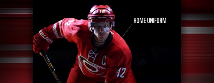
That said, the lace-up collar is found only on the home uniform. The white road jersey uses Reebok's standard V-neck collar. In the making-of video, we saw that the original red prototype didn't have the laces, but basically, Kirk Muller convinced them it would make the jersey more interesting. It did.
One more observation on the collar. It's the only part of the jersey that's black. Sure, there's the crest and the trim on the letters and numbers, but it feels unbalanced to not have a black stripe somewhere as well — like they've done with the non-matching white jersey.

The crest introduces a new technology from Reebok that helps the giant patch weigh less. Hurricanes marketing VP Doug Warf talked a little about this in the documentary. It's not that it was necessarily binding players, but it was the biggest in the league. So along with the lightweight material came a change in size.

The size of the logo was reduced by 15% from the previous jersey. That paired with the minimal waist striping gives the illusion that the crest sits much higher on the jersey, leaving more of an open space between it and the stripes. This doesn't bother me. And the more I look at the full uniforms, the better I like the smaller crest. It doesn't overpower the sweater the way it used to.

The video also points out that the silver in the crest — now the only place you can find silver on the Canes' uniforms — has been changed to a matte finish. So it's less sparkly now. Your first instinct might make you say, "isn't a 'matte silver' just grey?" But actually it still has that metallic luster. The difference now is it doesn't look like it has glitter on it.

At this point, the video switches to the back of the road uniform — but that jersey is focused on more in the second half. We get to see the new letters and numbers. The Canes describe it as a "clean, sans-serif font" that can "remain for upcoming years." Sounds to me like an oxymoron. In sports uniforms, the longest-surviving font has been the classic block style. Many teams have their own unique spin on the concept, but rarely do you find sans-serif fonts that stand the test of time.
That said, there's nothing that stands out about this type, so it's probably a safe choice. The good news: It's visually more appealing than the oversized, rounded italic font they had been using. The bad news: It's blander. Bland isn't a dealbreaker, it just doesn't do much for your brand. Despite its ugliness, at least the old italic font made you think of the driving winds of a hurricane. (Or maybe that was just me.)

Speaking of bland choices, the shoulder patches weren't carried over to the new look. The Canes say it's about "siimplicity" and "timelessness" but I disagree. A jersey with shoulder patches can be timeless. But if they didn't like the torn storm flag, perhaps a redesign was in order. Instead, blander.

Here's a new term from Reebok. They call this the "Hanger Effect." It's a design detail on the inside of the collar that is only visible when the jersey is hanging up — not when it's being worn. That means it's meant for the fans who are going out to buy them. As we can see, it's that warning flag stripe I was talking about before.
It's clearly a nod to the team's own tradition. Which begs the question, why hide it? It's a solid, simple design that, as a brand, they can own. I still can't quite understand why they would dilute their identity this way. Not every team has this sort of built-in design aesthetic. Take advantage of it.

The pants and gloves are now a solid red, without any extraneous design features. This is a good look. When trying to simplify your uniform — and this is definitely a team that needed it — a clean look for these pieces of equipment is always a plus.

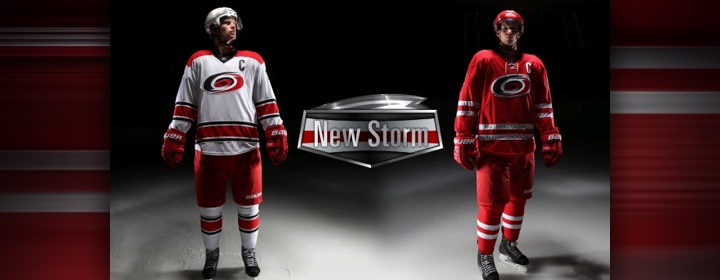
So now we move to the features of the road uniform.

Right off, I love the squared off shoulder yoke. It's a unique look you don't really see with any other NHL teams. Only the Devils come close, but theirs is black so it's not as visually striking. And speaking of black, it's great to see the Canes kept it with this uniform.
The biggest thing we notice is that the overall design is completely different from the red sweater. Typically, teams tend to design their white sweater as an inverse of their dark one. Here, the Canes have changed everything but the crest and font style.

Making the uniform unique on the league stage is the shoulder yoke — which is not only squared off but also extends down below the the nameplate. The Canes proudly draw attention to the fact that they are now the only NHL team with the nameplate inside the shoulder yoke.
They aren't the first — Buffalo did it back in their black-and-red days — but they are the only ones doing it currently. Could it be the start of a trend? I wouldn't mind. It's a nice look. (And it saves the equipment manager from having to keep track of two sets of lettering.)

Black numbering. I'm not sure why this is a plus. Or why it was even deemed necessary. The Canes have always worn red numbers, trimmed in black. Now they're black trimmed in that matted silver from the crest. Is this an overcompensation to keep black in the uniforms? Especially considering the red jersey barely features it.
I don't want to say this hurts the design. Overall, the black numbers look good on the sweater. But would red numbers have looked just as good? I'm going to call this a lateral move.

Finally, there's new striping on the road whites, which the Canes are calling "bold." If they mean that it's thick, solid colors, I can agree. But apart from that, in my mind, there's nothing bold about recoloring the Vancouver Canucks' striping pattern. Moreover, these stripe sizes would've provided the perfect opportunity to keep the warning flag stripe — around both the waist and sleeves.
They say it "further establishes [a] traditional look" but all it really does for me is move them away from their unique identity. The graphic also says the look is a "unique compliment" (think they meant "complement") to the new home threads. Again, it's different, but that doesn't mean unique.

I know reviews are supposed to end with a tallying of the score and a final grade. But I think trying to assign an objective number to a uniform design is a waste of time and in the end doesn't serve a purpose. You've seen the pictures and read the reasoning but you'll form your own opinion. and you've got my full review here in about 1,800 words.
Then again, I know everybody likes a good nutshell. I can do that.
The good:
- Cleaner, uncluttered design
- Simpler, straighter font style
- Unique shoulder yoke design on the white jersey
- Warning flag effect on the collar
- Going outside the box with non-matching jersey set
The bad:
- Losing the warning flag stripe from the waist
- Losing the shoulder patches
- Slightly too much red, not enough black
- Unoriginal striping patterns (Team Canada and the Canucks)
- Where is this team's unique identity?
Again, I don't feel right trying to assign a score. I'm both impressed and disappointed with different aspects of the Hurricanes' uniform redesign. I know we'll be stuck with it for some years to come now, but it's not about getting used to anything. The design is what it is and these are the things I think work and don't.
But there's an old foul-mouthed adage about opinions. I'm sure you know it. These opinions are mine. I'm curious to hear yours. The best comments below will be backed up with reasoning and explanations. The rest will probably be ignored by your fellow readers.


 The Canes will wear black 11 times at home and once on the road toward the end of the season. It'll make its season debut on Sun., Oct. 13 for an afternoon game against Phoenix.
 Chris
Chris

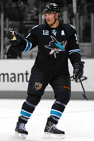 The San Jose Sharks will wear their black third jersey 11 times this season for Thursday and Sunday home games (excluding opening night).
 For a dozen games this season, the Colorado Avalanche will sport blue. The club plans to wear their alternate sweater 12 times, all at home.