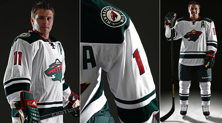
New Wild Road Jersey Revealed
 Saturday · Aug 31 · 2013 | 10:47 PM PDT
  63 Comments
 Promotional photos show up online 12 hours early
Whether intentional or not, the Minnesota Wild revealed their new road uniform on their official website late Saturday night — well before the anticipated Sunday morning unveiling event. So we're now getting to see the whole thing in all its glory.
First impressions? I like it. I was wrong about the shoulder yoke. Looked rounded in this morning's photo but obviously they've gone the same route as Carolina with the squared off design. It's a look I'm a big of — and Zach Parise is certainly no stranger to it after all his years in New Jersey.
It's a solid design. Logo looks great, the colors are sharp. But more importantly, this design fits beautifully alongside the home and alternate jerseys. The old white one was just starting to feel out of place. This one instantly feels like it belongs. And I get the sense that's why the team decided a change was needed in the first place.
What's your take? Stare at it for a few minutes and then maybe write some stuff in the comments.


Reader Comments (63)
very vibrant. looks nice and sharp.
The jersey overall design is a great. Even though everyone seems to appreciate the consistency between the jerseys (including the green alternate) they still have 3 different logos for their jersey. I would've thought they put the actual home logo (circle) on their new road sweater since it has ''Minnesota Wild'' on it and that teams often choose to put the city name on their road jerseys. Could it be that they are planning on ditching the circle logo? Or put their logo on the green jersey and make it their official home jersey? Maybe a swap between these two (a bit like LA Kings did with their purple jerseys and alternate black back then) ? I'm not really complaining here but if they're gonna go for consistency this would be changes to consider.
I think the jersey is beautiful, but I’m not a huge fan of this trend where teams are moving away from the tradition of the road jersey is the same as the home jersey but with reversed colors.
Beautiful! Well done Minnisota!
As a Red Wing fan, I think this this the cleanest, best improvement of the summer! Does not look too Christmasy (red and green mix), but does justice to the Wild logo, without going overboard. The red is used in just the right amount, and I like the deep green much more than the green on the Dallas jerseys.
Great job Wild!
Looks good, except for the captain's "C" which should be red. And one more thing, I've said it when the Canes and Stars unveiled their jerseys : I am really tired of lace-up collars. But it is still a solid jersey.
Great road jersey! They need to tweak the green one, according to the new road.
not sure what all the hype is. We all saw this jersey come out when Iowa unveiled theirs. Minnesota just colored in the yokes
At this rate, by 2015, all NHL teams will only have one color on the striping of their jerseys...
I'm really disliking the trend of "classic" looks going through the NHL right now.
Someone should buy the guy who designed this a beer.
Absolutely perfect, there is not a single change I would make. Kudos to the Wild.
Very good jersey. The only change I would have made would be adding some more red. The white strip on the bottom and sleeves would look good in red.
i've always like jerseys with the racing stripe down the sleeve. sorry to see the wild loose theirs. i do like the way they've parsed out the colors but besides that, meh.