


Sabres Unveil Third Jersey (With Help)
 Photo from Steve Ott (via Twitter)
Steve Ott "leaks" photos of new sweater on Twitter
What a strange morning. An apparent Twitter ultimatum from Buffalo Sabres forward Steve Ott resulted in the sudden reveal of the team's long-awaited new third jersey. But seeing how it all played out, you can't help but think it was all a little staged.
 It started early this morning when the Sabres seemed to be releasing their latest teaser.
But one look at the image and you knew they were just messing with everyone. It looked like they decided to take the vitriol they'd created and run with it.
They figured if everyone's going to hate the sneak peeks, why not give them a really good reason to hate them?
Then Ott chimed in: "Uncle, This is ridiculous! How about just releasing the jersey???"
To which the Sabres replied: "Hi Steve, we appreciate your excitement for the jersey, but we have a lot more pics to go before we unveil!"
And fans everywhere rolled their eyes.
Then an hour later, Ott tweeted: "HEY GUYS... I GOT it."
He's been known to be interested in this third jersey. We just didn't realize it was because he would be integral to the unveiling.
Shortly after came Ott's ultimatum, saying, "I'm sharing if you don't @BuffaloSabres #FansWantToSeeIt pucks in your rink! Boom. I'll give you 10 minutes."
Following that came another sign the Sabres were just screwing around with everybody. They tweeted: "Steve, thanks again for your interest, but we have the only two jerseys and they're under lock and key. #FortKnox"
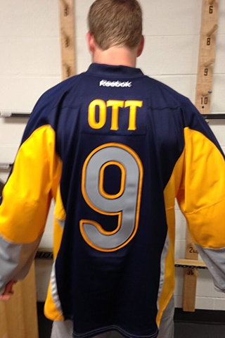 Photo from Steve Ott (via Twitter)I know Reebok's prototype process can be slow, but the season starts in a month and they only have two jerseys on hand? Come on.
Then, to Twitter's surprise, Ott made good on his threat! He posted the photo seen at the top of this post. And since it was a photo of him, not taken by him and apparently in the Sabres' locker room, it all became clear. Then he shared a photo of the back. This was an elaborate Twitter unveiling.
Whether they cultivated it from the start or not, the Sabres used the universal hate to their advantage. They created a hero in Ott that fans could rally around. The guy who stood up to the powers that be. I suppose the hope was that the emotional response to Ott's championing of the fans would be tied in some way to the reaction to the jersey design itself.
It wasn't.
I don't think I've seen a single positive comment. But I'll get to that in a moment.
A little while after Ott's revelations, the Sabres tweeted their own cropped versions of Ott's photos. So either they were in on it, or they played off the leak very well. (I think it's the former!)
The Sabres also followed up in response to a fan tweet asking when the jerseys would be going on sale. Given the feedback I've seen so far, I'm surprised anyone would want to buy one. (Unless of course to burn it, hence assuring one less in the world.)
But the reaction hasn't been great so far. I've read dozens of tweets and haven't seen one nice word to describe them. As for me, I think most of you know where I stand on third jerseys.
The widely despised black Islanders jersey wouldn't hang in my closet, but that doesn't mean I'd have anything bad to say about it. I believe alternate jerseys are meant for stepping outside the box. Like the Isles, the Sabres have moved back to retro-inspired primary jerseys. I think they should be able to goof around with their third and try new and different things.
By "goof around," of course, I mean the fact that the front is a different color from the back. Never seen that before in the NHL. I wouldn't want to see anybody make a habit out of it at this point, but it's also not the end of the world. It's unique. I will say the number on the back seems to be a bit large, though. What happens when you get a second digit in there?
Anyway, if/when the Sabres share official photos and a press release with details about the design, I'll write up a full review. Until then, what do you think it? (I think I already know.)
 Chris
Chris
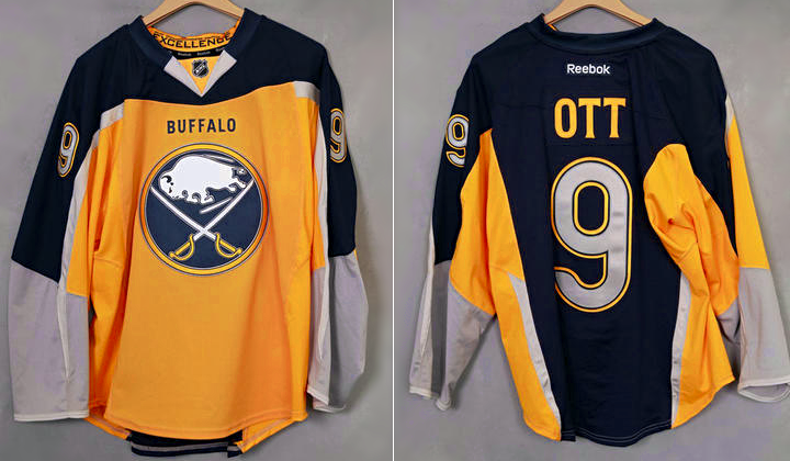 Photos from Buffalo Sabres
Official photos posted to Sabres' website
A theory that emerged earlier today was that the Sabres were just messing everyone on Twitter. That somehow the photos of Ott didn't show the real jersey. I think we can put that rumor to bed with the fact that the Sabres splashed it all over the main page of their official website today. There was a small photo gallery too.
 Screen shot of Sabres' official website
Sorry to have to bum out the naysayers even more, but I'm afraid this little number is the real deal.

Reader Comments (122)
Am I losing my mind or is the yellow two distinctly different shades between the front panel and the sides/underarms.
Just... what? The hell?
A Superman cape... hahahaha. Love the way Ott played this though.
As a Sabres fan I was hoping for something better, but I don't mind these
As much as I appreciate the "outside the box" thinking on this jersey, it doesn't look good. At least my Twitter feed was very entertaining this morning. Thanks, man!
Not a fan of these. Too much going on, even for an alternate jersey. Had they kept the yellow one color instead of going with two shades of it, I might actually hate these a little less.
I know I'm one of about ten people on the planet who likes "outside the box" jerseys (Thrashers red third, Isles black third, etc.) but I like it. It's different, but not too crazy. The only thing I really find off is the number of colors. With the yellow (gold/whatever), blue, gray, and white, it just seems confusing. If the gray on the cuffs had been replaced with blue, I think it would look a lot better. That being said, I'm a fan!
I'm with Mike B. I don't mind them and they stepped out of the box completely. I am happy to see they do not have shoulder patches because I think that would be a very busy jersey with the different colors from the front and back.
But what do I know... I still liked the Buffaslug idea. I thought that was a very unique branding for the time.
Everything about this has been such a debacle, and all for this mess of a jersey. I hope this whole thing is just a terrible PR stunt and these aren't the real jerseys.
Had high hopes...oh well
Wow, where to start? The word "Buffalo" is completely unnecessary, and what's with the grey strips? Is that reflective tape so cars can see you at night when your playing street hockey? The back side doesn't look so bad, but that front, WTF.
I'm hoping that this jersey is part of the joke too. I can't think of a single good comment about it. There's the weird white arm stripes that stop abruptly at the chest panel (I agree with Bill, it looks like a darker yellow). There's the weird grey on the sleeves and numbers. There's the terrible mismatched front and back and the arched section on the triceps where the two colors meet/clash. Everything about this is terrible except for the fact that it uses the main logo on the chest. What are the two white vertical stripes on the back sides?
Let's just cross our fingers and hope this is all part of the act.
I love the jersey it is unique, for a third to try different things that is awesome. I love the silver numbers and the front and back being different colors. only thing I would change is keeping the sleeves all yellow, beyond that can't wait to get one
Needs a new word to describe it : UGLAWFULL
Oof, only thing worse is those terrible Lightning jerseys with waves and yellow lightning bolts on the sleeves.
Ugliest jersey I've ever seen. Even european sweaters with 157989345796 adds are nicer than this piece of crap...
Bill and everyone else who commented on the apparent two shades of yellow while I was originally composing this comment, it's the difference in the side-panel material from the front body and sleeves. The same thing happens with other teams if you know where to look, both with the Edge uniforms and Nike's new NFL uniforms - it's all because of a combination of different materials.
If you take the Buffalo elements off it and put the Predators' logo on the front, it would have fit in much better with Nashville's old Edge set (or even their pre-Edge jerseys). As a Sabres jersey, though, it looks much worse that the Slug jerseys.
The one thing that pisses me off the most, though, is the "BUFFALO" above the crest. It's completely unneccessary because the logo already incorporates the "Buffalo" element. It's one of the reasons I've always liked the classic logo - it literally reads as "Buffalo Sabres". As a result of the added wordmark, though, this jersey's front reads "Buffalo Buffalo Sabres".
I kind of feel like we're all being trolled. I mean, the cheesy manner in which they unveiled these, and the fact that they're so different from ANYTHING ever done before, not to mention being hideous... I wouldn't be entirely surprised to see them come out with something a bit more formally that looks classier than this. At least we can HOPE! I just hope they don't wear these when my Sharks visit Buffalo. I really don't want to have to watch these flying back and forth on my TV.
So I was pretty much 100% spot on with my super long post last week on what the jersey would look like, minus the full blue back with I wasn't too sure if it was going to happen or not.
Now that it's finally been revealed, my first impression of course was "this is terrible." But then, it's just because it's so different than the standard and different is always awkward at first glance. Is it weird that the longer I look at it, it doesn't quite seem so bad? The dual yellows on the front definitely bothers me, but it cooould just be the lighting since the Predators pulled it off with no issues. As for the different colors from front to back, I mean, it was a ballsy move to say the least and I commend them for going really different on this one.
Yes it might look a little odd on the ice though, superman cape as mentioned before, but that has yet to be seen. The main thing though is that I just can't say I hate it as much as I would think which is a little scary. And most importantly, the jersey isn't a lazy attempt to switch a couple of colors around and make a sale; they really went all out with this one. As an Islanders fan, I actually hate our third much more than this one in that it seems like no effort was made in putting it together to make it either unique, beautiful, or even odd; it's just boring, uninspired, and with no connection to the team (diamond pattern joining the jersey to the shorts? Why?).
So...congratulations Buffalo??
oh dear. that really was NOT worth the very long wait!!! the grey ends of the sleeve, why?? in fact the whole design is just plain bad, i cant think of one single positive thing to say about it......t
Yes, it is an alternate. As a Buffalonian, I'm buying the jersey regardless. (Own every jersey but 2.) An I think all was done right except one thing. I don't like that the back is blue. Had it been yellow, bingo. My number one peeve about alternates is that they are the same color as the home. Islanders shoulda been orange, this should have been full yellow on the base with blue/silver shoulders/arms. Other than that, I don't mind branching to the "Buffalo" under the collar, heck, I like the numbers on the front of the home and aways. As for the 2 shades of yellow, I'm thinking it's just the lighting.
I like the back, but not the front. I have a feeling that these are going to look terrible on the ice, but give the Sabres credit for doing something completely out of left field.
Its a joke, right?
These are pretty good warm up or practice jerseys. The Sabres fan in me can't hate them but I also can't love them blindly. Either way you look at it, you can honestly say there isn't another jersey like it in the NHL currently so that's a positive.
I'll stick to wearing my navy home or whenever I decide to buy the road white over this third.
Superman cape is EXACTLY what I thought when I saw it but I think the word Buffalo is the worst.
Wow. And I'm not saying that in a good way.
When I first saw the front I thought they were doing some kind of weird, Man of Steel kind of twisting of a normal jersey, what with the solid blue shoulders and down the sleeves, and the weird collar triangles that stand out. Then I scrolled down and saw that there was almost a literal cape on the back. At least it wasn't red I guess. I should say, though, that I didn't care for the Sharks' redesign either, so I'm not a big fan of the solid shoulder/collar colour in many cases.
One of the worst jerseys to ever hit the ice (potentially).... There can't be a way THAT is the real third jersey.... I really hope this is a huge prank and they will unveil something presentable in the weeks to come.
If that is real, is Buffalo trying to say F you to their fans... That thing is horrid.
Like Pee-wee house league bad.
You know what.... sans the grey wrists... I like it. I don't get the grey. The blue and yellow should've gone all the way to the end of the sleeve... but meh...
Kinda looks like they're wearing a cape, tho, huh? First we have apron's. Now cape's. Nice.
But i like it. I like the font of the number on the back, although it does look big. If a two digit number goes on there, I hope it stays within the blue and not overlap the yellow. I like the font used on the lettering in the back. It does look like two shades of yellow on the front and side panels though, but still not a deal breaker. For a third jersey- I like it. Glad they kept the logo.
Not as good as what they have as their 3rd before, but that jersey (as good as it was) didn't really difffer a whole lot from their regular jersey's. This is just completely different, definatley outside the box. I'm a fan.
I traveled through New Zealand about 20 years ago, and at the time, you could go directly to the company that made all the rugby jersey's to buy direct and get something unique.... One of the kits they sold was called an 'ugly' and it was a jersey that was stitched together with left over pieces; a blue back, red and white striped front, yellow right under arm, left cuff might be purple......you get the idea. No two jerseys where the same......this thing reminds me of my old ugly. No continuity or pattern that makes any kind of sense? Sorry Sabres, for all the hype, you just got schooled by the Wild.....
And here I thought being a Sabres fan couldn't possibly get worse this year. I stand corrected. It's almost as if they're playing a joke on us. These don't have a single redeeming quality.
The number font is a joke… the name and the number are gigantic (OTT and 9 are the smallest combo we have… when GRIGORENKO and 25 have to go on there, is it even possible that it fits?)… the gray sleeves and gray numbers (!) are gross… what were they thinking with the line that goes from the armpit down the arm? It looks like masking tape someone forgot to take off… it might just be the lighting, but it would appear that the front yellow doesn’t match the arm/side panel yellow. The stupid white “v” on the collar that looks like an homage to a bowtie or something. Shockingly and impossibly, the front yellow/back blue is almost the least offensive thing about it. and it still kind of sucks.
And they look like they're wearing capes.
Seriously? What a joke of a sweater. What idiot thought this design up, what idiot liked it, and what idiot approved it??????? Terrible. The Sabres messed up their uniforms for years and recently went back to the basics and got it right. Now they pull this crap?! Disgusted. The NHL needs to follow suit with the NFL and get rid of Reebok and give the equipment contract to Nike.
I like this. It's about time someone brought some colour back to the NHL. I actually like that the front and back are different colours, as long as every other team doesn't start doing the same. I'm very happy there's no black on it. This and the new Wild jerseys are the only ones unvieled this summer worth buying. If I can find a Canadian made Edge 2.0 version of this I'll buy it. This is a very unique jersey.
I do agree that the word "Buffalo" above the crest looks wrong and the number on the back looks a little strange. It's hard to judge back numbers when the player isn't wearing shouler pads though. I'm glad there's no number on the front, I hope NHL teams move away from that trend.
The best thing I can think to say is that they somehow managed to not give it away at all from the "teasers"... Totally didn't see this coming
Hey, I think I was closest! And seeing the jersey, that's certainly not something to be proud of...
I don't mind the front of the jersey at all. In fact, I think the front looks great. The back...ummm...ewww. There is absolutely no way they will be able to wear this jersey against the Predators.
I might be the closest. However, I don't think anybody got the silver numbers.
So, it's been about three hours since the jersey was "leaked"..no statement from the team, and nothing on the website as of this moment. Compare that to the websites of the Wild and the Sharks-there's a fancy splash page, behind-the-scenes videos, etc. So either the Sabres were caught off guard, or this is a joke
I think we've all been trolled, but we'll see
Embarrassing. It's worse than I thought it would be, and I was expecting it to be pretty bad from the first teaser.
I will be referring to this jersey as "The Blue Mullet", as this is the best representation of the ridiculousness I am seeing.
If the blue had only been on the sleeves, and the back was all gold, it would've been tolerable.
This is just hideous. It will be physically straining on the eyes to watch this on the ice.
Man I love Sabres uniforms. As bad as the Buffaslug logo was, that jersey design would have been fantastic as a third, and so is this. It's completely different while still looking like a Buffalo jersey, and since it doesn't seem clear to everyone, the reflective shiny silver stripes are supposed to represent sabres (because this isn't the Buffalo Buffaloes, remember?). 5/5, since it's a third and not a regular.
I just made a rough mock-up replacing the Sabres' logo and wordmark with the Predators', and...

It's definitely more of a Preds jersey.
I wonder what the matching pajama bottoms look like, those look comfy
I am man enough to admit that my comments on previous posts (e.g., they won't be two-tone) were wrong, very wrong. I did not have it right at all. This is far worse than I could have imagined.
gross, just plain gross. like ive said before on other posts, it looked eerily similar to a predators jersey in the teaser pics. buffalo = fail. this makes the infamous "slug" jerseys look good.
I hate rounded numbers - the Sabres fonts are one of the best parts of the current home and road jerseys and they totally ditched that here. I always wondered how a meeting occurred where someone approved the slugs, and now I have to wonder the same thing here. It's like the whole front office went on a bender and threw blue and gold paint at a wall.
Jesus! This jersey is bloody horrible. And rightfully so, it's being widely criticized and disliked. I can only hope a jersey this horrible will be scrapped after one season, but that dam ugly Islanders third jersey is still around, so who knows. This is a waste of a third jersey, they've could've done miles better than this WTF. Disappointment!!!!
Let's just call this the "Casual Friday Jersey". Its kinda like when you go to the store in a really nice pair of pj's at 2 in the morning.
@Rob S
Oh I know why the yellows are different shades, but if they couldn't mix materials in a way that was a
littlelot more seamless, they should've at least had a design element (stripe, whatever) separating the two so the transition between the side and chest material was less... I dunno, horrifyingly clashy? It's awful.First time poster. Hi. This belongs in Freak Out Friday. This borderline requires UN intervention.