Entries from July 11, 2010 - July 17, 2010

Friday
Jul162010

New Pens Sweater Coming in Fall

The Pittsburgh Penguins will unveil their 2011 Winter Classic sweater early this fall, according to newspaper reports in Pittsburgh. And after its New Year's debut, expect it to replace the powder blue third jersey.

Yesterday, the Tribune-Review and Post-Gazette offered up a few tantalizing details regarding the outdoor game which the Pens will host at Heinz Field on January 1. Let's take a look at what they've got.

Rob Rossi of the Tribune-Review writes the following:

More details about the 2011 NHL Winter Classic at Heinz Field — including ticket information — will be unveiled at a news conference tentatively planned for the final week of this month.

President David Morehouse reiterated that the Penguins will debut a new alternate uniform at the Winter Classic but said details would not be made public until the fall. This uniform will replace the baby-blue look the Penguins wore at the 2008 Classic and for a handful of games the past two seasons.

It's only a guess, but the league may use this opportunity to officially reveal the new Winter Classic logo — which we got a sneak peek at the day the season schedule was released. One detail not expressed here is whether the new WC sweater will take over third jersey duties in 2011 right after the outdoor game, or be pushed to the 2011-12 season.

The Post-Gazette's Dave Molinari may have gotten an answer to that question:

"The new jersey we unveil will be specially designed for the Winter Classic," said Tom McMillan, the team's vice president of communications. "That's become a Winter Classic tradition."

... "It could become the third jersey in the future," McMillan said.

In other words, nothing is set in stone right now. It all depends on fan response. Molinari also confirmed with the team that the powder blues will be worn for "about 10 regular-season games" in the 2010-11 season.

As expected, neither report has any details on the design, but fans have started a number of rumors. The tradition that McMillan spoke of is all about teams digging into their history for a classic look. For the Pens, they have a decent variety to work with.

Rumors suggest these are the Penguins' Winter Classic jersey options

Their history, as showcased by the Hockey Uniform Database, reveals a number of possible sweater designs. The dark blue jerseys, worn from 1977 to 1980 have been rumored as have the black/yellow sweaters used between 1980 and 1992. (Both above.)

Which do you prefer? Drop a line in the comments.

Thursday
Jul152010

Going to the Next Level


Those who have been avid readers of Icethetics from the beginning — I'm talking back in the NHLToL days — will no doubt recognize the logos above, and just as equally the unusual cyber-moniker of the artist that created them. GhettoFarmBoy, known in the real world as Matt Kauzlarich, partnered up with NHLToL to showcase some of the best concept art that has ever graced these pages.

“It was undoubtedly the most popular concept art series Icethetics has ever hosted.”He launched a series we called Rebranding the NHL, in which he would redesign the logos and uniforms of teams he felt were in need of a new look. It was undoubtedly the most popular concept art series Icethetics has ever hosted.

It all began in August 2007 when I posted Matt's Thrashers concept on NHLToL. It continued that week with the Islanders, Senators and Bruins. Before long, readers were begging for more. Matt rebranded the Ducks, Devils, Sharks, Capitals and Panthers before we officially joined forces in May 2008.

Under the partnership, all of Matt's new rebrands would make their world premiere here. His Lightning rebrand was first out of the gate. In the next few months, he also reworked the Sabres and, finally, the Stars on August 6, 2008. The year flew by but it was one of the most memorable for NHLToL/Icethetics readers.

Unfortunately, the blockbuster partnership was short-lived as Matt's work was getting noticed. Despite starting work on a highly-anticipated St. Louis Blues rebrand, Matt has never gotten around to finishing it. But that's because he's been busy selling his talents to pro teams — right where they belong.

I'm disappointed to say that I have not had much contact with him in the last two years, but by chance the other day I came across his portfolio. I was thrilled to discover that he was the artist behind what I consider one of the best-looking teams in minor pro hockey.

Last summer, when the Quad City Mallards unveiled their new logos and uniforms, I marveled at the artist's ability to make a mallard duck look intimidating. No other IHL team looked this good. Quietly, though, I was struck by how familiar the new look seemed, as though I'd somehow seen it before. It must've been my subconscious connecting the dots. The design has Matt's fingerprints all over it.

You know, it seems the only logo-related news on the blog lately has dealt with the dark side of logo design — infringement. It's refreshing to be able to share a success story with you guys — an Icethetics concept artist who's gone on to much bigger and much better things.

I'd love to be able to offer details of Matt's sports design journey in his own words, but sadly he has yet to reply to my emails. Busy guy, I'm sure. Hopefully we'll hear from him soon. And maybe even one day we'll satisfy that Blues rebrand curiosity.

Monday
Jul122010

A History of Logo Larceny

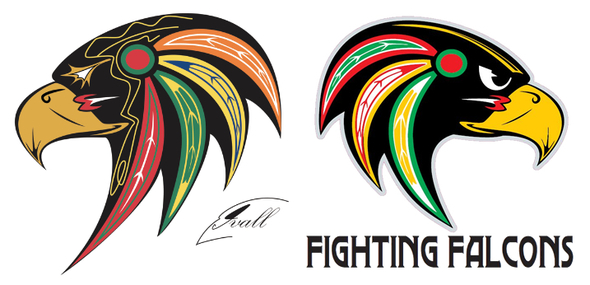
Take a good look. On the left is a logo created by Mike Ivall and first posted to the Icethetics blog on July 8, 2008. It has a habit of stirring up controversy in the form of infringement because, on right is the new logo of the NAHL's Port Huron Fighting Falcons, who will have an unveiling event for it on Wednesday.

There is no question where this Fighting Falcons logo came from. Too many distinct elements just copied outright without much else altered. What is perhaps most disturbing is that this team isn't even bothering to credit the logo's original creator and, in fact, crediting someone else entirely. Someone named Larry Smith of Tag Sports Graphics gets the nod on the team's website.

Mike tells me he emailed the team over the weekend and is waiting to hear back. I also have an email into the them seeking comment on the situation. I'll let you know if they reply.

This isn't the first time Mike's logo has been used without his permission. Most recently, he worked out a deal with the Maplesoft Hawks, a AAA organization based in Ottawa, had been using his exact logo on team merchandise.

However, a rather shady company called Chi-City Tees, presumably based in Chicago, is selling t-shirts featuring Mike's design — without his permission. They list no physical address on their website. Another company called MNM Hockey, is using a slightly altered version of the logo to promote its site. To my knowledge, neither organization has worked out a deal with Mike.

That just makes them thieves.