Top 13 Concepts of 2013
After the Blog, the Concepts page has always been a favorite of Icethetics readers. It's updated daily with fresh concept art designed and sent in by fellow readers with a knack for the artistic. And at the end of the year I like to take a look back at the highest-rated designs.
13 ∙ Team Germany by Bastian Schmülling
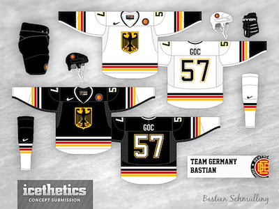 If there was a list of the top rookie concept artists of the year, Bastian Schmülling would certainly be among the leaders.
His consistently solid work impressed many in 2013. But it was a design for his home country's national team, posted April 28, that earns him kudos on this list.
Now if only Germany had qualified for the upcoming 2014 Winter Olympics in Sochi.
Keep an eye out for more of Bastian's work later in this countdown to the top concept of the year.
12 ∙ All-Stars in Anaheim by Matt McElroy
 If you consider the IceHL Project to be Icethetics' premier concept design contest, then Matt McElroy was easily the breakout star. He was responsible for designing the winning visual identities for five teams over the summer.
But on July 23, we got a look at his take on what would be Anaheim's first shot at hosting the NHL All-Star Game. Of course, we now know Columbus will take on those duties in 2015.
Matt's excellent design is definitely in the same league with other NHL All-Star logos we've seen in recent years. And voters recognized his talent with their ratings.
11 ∙ Senator Stripes by Nevill Carney
 In a season where the Ottawa Senators will participate in the NHL Heritage Classic, we got a look at a stripe-filled concept from Nevill Carney on Nov. 28.
In fact, Nevill originally submitted this design back in October 2011, so it took two years for him to get his proper due. (Sometimes my inbox gets backed up.)
He actually created these jerseys as companions to the black Heritage Jersey the Sens had just released at the time.
In the email, he wrote, "Hopefully, they can find a home on Icethetics at some point."
Sorry to him — and to you guys — for taking so long to get them posted.
10 ∙ Toronto Throwback by Victor You
 Cracking the top 10 is Victor You with a well-received retro uniform set for the Toronto Maple Leafs on May 14.
Maybe it was the extra dark shade of blue. Maybe it was the updated to a classic crest. Whatever the reason, Icethetics readers loved this one!
Neonix called it a "wonderful piece of art." Etrusken Raider asked, "when will this be on the ice?" And Simon wrote, "my god, this is perfect."
High praise well-earned on this one.
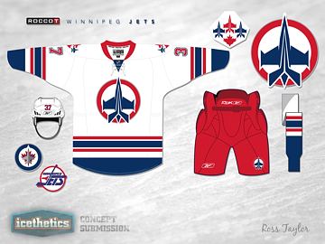
9 ∙ Winnipeg Throwback by Bastian Schmülling
 Back-to-back throwbacks mark this point of the countdown thanks to the efforts of the talented Bastian Schmülling.
On Aug. 22, he helped us imagine a great third jersey for the Winnipeg Jets. He matched the striping and number style of the existing uniforms, but wowed us with a classic crest and colors.
"Absolutely perfect," said DanC. "This one gets 6 stars out of 5," added Kevin Y.
By the way, I can't imagine it'll be too much longer before the Jets introduce us to a real third jersey.
8 ∙ Ohio Pride by Avi Stein
 Avi Stein felt like the Columbus Blue Jackets should do more to promote themselves as "Ohio's team" so he came up with this simple alternate jersey idea.
He called it Ohio Pride and it went over huge with readers!
"Why isn't this already their regular white jersey?" asked jonathanc. "These are amazing," added d'sA. "The new best I've seen on this site."
Some readers were also keen to point out out the Ohio-shaped captain's patch — a great callback to the Cleveland Barons.
7 ∙ Heritage in Vancouver by Ryan Haslett
 The highly-anticipated 2014 NHL Heritage Classic — being hosted in Vancouver's B.C. Place — was the subject of one of the best concepts of the year.
Coming in seventh in 2013 was Ryan Haslett's take on Canada's only outdoor NHL game of the season.
It was the middle of summer (Aug. 17) so it was pretty hard to think about outdoor ice hockey, but we found a way.
Ryan reimagined the opposing teams in more modern colors — the Canucks in blue and the Senators in a cleaner white. Though he did manage to keep the overall feel of the game we'll be seeing this March.
6 ∙ Fixing the Flames by Laurent Elbaz
 Not long after the Calgary Flames debuted their new third jersey, we were reminded by Laurent Elbaz of what they were leaving behind.
His retro-inspired Calgary sweaters were among reader favorites in 2013. He also included a third jersey design that was strikingly similar to the Flames' new look — a design he came up with long before the leak revealed the design.
Of course, the black-free set is what got voters excited on Oct. 22. Shawn V said, "Love this. It's a perfect renewal of old style, making it worthy of a new team. Ken King needs to see this, in all seriousness. Well done!"
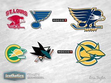
5 ∙ Retro Blues by Tristan Mani
 In 2010, Icethetics readers voted the St. Louis Blues' logo the best in the NHL. So it's not surprising to see a classic jersey design featuring the Blue Note rounding out our top 5 concepts of the year.
Tristan Mani's simple yet stunning design garnered major acclaim from his fellow readers on Nov. 6.
Ryan M may have summed it up perfectly with the first comment on the post. "Where can I buy one!!!!!"
The design even broke down barriers. Joe wrote, "Love it! Not a Blues fan at all... but this sweater is great!"
Not to spoil anything, but don't bet on this being the last time we see Tristan in this countdown!
4 ∙ Minnesota's Winter Classic by Matt Madore
 You may know Matt Madore as the designer of the IceHL's Milwaukee Lagers jersey — the only IceHL jersey that actually exists in the real world!
In fact, Matt also joins our 2013 concept countdown at number four with his idea for an NHL Winter Classic matchup hosted in Minnesota in 2016.
He not only designed jerseys for the Wild and their proposed opponent — the Blues — but also included a unique logo for the game. Click on the graphic to the left to see the full post.
The Dec. 7 concept also marks the debut of Matt McElroy's IceBorn jersey template in our countdown. Mr. Madore put it to great use here. And readers agreed.
"Both of those are absolutely fantastic," Tyler wrote. "Especially the Blues."
"That Blues jersey is absolutely perfect," said Kris K, "and I wouldn't mind it if they wore this full time!"
Take note of how the Blues seem to be taking over as we inch toward the top.
3 ∙ The Red Blue Jackets by Matt Madore
 Look who's got back-to-back entries in the countdown! Matt Madore takes the third spot and it all started with an outside-the-box proposal for the Columbus Blue Jackets on Nov. 26.
As the title suggests, this concept post started with an unusual red jersey for a team with "blue" in its name. And while that design was well-received on its own, the numbers soared when Matt brought the blue with a revised design later in the day.
Icethetics readers loved this one!
"Matt Madore, bravo!" cheered Henry Stebbins. "This is a wonderful set. I hope this finds its way on to someone's desk in Columbus."
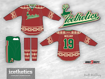
2 ∙ Christmas Sweater Redux by Matt McElroy
 Readers felt a bit of deja vu this past Christmas Eve as the Concepts page played host to another holiday sweater by Matt McElroy.
And you might be feeling it again as it enters our countdown as the second most popular concept design of the year. (Matt's 2012 holiday sweater was seventh in last year's countdown.)
Apparently you guys really love a good holiday sweater. Who knew? But after two years in a row, will Matt do another for 2014? And will he be able to top himself?
He's got 354 days to figure it out.
As for now, it's time to reveal the top concept design of the entire year...
1 ∙ Retro Blues (revised) by Tristan Mani
 The last stop in our countdown brings us to a familiar place. Remember Tristan Mani's retro St. Louis Blues concept back at number five? Apparently, you loved his encore even more!
The highest-rated concept of 2013 was the white version of Tristan's Blues jersey from Nov. 6. As a matter of fact, it's the only design on the entire site that still averages a full five stars after almost 700 votes! That's unheard of!
Big Jim Sports wrote, "I don't know about anyone else, but I tweeted the Blues directly about this concept. You deserve to have them see this. THIS is what the blues should be wearing. These are gorgeous. Amazing work!"
The praise was well-deserved. Congratulations Tristan on having some of the best concepts of 2013!
Who will be on this list at the end of 2014? Stay tuned to the Concepts page all year long.
 Chris
Chris
The top Freak Out Fridays of 2013
In the comments, a couple of you asked specifically about the top Freak Out Friday posts of 2013. I thought that might be interesting as well, so here they are.

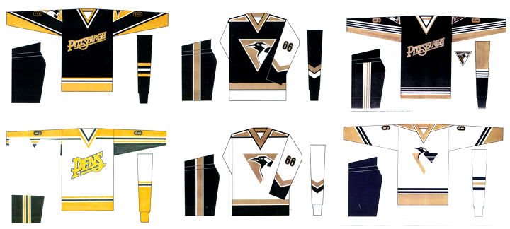
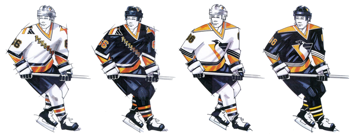
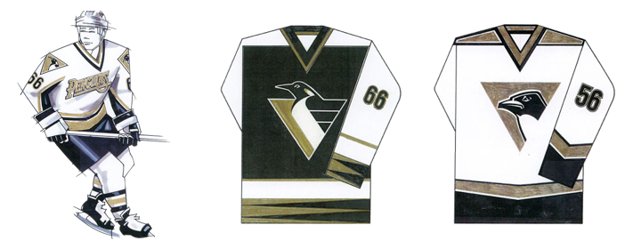
I was surprised and honored to discover that something I put on paper more than 15 years ago was so highly rated. So thanks for that.
If you'd like to go back and revisit the original posts, the links follow. The highest-rated Freak Out of 2013 was Florida Fauxback Freak Out by Nick Burton. The runner-up was Pennsylvania Freak Out by John Elbertson. Next was my personal Freak Out Flashback post. And rounding out the group was the update to Freaky Florida Cats by Antonio Calisto.
Funny to see two Panthers concepts finish at the top of the Freak Out list, by the way.