Entries in pittsburgh penguins (28)

Wednesday
Jan082014

Loose Threads: Alternates & Adidas

It's not quite time for the first JerseyWatch 2014 yet, so consider this a warm-up.

Penguins pondering another retro third jersey

The Pittsburgh Penguins are considering a new third jersey for next season, according to the Pittsburgh Tribune-Review. And it could make a lot of fans' dreams come true. (I'm thinking of one regular reader in particular. He knows who he is.)

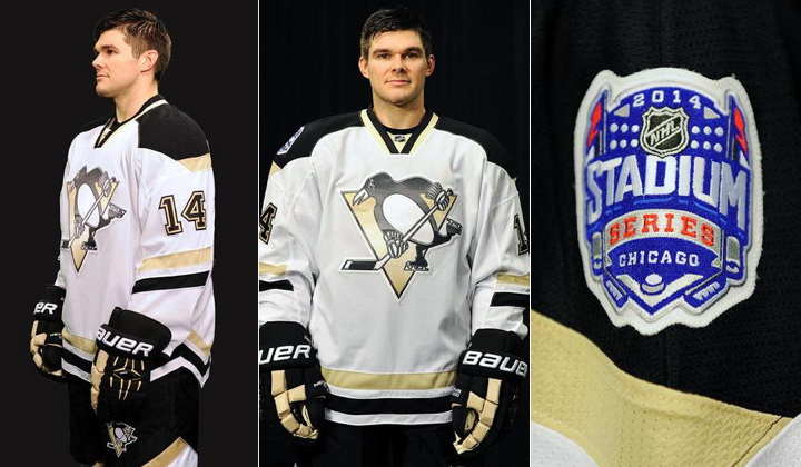
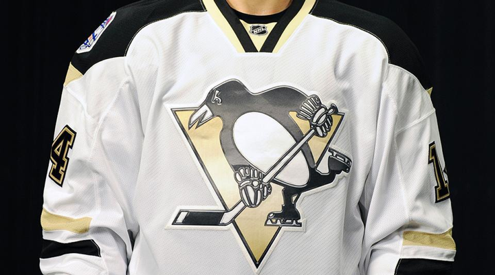
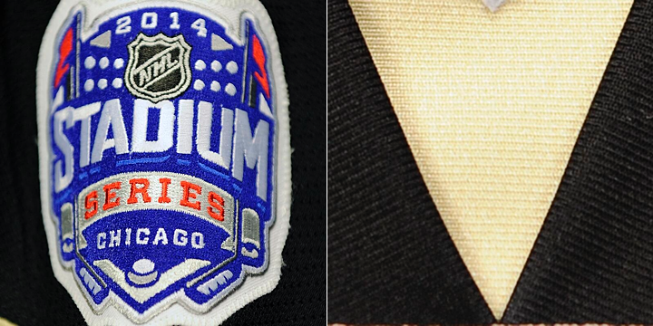
The only details came by way of an article published on Dec. 13, the day the Pens unveiled their Stadium Series jersey, which the article confirmed will only be worn once.

There are tentative plans for a new alternate jersey that could debut next season. A design is not finalized, but under consideration is a jersey similar to the ones the Penguins wore during their 1991 and 1992 Stanley Cup runs.

Who's excited?

If they're smart, they'll move forward with these plans. Such a jersey would probably sell well, especially among Icethetics readers. But don't take my word for it. Check out the rating for the Penguins concept I posted yesterday.

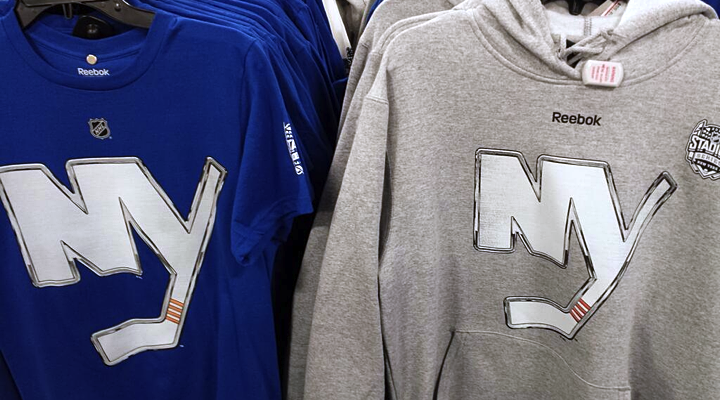
Islanders' Stadium Series look may endure

While the Pens are ditching their Stadium Series jerseys after their big game, the New York Islanders are going in the opposite direction. Isles beat writer Chris Botta tweeted last week that we're certain to see at least the new crest sticking around.

That NY look on the Islanders' stadium jersey? Yeah, it's confirmed that you'll be seeing more of it in coming seasons.

He followed up with a few details.

Expectation is that the NY crest jersey, or something very close to it, will be the Islanders' 3rd jersey by 2015.

This effectively means the black third everyone loves to hate is on the way out. Perhaps only one more season of it — if that. Maybe the Isles will surprise us and have the new sweater ready by the fall. But it's more likely they'll wait and launch it with their move to Brooklyn.

By the way, check out their current Twitter profile image.

Ducks may promote third jersey, add white road version

If you don't follow me on Twitter, you may have missed this nugget. Orange County Register writer Eric Stephens says the Anaheim Ducks may have new home and road sweaters next fall.

This was his tweet back on Dec. 3:

Plan is for current Ducks third jersey to become main home sweater, perhaps next year. I figure next alternate will be orange-based.

No more wordmark! Wahoo!

Stephens doesn't specifically say there would be a white version added as a road jersey, but it makes sense the team would want matching sweaters.

That news followed the unveiling of the Ducks' Stadium Series jersey. It would be simple enough for that to become the new third — though it may not be popular enough among fans. But I've seen mixed reviews from Icethetics readers. You've got those that love it, hate it and are indifferent to it — in seemingly equal parts.

If the Ducks were to follow in the footsteps of the Penguins, what would you think of an orange Mighty Ducks jersey? Again, I'll point you to the Concepts page to see any number of ways that could work successfully.

Adidas may replace Reebok jersey branding

In the world of hockey jerseys, the word Reebok has become synonymous with repulsive to many. But that's not why parent company Adidas may soon swap out the name seen on the back of every NHL sweater.

CBC's Elliotte Friedman included an interesting tidbit in his 30 Thoughts article posted Monday. Specifically, he wrote:

Small business item: Reebok has the rights to make NHL jerseys. Its parent company, Adidas, apparently is considering putting its own name there instead of Reebok. As part of that, we may see an extension of the current contract, which runs through 2016-17.

This isn't totally unexpected. Adidas has been trying to reposition the Reebok brand back to its focus on runners — like it has been historically. From their mission statement:

At Reebok, our innovation focus is on fitness and training, where the priority is creating products that provide a material benefit to the consumer's fitness activities (e.g. flexibility or lightweight).

Hat tip to Matt Johnson for the link.

That said, I would've expected to see Adidas reposition CCM as the big name in hockey — as it has been historically. Plus, this is a brand that still has a very good reputation among folks who appreciate (and buy) hockey jerseys.

Then again, Adidas is a bigger name with better brand recognition — even if people like me associate them solely with soccer. Regardless of any branding changes, I would not expect the Edge uniform system to be replaced anytime soon.

Lots of news here tonight. Take your time digesting it all. I'm taking a long weekend in California!

Friday
Dec132013

Penguins Unveil Stadium Sweater

Jersey utilizes same template as others from Stadium Series

Just as they promised, the Pittsburgh Penguins unveiled their 2014 Stadium Series jersey this afternoon. Compared with the other Stadium sweaters we've seen so far, this one is the most similar to its team's existing uniform set.

No alternate colors. No alternate logos. Just more of the same. Only slightly different.

Photos from Pittsburgh Penguins

I will say I like the black and Vegas gold better as distinct stripes than as amorphous splotches across the sweater. So I'll give them points for that. And I won't take away points for the similarities to the other Stadium Series jerseys. Reebok wants a template. Reebok gets a template. Hard to fight that battle.

But at least we got another new collar design. No laces for the Pens.

Photo from Pittsburgh Penguins

Where I will take away points is that crest. Combine the silly chrome Photoshop effect with the screen printing process and all you can do is shake your head. At no point should professional hockey players be wearing anything screen printed on their sweaters. And I think that's just a universal law.

Here's a look at the back from a few different angles.

Video stills from Pittsburgh Penguins (composite)

I haven't seen a really great shot of the pants and socks yet, but what we have seen suggests it won't be a big deparature from what the Islanders, Kings and Ducks are doing.

The Penguins visit the Chicago to play their third outdoor game on March 1 at Soldier Field. By the way, we're still waiting to hear when the Blackhawks will show us their Stadium look. (No way they'd share the spotlight with Pittsburgh.)

So what do you think of the newest Penguins jersey? And what do you expect from the Hawks?

Wednesday
Dec112013

Penguins Tease Stadium Jersey

Photos from Pittsburgh Penguins (via Twitter)

Friday will bring Pens' third outdoor jersey in five years

The Pittsburgh Penguins hopped on the jersey teaser bandwagon today — seems like they've been coming nonstop from around the league since last spring. The Pens offered up a pair of photos today that, frankly, don't tell us very much.

The team will travel to Chicago after the Olympics to face the Blackhawks at Soldier Field. It'll be the Pens' third outdoor appearance since the NHL started making a habit out of it in 2008. Earlier today, the Penguins announced they will unveil their 2014 Stadium Series jersey on Friday at 2 PM ET.

No word yet on whether the Blackhawks will join them.

The Pens followed up their Twitter announcement with a sneak peek of the jersey — if you can call it that. We got a close-up of the Stadium Series shoulder patch (above, left). Then a few hours later came a second teaser photo. It showed a gold triangle over a swatch of black.

I'll be honest. I have absolutely no idea what we're looking at there. There is a small white triangle at the top of that photo, which could be a patch. But is it on the shoulder? There's something going on at the bottom edge of the photo. Maybe a sleeve number?

What do you see in these photos? Share your theories below!

Tuesday
Nov192013

What's in Store for the Stadium Series?

New event merchandise could be full of clues

I rarely get the opportunity for a good headline pun. Tonight we're taking a look at some new NHL Stadium Series T-shirts that are now showing up in stores. The designs could be offering some insight into what the forthcoming jerseys will look like.

We'll dive in with the New York Rangers first.

Photos from ebay (o_sports_gear)

A few things to note. First, the shirt is white. We'll see that's not the case with all of them and there's reason to believe they may suggest the colors of each team's Stadium Series jersey. For one thing, a source tells me the Rangers' jersey is, in fact, white.

It makes sense as the Rangers will be the designated "road team" for both of their Yankee Stadium games against the Islanders and Devils. Speaking of the Devils... (On a roll with these awful puns!)

Photo by @TheJerseyNYRFan (via Twitter)

A photo posted to Twitter by @TheJerseyNYRFan on Monday shows the back of the New Jersey Devils shirt. It's red with white numbers.

The tweeter also pointed out the coloring of the Devils' chrome Stadium Series logo on the "Cross River Rivals" tee seen in the middle. There's no green in sight. But it's likely that has more to do with the production costs associated with the number of colors used in the screen printing process.

Back to the Rangers for a moment.  The number treatment seen on these shirts is unlike anything the team has used before. The grey/silver evokes the design used on the Lady Liberty jerseys from back in the late '90s. But those numbers used red for the shadow rather than a thin outline.

Photo by Jessica D'Agata (@ayojess via Twitter)

This blue New York Islanders tee seems to confirm the idea that the shirts match the jersey colors. But look closely and you'll see this chrome Isles logo doesn't quite match the one released last week. The one on the shirt has rounded corners and an angled corner at the top of the Y.

To sum up, these are the colors and logos that will be representing these teams in January.

As far as jersey crests, I think it's accurate only for the Devils and Islanders. It sounds like the Rangers will, as usual, go with a wordmark across their chests and the shield will be used on the shoulders. Whether the crests will make use of this chrome-treated effect is anyone's guess. But I hope not.

Let's switch gears now to the Soldier Field game in Chicago.

Photos from ebay (o_sports_gear)

The Chicago Blackhawks have red Stadium Series T-shirts. As the home team, this makes sense. But the noteworthy element of these photos is the elongated number design. It's the standard Blackhawks font, but it's stretched out.

If you look back at the Rangers' shirts you'll notice the same thing. It's just more pronounced here.

The elongated design is very noticeable on the Pittsburgh Penguins shirts. Their jersey numbers are usually rather wide. Definitely not the case here. So could these number redesigns be an element of the "futuristic" jerseys we've heard about?

Based on the colors and crests, it doesn't appear things will look too different for Chicago's Stadium Series game. Here are the colors and crests based on what we've seen so far.

That leaves us with the California game at Dodger Stadium.

Just today, a new T-shirt showed up for the Los Angeles Kings with another new logo.

Photo from TEAM LA Store

The TEAM LA Store started selling this, described as a "ligature logo T-shirt." A ligature is basically a couple of letters joined together to create a unique letterform. It's the letters from the Kings' primary logo — which is also featured on the tee. However, it is not the same as the chrome logo unveiled last week. So that's nice and confusing.

What will be on the front of the Kings' Stadium Series sweater? Your guess is as good as mine, but I doubt it's this ligature. This shirt is different from the previous ones seen in this post. The others have the NHL shield in place of the Reebok logo near the neck — and apart from that and the chrome logo, there's nothing else on the front of them.

In other words, this shirt doesn't seem to be part of the same series as the others.

As for the Anaheim Ducks, I haven't seen a shirt yet. All I know is the jersey will be orange. That's according to a tweet by Ducks PR guy Adam Brady. This means the L.A.-based outdoor game may feature orange versus black. We already know the 2014 Winter Classic will see red versus blue. Nice to see the league branching out.

We don't have enough information to be certain yet, so this graphic is a bit of an educated guess on my part. Like I said, the Kings could end up wearing white. (I'm just hoping they don't.)

As we piece together the looks for the upcoming Stadium Series, what are you hoping to see or not see?

Tuesday
Nov122013

Chrome Logos for Stadium Series

Effected logos to represent seven participating teams

Today, in a bizarre move, the NHL unveiled a collection of what it calls "chrome-treated" logos for the seven teams participating in the 2014 NHL Stadium Series. In essence, it was the result of someone goofing around with Photoshop — a fact eluding exactly no one. But there were some interesting revelations to discuss.

First, a new version of the New York Islanders primary logo was added to the mix — without the map of Long Island, the wordmark or the classic blue circle. The team has never used the NY on its own before. But check out the graphic posted on the front page of the Isles' website today.

It shows us that the new logo — un-chromed — was designed to sit on a blue background. So it appears we should be anticipating a blue jersey for the Isles' Stadium Series appearance.

By the way, said jersey is now on sale to Islanders' season ticket holders — sight unseen, no less. I'm not sure I could bring myself to part with that much money to buy something I've never seen.

The chrome logo for the New Jersey Devils re-introduces an old color palette. Green is back! But does this mean the Devils will simply break out the throwback jerseys they've been wearing in recent years for St. Patrick's Day? Based on what I've been hearing, I'm not so sure. Read on, I'll explain.

The Isles and Devils will both face the New York Rangers at Yankee Stadium in late January. And while this chrome-ified shield would indicate a Blueshirts throwback to the 1970s, I understand this logo will be little more than a shoulder patch.

The Rangers are known for the diagonal text across the front of their uniforms, and it may well be "NEW YORK" on the chest rather than the club's nickname — not unlike their Heritage Jersey, which debuted in 2011. Something to keep an eye on as we wait for the unveiling.

Speaking of which, the Rangers' own press release tells us the league will reveal all of the Stadium Series jerseys together "in the coming weeks." When that is exactly is anyone's guess.

The Los Angeles Kings are going back to the crown for their Stadium Series logo. But note the conspicuous lack of purple. Perhaps a sign the Kings could sport a Gretzky-era look? Maybe, but again I'm not so sure. Stay with me here.

The Kings' Dodger Stadium foe will be the Anaheim Ducks. But didn't we hear recently that Mighty Ducks might be making another appearance this season? Not if we assume this logo is the crest of the team's new sweater. On the other hand, I do still expect it to be orange. This would allow the Kings to wear black or white.

The Chicago Blackhawks and Pittsburgh Penguins will wrap up the Stadium Series on March 1 at Soldier Field. But their fancy chrome logos give us nothing. They're exactly the same as their existing primary marks — you know except for all that fancy chrome stuff.

I swear I did a logo treatment like this for Icethetics several years back. I'll have to try to track that stuff down. It didn't last long because you guys told me it looked terrible. And it did. Guess no one told them.

Stadium Series aesthetics will not be inspired by tradition

Since 2008, we've become accustomed to outdoor NHL games requiring a certain historical aesthetic. It's right there in the name. The Winter Classic. The Heritage Classic (double there!). Teams wear throwback jerseys and the whole event is designed to evoke feelings of the game's origin out there on the frozen pond in a world that could barely imagine our immense 20,000-seat arenas.

But there's a reason they didn't call this the Stadium Classic Series. (And it's not just the extra syllables.) The word "classic" conjures old-time hockey thanks to the Winter and Heritage Classics. It's my understanding the NHL is going in the opposite direction for these events. In a way, the goofy chrome logo treatment is to get fans out of that retro mindset.

It's right there in the Rangers' press release, actually.

The NHL also unveiled today the NHL Chrome Collection, chrome-treated team logos specifically designed for use in connection with the 2014 Coors Light NHL Stadium Series™. The Chrome logo designs are unique to the NHL Stadium Series and inspired from the chrome details on the NHL shield, bringing a dynamic and modern perspective to conventional team identities.

We might be wise to read a little more into that last line. Bringing a "modern perspective to conventional team identities." Likely a frightening thought to the traditionalists among us, but probably an important idea to consider.

In fact, someone with knowledge of the Stadium Series jersey designs recently described them to me as "futuristic." Later, another source told me the NHL and Reebok took the lead designing them. The teams were merely "consulted" as opposed to being directly involved.

Think about that as we wait for the league to finally unveil the jerseys. What sort of futuristic ideas could you imagine Reebok incorporating into these new uniforms?