Entries from December 16, 2012 - December 22, 2012

Friday
Dec212012

Winter Classic Shifts to Desert, Indoors

Despite the preceding headline and logo, the world, in fact, did not end today. Then again the day isn't yet over. So we'll see what happens. But while we're all still here, it's back to the blogging grind for me.

On Tuesday, the ECHL's Las Vegas Wranglers announced that they will be hosting the Ontario Reign for the Indoor Winter Classic at the Orleans Arena on Jan. 1, 2013. Yes. This story is too funny not to be true. The Wranglers have a marketing department that just can't help themselves. And why should they? Got to do something to rally a tourist town around your hockey team.

In fact, the press release itself demonstrates a refreshing sense of humor that we don't often get from professional hockey teams. Take a look.

“The game will feature many arena doors being left open in hope of creating unpredictable breeze patterns,” said Wranglers President and Chief Operating Officer Billy Johnson. “We are hoping for quite a draft.”

A trophy, which is currently being built, will be presented to the winning team and will feature a chain and a padlock somewhere in the design. The emphasis on the chain and lock is as yet undetermined because it’s a “budget matter,” said a team representative.

Advance weather forecasts for inside the arena call for intermittent snow for the Indoor Winter Classic, as well as the sound of whistling winds throughout the game.

“We hope that with time the Indoor Winter Classic grows and we will be forced to move it outdoors,” Johnson said.

Fans will be allowed to skate with the Wranglers following the Indoor Winter Classic, and rental skates will be provided at no additional charge.

In previous seasons the Wranglers have presented Dick Cheney Hunting Vest Night, Rod Blagojevich Prison Uniform Night, and Rapture Night: The Last Hockey Game on Earth. The Wranglers have also played at least one game at midnight since its inception in 2003, and hosted such performers as Mini Kiss and Tony Clifton at games.

A "budget matter," said a team representative. That line alone made me actually laugh out loud. You know why? Because if you can't laugh about this asinine lockout, you'll only cry. Good on the Wranglers for at least making a little extra cash off of it. Somebody should.

The team also says it will host Over 18 Night: The World's First Topless Hockey Game on Feb. 4. Only in Vegas. Can't wait to see the special jerseys for that game! Er... well.

Thursday
Dec202012

Top 10 Worst NHL Logos of All Time

Guess this is it. The final 24 hours of existence. The end of everything. You know, or not. But let's just say armageddon is coming. Might as well finish tallying up the best and worst logos in history of North American pro hockey.

We began with the Top 10 NHL logos. It only makes sense that we'd bookend the week with the worst. So here they are. In my estimation, these are the 10 worst logos the NHL has ever seen.

1. Columbus Blue Jackets

In 2000, when the Columbus Blue Jackets took the ice for the very first time, they were wearing this dreadful thing on their shoulders. You'd think I was making that up. But I'm not. In those days, electric green and powder blue were part of the club's color scheme. And this funny-looking bug was originally meant to be part of their primary logo. It's a relief they wised up. Their current primary logo would definitely be in my Top 15.

2. Buffalo Sabres

The No. 1 spot was a toss-up between the Blue Jackets bug and the Buffaslug. (But come on, the green bug, obviously!) The yellow buffalo got a lot of stick during its brief lifespan. All warranted. Someone earlier this week told me to separate the people and events surrounding these logos from my judgment of the actual design itself. As if this were an objective exercise. That's impossible. If these logos were standalone pieces of artwork, they would mean nothing and would therefore be impossible to rank. Part of what gives a logo its personality is what it represents. But even if I could separate things, I'd still consider this to be an awful design.

3. Boston Bruins

Need to add one more shoulder patch to the worst logos list. This logo and its successor (often nicknamed Winnie-the-Pooh) shows us why the Boston Bruins should stick to their classic spoked-B and stop trying to put actual bears in their logos. That said, they did get it right with the new shoulder patch in 2007. I will say, though, that this logo is good for one thing. You know those "guess how many" contests? We held one at my workplace recently. How many marshmallows are in this huge jar? Closest guess wins. You could do a similar contest counting the number of sharp points in this logo. But then someone would have to actually sit there and count them all.

4. Tampa Bay Lightning

Here. Proof I checked my homerism at the door. I love Phil Esposito to death, but that man should've hired a logo designer instead of scrawling something on a napkin way back when. He is credited with designing the Tampa Bay Lightning's original logo which debuted in 1992. And that's too bad. It was sort of a relief to me when they updated it in 2007 with a better looking bolt. But why leave Tampa Bay at the top? They finally fixed it last year. It just missed my Top 10 and I am sad about that.

5. New York Islanders

We mock it every chance we get. The New York Islanders introduced this spray-tanned fisherman in 1995 for no apparent reason. They already had their perfect logo. And it only took the team two and a half years to realize and correct their mistake. And that was before social media! Guess fans protested well enough back then with their wallets.

6. Phoenix Coyotes

This one is a controversial pick. I get the feeling there are just as many of you that love this logo as hate it. But it does seem to be one of those marks that elicits a strong reaction. Nobody just says "meh" when they see it. You either love it for having a distinctive style. Or you hate it for being weird. Personally, I love it. But I will always consider the Picasso desert dog one of the worst logos in NHL history and something never to be repeated.

7. Ottawa Senators

The Ottawa Senators had a perfectly good logo when they debuted in 1992. Then they came up with their first third jersey in 1997. And it had this multi-colored mark on the front. And we all asked, "why?" Turning the guy's head to make the logo more three-dimensional takes the logo to a weird place. And it just looks bad. The Sens thought they fixed the problem in 2007 by adding bolder lines and sharper corners. But they didn't. Long live the 2D head.

8. Vancouver Canucks

I anticipate my Vancouver friends will fillet me for this one. But I just can't stand it. Why all the lines? The Canucks had a pretty good thing going with the stick-in-the-rink mark. Boring, maybe. But it wasn't terrible. This and the color change in 1978 were just uncalled for. But they kept it around for 20 years until they brought in the orca.

9. Atlanta Thrashers

When this logo debuted in 1999, I was impressed. The colors were new and unique and I thought the bird looked pretty cool. But the perspective that only time can bring showed me the error of my ways. For one thing, the hockey stick was completely unnecessary. This logo would be instantly improved if they lost that. But then they were trying to get people to watch hockey in Atlanta. And not to pile on, but after someone once described this logo to me as a bird stirring itself into a pot of soup, I've never been able to look at it the same way. Still, I was sorry to see them move. And that brings us to...

10. Winnipeg Jets

This logo is so bad that when it was first leaked online, I refused to believe it was legitimate. It looks like an exploding airplane. Not a great visual. And while I appreciate the symbolism of the compass pointing "True North," I still only ever see a detonating jet. And that's not the icon that should represent a hockey franchise.

I'm anticipating a lot of disagreement so I'm curious to see what you guys have to say about this particular list. But get your complaints in quick. Don't forget the world is ending soon.

And if it doesn't, well let's do the world's largest hockey logo ranking project in 2013! It'll be a big endeavor but I think it would be hugely entertaining to learn about what makes a hockey logo popular or not. And at the same time, it'll be free market research for the next team that wants to do a rebrand. What do you guys say?

Wednesday
Dec192012

Best & Worst ECHL Logos of All Time

This week — our last week on the planet according to a handful of ancient cultures — we've been taking time out to consider the best and worst hockey logos of all time. Monday we covered the Top 10 NHL logos. Tuesday brought the best and worst of the AHL. Next is the ECHL.

The East Coast Hockey League was founded in 1988. When it merged with the West Coast Hockey League in 2003, it became known simply as the ECHL. Over the last 24 years, many teams have come and gone along with a great many logos. Today, I'll try to quantify them. The Top 5 and the Bottom 5.

Top 5: The Best Logos

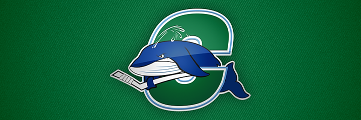
1. Orlando Solar Bears

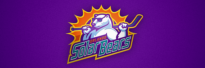
Yes, I firmly believe that the best logo the ECHL has ever seen came in its final year of existence — if the Maya and Hopi are to be believed. This season brought about the resurrection of an IHL team that was founded in 1995 and was disbanded when the league folded in 2001. The Orlando Solar Bears were re-established with this absolute gem of a logo from the immensely talented Joe Bosack. His firm has been responsible for most of the sporting world's greatest logos in recent years. If the world weren't ending, I'd say we could hope for many more to come.

He's done amazing things here. It's hard to believe that a polar bear wearing sunglasses and holding a hockey stick while surrounded by the brightest color palette in sports could be among the best logos. But it is. Right there at the top and everything.

2. Kalamazoo Wings

In minor league hockey, clubs come and go frequently. But often new teams in old markets are branded with familiar names and marks. It's something I touched on yesterday with the Peoria Rivermen. The Kalamazoo Wings are another example. The name and winged-K logo date back to 1974 in the International Hockey League. In 1995, they became the Michigan K-Wings, adopting the simplified nickname. When they lost their affiliation in 2000, the team shut down. But over in the United Hockey League, a Wisconsin-based team head to Kalamazoo and adopted the classic moniker. In 2009, that team transferred to the ECHL. Now this history lesson isn't what makes this a good logo. The simple and beautiful design, on the other hand, does. The longevity proves it.

3. Florida Everblades

I know. How is it possible that two Florida hockey teams crack the Top 5 ECHL logos of all time? You could call it a bias toward my home state. But then you'd just sound silly. The Florida Everblades' logo may be a little more intricate than the two that preceded it, but every detail just improves it. It's one of those rare instances where a ferocious animal really gets the job done. 

4. Wheeling Nailers

Back to "simplicity is king" with this one. The Wheeling Nailers absolutely nailed their logo. And I'm sorry about the poor pun, but I'm writing this at 3 AM when I should be sleeping. The old-time goalie mask and crossed railroad ties (I presume) provide this West Virginia hockey team with the ideal mark. Now if only they hadn't gone and ruined it this year by dropping the red. That was a big disappointment.

The franchise was created in 1981 in the Atlantic Coast Hockey League as the Carolina Thunderbirds. After that league folded, they became a founding member of the ECHL in 1988. They moved to Wheeling in 1992 and a few years later lost a trademark dispute with — of all teams — the WHL's Seattle Thunderbirds (or so says Wikipedia). In 1996, they became the Nailers and have always used some variation of this logo.

5. South Carolina Stingrays

In one fell swoop back in 2008, the South Carolina Stingrays went from having the ECHL's worst logo to one of its best. If you don't believe me, take a look at who leads the Bottom 5 below. This is a classic, clean and simple logo, the likes of which we rarely see in minor league hockey. But the good news is that marks like this have been the trend in recent years. Thank goodness.

Honorable Mentions

I have to give a shoutout to some of the logos that got serious consideration for the Top 5 list. These would definitely be in my Top 10 though. The Cincinnati Cyclones is just awesome. It's not an animal, but the designer gave a twister an angry face and a hockey stick anyway. The Cyclones have existed with this logo in multiple forms dating back to 1990.

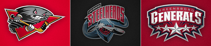
Then there's the Boise-based Idaho Steelheads, a carryover from the WCHL where they were founded in 1997. They survived the 2003 merger but have changed their logo a couple of times recently. As of last year, it's now just a fish. Way to be on the nose. I loved the goalie mask with the ricocheting puck.

And lastly, what can you say about the Greensboro Generals? The franchise only existed for five seasons from 1999 to 2004, but it provided my favorite wordmark logo of all time. Just goes to show you don't need an angry animal biting a hockey stick to make a sharp logo. Hey, as a matter of fact...

Bottom 5: The Worst Logos

1. South Carolina Stingrays

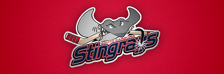
Look at that. It's torture. This piece of feces was not created in the 1970s or 80s as it may seem. No, the South Carolina Stingrays adopted this ugly excuse for a drawing as a logo in 2000. And players actually wore it on their sweaters. Really. How could one man do that to another? I know I'm being harsh, but there are no redeeming qualities here. Let's move on.

2. San Francisco Bulls

If not for that blasted Stingrays thing, the year to end all years (a.k.a. 2012) would've brought us both the best and the worst the ECHL ever had to offer. Seeing what the Solar Bears came up with gave us high hopes for the ECHL's other 2012 expansion franchise. But the San Francisco Bulls logo wasn't just disappointing, it was almost appalling. Who would look at those two logos and believe they were created in the same year? I'd love to see how they're looked upon in 2032, but I suppose the point of all this is that we won't be making it that far.

3. Greenville Grrrowl

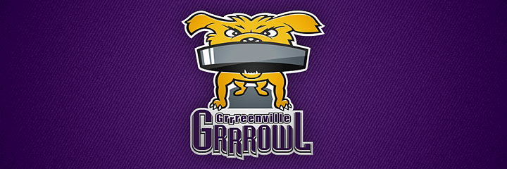
Maybe it's all the Rs. Maybe it's the cross-eyed puppy biting a hockey puck. All I know is this is not a logo that should've ever been worn by professional hockey players. And yet for eight seasons from 1998 to 2006, it was. Then the team met with financial ruin and ceased to exist. What a relief.

4. New Orleans Brass

You'd think I had something against the color combination of purple and gold. I assure you I don't but there are better ways of putting it to use than with these logos. The New Orleans Brass, for one, had a bad name. But all I can think of when I see this logo is that rejected St. Louis Blues third jersey from 1996. You know, the one the players almost had to wear but for Mike Keenan stepping in with some dignity-saving common sense. But associations aside, this is just a poor logo. Nothing about it tells me I'm about to see some hard-hitting hockey. Maybe a symphony?

5. Mississippi Sea Wolves

So many bad logos deserve to be on this list, but I had to limit myself to five. And as such, our final spot belongs to the Mississippi Sea Wolves. It's an abomination of a logo. All I want to know is why the sea wolf captain has an earring and a hook. I'm glad the madness is behind us, but I do feel bad that the team was force to shut down because of the lingering impact of Hurricane Katrina. No team deserves to go out that way. Not even one with a logo as bad as this.

And there you have it. The best and worst logos of the ECHL. Would you agree? Did I leave out any logos that should've been on one of these lists?

We'll wrap up the week — and our time on Earth — tomorrow with the Top 10 worst NHL logos. The world will then end sometime on Friday. Dawn? Noon? Anyone know when?

Tuesday
Dec182012

Best & Worst AHL Logos of All Time

Yesterday I decided to start quantifying the history of hockey logos — seeing as a number of ancient cultures have predicted Friday to be the end of days. We began with the Top 10 logos in the NHL. We continue today with North America's top minor league — the AHL.

Minor league logos are tricky. Some teams just copy their big league affiliate. Many more just employ an angry animal wielding a hockey stick. These teams come and go as do their logos. So instead of a Top 10, I'll give you my Top 5 (along with some honorable mentions) as well as my Bottom 5.

Top 5: The Best Logos

1. Rochester Americans

The Amerks. A true minor hockey classic. In a league where tradition takes a backseat to filling arenas, it's comforting to know that some things don't change. The Rochester Americans were founded in 1956. Their current logo has been in use since 1972 — decades longer than any of their AHL brethren — and the shield itself has been around since 1959. It's no coincidence that the oldest logo is No. 1 on my list nor is it a coincidence that this mark has been around so many years.

2. Chicago Wolves

In my mind, this is the quintessential minor league hockey logo, and yet it's not obnoxious. We have a crazy-eyed wild animal alongside a hockey stick and a puck — just to make sure you know what sport this is. And yet I just want to wear a Chicago Wolves jersey. The logo was created in 1994 when the team joined the International Hockey League. They were saved in 2001 when the IHL merged with the AHL.

3. Omaha Ak-Sar-Ben Knights

This is where I'll probably lose some of you. This may very well be a logo you have never seen. So how could I place it among my Top 5? Well, just look at it. The Omaha Ak-Sar-Ben Knights debuted in 2005 as the Calgary Flames' top AHL affiliate. That fact is clear when you look at the back of the knight's head. It's the fire from the flaming C logo beautifully incorporated into a logo that that has nothing to do with fire. I also like that while "Ak-Sar-Ben" gives the team an enigmatic vibe, it's really just Nebraska spelled backwards. The Knights existed just two seasons before being moved to Illinois. They currently exist as the Abbotsford Heat.

4. Manitoba Moose

Also in 2005 came this gem when the Manitoba Moose got all new logos and uniforms. Angry animals with text are the standard flavor in the minors, so it's really about finding the ones that stand out. This moose just looks like a badass you don't want to cross. It was a sad day when the Thrashers moved to Winnipeg, forcing the Moose to the east coast where they became the St. John's IceCaps.

5. Bridgeport Sound Tigers

Rounding out this group are the Bridgeport Sound Tigers. This logo has undergone some color changes over the years, but it's been one of my favorites ever since this team joined the AHL in 2001. The lines are perfect and the tiger is scary. It's a sharp design in a style we don't see very often. In fact, it's almost too good for the minors.

Honorable Mentions

Doing a Top 5 means a lot of good logos don't get a mention, so I've opted for some honorable mentions. The Peoria Rivermen logo is a minor hockey classic that's been around for years. It's existed as three separate franchises in three different leagues with the earliest dating back to the IHL in 1984. Each iteration of the Rivermen has utilized the same riverboat captain chewing on a puck though the palette always included red until the team joined the AHL in 2005. The question is, is this logo great because it has survived or has it survived because it is great?

The Milwaukee Admirals have been around for decades — at least since the 1970s. They went pro in 1977 when they joined the IHL but always had lame logos — until the skinless admiral appeared in 2006. And finally, there's the Hartford Wolf Pack. Again we have an angry animal showing its teeth, but that doesn't mean we don't have a solid logo. It has been sorely missed since the team was rebranded as the Connecticut Whale. Speaking of which...

Bottom 5: The Worst Logos

1. Connecticut Whale

Yeah, it's no secret around these parts that I have nothing but hate for this logo. Howard Baldwin promised a return of the whale. I didn't think he meant that would be the team's actual name. And I didn't think the logo would be so pathetic. It's everything that's bad about minor hockey logo design. It was so bad it spawned a new word. When the logo was unveiled, Icethetics reader Connor Hanley famously called it "horr-awful." And he was right.

2. Rockford IceHogs

The second-worst logo in AHL history was actually born in the now-defunct United Hockey League in 1999. It ticked all the terrible boxes: A ridiculous name with "ice" tacked onto it, a silly mascot biting a hockey stick, and a pathetic font. There's nothing to like about this logo and there's no reason to name a hockey team after swine. The IceHogs joined the AHL in 2007 after winning the last UHL championship and didn't bother to update their name or logo.

3. Albany River Rats

It would be easy to just keep cherry-picking logos that feature angry animals wielding hockey sticks, but the offenders on this list are the worst of the worst. The Albany River Rats logo debuted in 1993 after the Capital District Islanders were sold and rebranded by their new owner. McKinley Griffen was the design firm hired to give the River Rats their new look. It was their first ever sports logo, and they now take credit for setting an industry trend (angry animal with a hockey stick isn't something I'd be proud of) along with "multiple awards." It also led to them getting more sports logo design jobs.

4. Kentucky Thoroughblades

You want someone to blame for these logos? We have the name. McKinley Griffen. A couple years after "setting a trend," that firm brought us this monstrosity. Lexington, Kentucky got its first pro hockey team in the form of the Thoroughblades when the AHL expanded in 1996. Today, the team is known as the Worcester Sharks — and it has much, much better logos.

5. Abbotsford Heat

We finish this list with the AHL's westernmost franchise. I'll be honest, this is technically bad design. It's just lazy. Their NHL affiliate is the Flames. They're called the Heat. But I don't get any feeling of heat from this logo. Just a FoxTrax puck flying around. It's as bad as the NBA's Oklahoma City Thunder. You can do better, Abbotsford. Just look at who you used to be in Omaha.

That wasn't too painful. Any glaring errors on this list? I got taken to task here and on Twitter for leaving out the Maple Leafs and Red Wings from my NHL Top 10. Did I leave out any critical AHL logos?

The ECHL is next up tomorrow in the same format. Then Thursday we get the Top 10 worst NHL logos. If we're all still here Friday, geez, I don't know what I'll do.

Monday
Dec172012

Top 10 NHL Logos of All Time

So. A handful of ancient cultures tell us the world ends on Friday. Guess there's no better time than now to quantify the history of hockey logos — since obviously there won't be anymore to come. Ever.

Before we start, understand this is just me picking my favorites. Yours may differ wildly. And if we all survive December 21, you'll get your chance to vote in a new sort of logo tournament after the new year. Now let's go. Clock's ticking.

1. Hartford Whalers

Its perfection lies in its subtlety. The use of negative space has a lot to do with the brilliance of the Whalers' logo. Often the H in the middle is what catches people off guard. They say, "how could I have missed that?" When a designer is able to incorporate every inch of their design into important symbolism, they've struck gold. Peter Good is responsible for this logo and even though it was retired in 1997 with the relocation of the Whalers, hockey is better off for having had it.

2. Minnesota Wild

It was hard not to place this logo at No. 1. I think the Whalers logo only got it because of longevity. It happened to come first. But if the world weren't ending, I'd say this logo will be around for a long time as well. Imagine being told to design a logo for a team called the Minnesota Wild. What does that mean? And yet this mark so perfectly captures the wilderness the team is named for. You can see something new every time you look at it. The trees and setting sun are perhaps most obvious. Then there's the shooting star, flowing river and distant hills. It all comes together in the shape of a wild animal's head. Some people see a wolf. I see a bear. It's a remarkable symbol that I hope survives the apocalypse.

3. Montreal Canadiens

No list of this sort would be complete without this juggernaut toward the top. Montreal's classic CH has survivedin some form for more than a century. It's lived through wars, depressions and even lockouts. So what's a little armageddon? Long live the CH. And just so it's being said here, the H does not stand for Habs, but rather simply, "hockey" as the organization's official name is le Club de hockey Canadien.

4. Colorado Avalanche

It may seem blasphemous to put so many logos created in the last two decades so high on this list, but I wouldn't do it if they weren't awesome. The Avalanche logo is another that approaches perfection. Created by Adrenalin in 1995 after the sudden relocation of the Quebec Nordiques, this logo is striking. It conveys motion splendidly with a color palette found nowhere else in sports. A logo this good. There's no way it could wait to hoist the Stanley Cup.

5. St. Louis Blues

The Blue Note originated in 1967 when the NHL expanded beyond the Original Six. Over the years it's been upgraded and revised. The mark we see today is beautifully balanced and it almost makes you hear music in your head when you look at it. There's no better symbol for a team named the Blues. They got it right the first time. They were smart to stick with it.

6. New Jersey Devils

Clearly this isn't a list of my favorite teams. And for as much as I may dislike the Devils, they have a superb logo. It's no wonder they don't have any secondary or alternate logos. Just this one. The only difference you'll find in the history books is that green replaced black at the beginning when the team arrived in New Jersey in 1982. (By the way, Wikipedia would have us believe that the logo was designed by the wife of the owner at the time of the team's move. But I can't find any corroborating evidence for that.)

7. Boston Bruins

The spoked-B has always been in league with Montreal's CH in my book. I don't mean that literally. Of course they are both members of the NHL and have been since the early days. But the idea of logos so simple, I think, is beyond what would be considered good sports logos these days. When was the last time a new team sprang up with nothing but a letter as its primary symbol? Over the years, the Bruins' logo has been upgraded and refined, each time for the better. It's one of those great, recognizable marks.

8. Chicago Blackhawks

No doubt many of you will complain this logo wasn't higher on the list. But you've heard my position before. I don't think it's a bad logo. I just don't think it's the best the way so many other people do. I've never understood that. Still, it certainly has a place on my Top 10. Only the Blackhawks could pull off such great use of color. (There are 8!) It's another one that's been around for a long time and seen a lot of refinements. But it's old and it shows. For a logo, there's no better compliment.

9. Colorado Rockies

Yep, the Rocky Mountain State shows up twice on my list with two different teams. In 1976, the Kansas City Scouts moved to Denver and became the Colorado Rockies (the original ones!). Their logo struck the ideal balance between a team's nickname and its location. It was only a shame they left town in 1982. I always hoped the Avalanche would get a chance to wear this mark in a Winter Classic or something. But with the Four Horsemen supposedly on their way, I guess that's out of the question.

10. Philadelphia Flyers

How does anyone finish a Top 10 list? It's so difficult. And so final. Here I've decided to go back to the first expansion again. Some logos are just so instantly identifiable, that you'd only need to see them for a fraction of a second. The Flyers logo is one of them. Like the Devils, I can't stand the team. It's ingrained in me. But when I look at their mark, I can't deny a fantastic design.

I'm sure a number of you will find fault with my ranking, but that's what the comments are for. How did I do? Any serious oversights? Any big blunders? I'd love to see your Top 10s.

Check back on Thursday for my Top 10 worst NHL logos. Tuesday and Wednesday will be dedicated to the minor leagues — AHL and ECHL.