One of the most popular sections of Icethetics is the Concepts page. This site has always been a haven for creative hockey fans who have new and unique ideas for hockey uniform designs. But these fan creations weren't always posted on a regular basis.
That changed in 2012 with the re-launch of the page. New hockey concepts, submitted to Icethetics via email, are now posted every day — like clockwork. Readers are asked to rate each design and based on those ratings, I have assembled the Top 10 Icethetics Concepts of 2012.
We're starting at No. 10 and working our way up to the highest rated concept of the year!
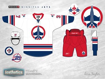
10 ∙ Two Kinds of Jets — Ross Taylor
 Our countdown begins with a frequent contributor to the Icethetics Concepts page. Last spring, Ross Taylor began submitting a series of concepts that merged multiple team identities into a single cohesive look. On May 18, in Two Kinds of Jets, Ross melded the old Winnipg Jets of 1990 with the new team of the same name that arrived from Atlanta in 2011.
Ross earned a lot of high praise for this entry. "This is absolutely fantastic," wrote a reader named Tom. "He should mail it in to them. Would be one of the best jerseys in the NHL right now. Would love to see a home jersey that was red!"
Ross never made a red one, but that didn't stop requests for more versions. Rob S. commented: "Bee-YOOUUUUUU-tiful! We need to see the blue jersey now!"
Perhaps the best compliment came by way of tp71, who wrote: "That may be one of the best concepts I've seen on here in a long long time. This is fantastic. ... Usually concepts are a different take and may not be an actual improvement on what is currently used, but this to me, and I love the Jets current jerseys, is a massive improvement.
"If I could, I would give you a standing ovation for this. Well done."
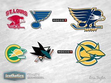
9 ∙ Blue Eagles & Golden Sharks — Ross Taylor
 Sure looks like Ross Taylor could very well dominate our Top 10 Concepts of 2012. (Not to worry, plenty of other artists are represented.) Coming in at No. 9 is another entry in Ross's brand-blending series, which found a home on our Freak Out Friday.
In Blue Eagles & Golden Sharks, posted on April 27, Ross mixed old with new in former NHL cities that got a second chance with new teams. St. Louis, Mo. went about 30 years between the Eagles and the Blues. The San Francisco area, on the other hand, endured 15 years between the Golden Seals and the Sharks.
"These. Are. Awesome!" wrote etown in the comments.
For both cities, Ross fused the logos of the original teams with the newer ones creating Icethetics fan favorites in the process. Ross followed up a week later with reader-requested jerseys for these two hybrid teams.
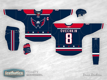
8 ∙ Spread Your Wings — Brian Brideau
 At No. 8 we find another regular contributor in Brian Brideau. He tackled an old standard on Nov. 22 in Spread Your Wings, and did it better than anyone else ever has.
The "old standard" to which I'm referring, is the oft-tried Washington Capitals third jersey concept featuring the secondary logo — affectionately called the Weagle — front and center. Many designers have attempted this but no has done it better than Brian — at least according to the ratings.
"I don't give out five stars normally," commented Phil, "but this thing is gorgeous." The sentiments were shared by many readers included fellow contributor Justin Nahhas.
I have always been the minority that has not wanted to see the Weagle as a main crest, nor a blue jersey in the Capitals arsenal. But this concept changes my mind. I would love to see a home and away set based off of this (without the Weagle of course). Five stars, though — props on this one.
Finally, it seems Andrew O. posed the best question: "Why hasn't this happened yet?"
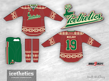
7 ∙ A Visit From You-Know-Who — Matt McElroy
 Lucky No. 7 showed up on Icethetics just over a week ago, on Christmas Eve. Matt McElroy's self-titled "Ugly Christmas Sweater" was featured in A Visit From You-Know-Who on Dec. 24.
Matt told me he planned to pitch the design to a minor or junior league team as a possible theme night sweater. I'm not sure whether he had any success, but he should have. I know I'd buy one of these in a hurry.
Matt has an interesting Icethetics story. His work was first featured on Jan. 8, 2010. It was a Kings jersey with a bizarre color combination that yielded rather harsh comments from me and more than a few commenters. It lit a fire in him.
Earlier this year, on May 7, Matt submitted a new Kings concept that blew me and others away. Matt explained how the reaction to his first submission fueled him to improve his skills. Two years on, he's responsible for some of the best and most memorable concepts ever to grace these pages.
It's so much fun to watch stories like this unfold over the five years Icethetics has existed.
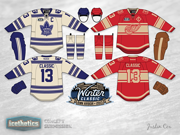
6 ∙ Revisiting the Winter Classic — Justin Cox
 It seems Justin Cox has a knack for creating crowd-pleasing concepts. His talents were clearly on display July 29 in Revisiting the Winter Classic.
Long before any talk of a lockout, much less the cancellation of the 2013 NHL Winter Classic, Justin was working up ideas for uniforms the Maple Leafs and Red Wings could sport. Unfortunately, we won't know for at least another year if his concept was even in the neighborhood.
However, we do know it went over huge with Icethetics readers! One commenter, Brad, wrote: "So it's decided then. Those are going to be the Winter Classic unis. No excuses."
A few months later, the NHL canceled the game and any hope of seeing sweaters even remotely like these. But this isn't all we'll see from Justin. I get the feeling he'll show up again on this list.
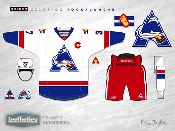
5 ∙ The Colorado Rockalanche — Ross Taylor
 Surprise, surprise. Ross Taylor is back in the countdown! Two weeks into his concept series, Ross created the crown jewel and standard bearer for his brand blends.
He mixed the Colorado Rockies logo with that of the Colorado Avalanche and produced one of the highest rated concepts in Icethetics history. He called the team the Rockalanche. An instant classic.
To this day, it still gets referenced anytime I post a new Avalanche concept. But even on the day it was posted, it's greatness was recognized.
"One word," wrote Mayhem in the comments. "AWESOME!"
A couple months later, Ross revisited the Rockalanche with full light and dark uniforms. Then in July he had a bit of a rethink. He left the logo unchanged but redesigned the jerseys. That concept is part of the top 20 of 2012.
Ross went on to create many more concepts using this theme, but none has been as popular as the Rockalanche.
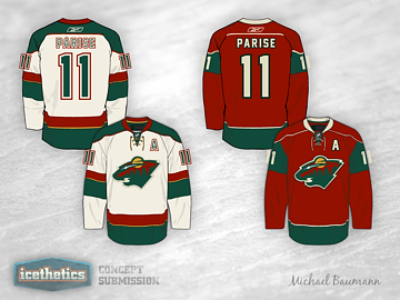
4 ∙ That's Wild! — Michael Baumann
 You could call Michael Baumann a one-hit wonder, but that wouldn't do justice to the concept he created for the Minnesota Wild. His simple, elegant design was posted on July 18 in That's Wild! and became an instant favorite of Icethetics readers.
Michael actually created four jerseys in this set (only two are pictured here), including a home red, road wheat, a green alternate, and a gold Winter Classic jersey.
As for the reader feedback, it was all glowing. John was rather straightforward with his critique: "Dude you did an incredible job. That's better than their regular set."
"Exceptionally well done," said Blitz. "Awesome job," wrote SabresFan. And Ryan added, "great friggin work."
Perhaps the greatest praise came from the designer who came just ahead of Michael on this list — designing for the same team. Justin Cox wrote, "these are spectacular!"
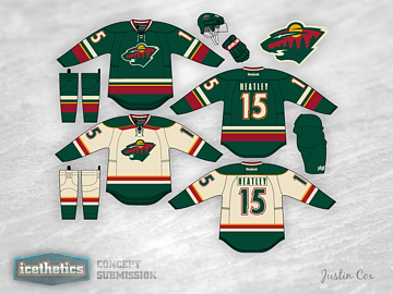
3 ∙ Minnesota Green — Justin Cox
 While Justin Cox was extremely complimentary of Michael Baumann's Wild concept, readers found Justin's own design to be beyond spectacular.
Making our countdown at No. 3 is this design posted on Nov. 28 in Minnesota Green. One thing I pointed out at the time was that, whie the Wild are often mocked for their "Christmas colors," this uniform did not have that feel at all — despite keeping the existing color palette.
"You hit the nail on the head for me there," said Nathan in one comment. "I really do not like the current Minnesota jerseys mainly because of the colour scheme. At least that is what I thought was the problem. However, these jerseys show that this colour scheme can really work. I love them."
Proof that it's not the colors but how you use them that can make or break a hockey sweater.
In the very next comment, Tyler wrote: "Yes. Yes. Oh my god yes. These are perfect. They cannot be improved upon. Why on earth are the Wild not wearing these now?"
I second that. We all second that.
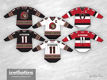
2 ∙ The Sens' Perfect Collection — Justin Cox
 So talented is Justin Cox, it seems, that he takes two of our top three positions in the highest rated concepts of 2012. Justin's most respected design is this one for the Ottawa Senators, posted Dec. 10 in The Sens' Perfect Collection.
At the time I posted this, I wrote that Justin had solved the Sens' uniforms for good. I wasn't sure how many readers would agree with me. But it turns out almost all of you did.
Justin created a phenomenal set of jerseys that borrow's on the history of Ottawa hockey without feeling dated or dull. Instead, he's designed sweaters that anyone would be thrilled to wear.
"Perfect. Absolutely perfect," wrote Jim.
Tony Dunsworth couldn't fit in enough exclamation points as he said: "As a Sens fan from the day the team was announced, I would love these jerseys and buy them in a heartbeat! Wow! Impressive!"
"Can I place an order on these beauties?!?" asked Vaytch. "I'd buy three of each just [in case] I spill something over them! #INSTABUY"
"In one word: PERFECTION," touted Stephen. "Need I say more?"
You need not, Stephen.
With that, we arrive at the highest rated concept to appear on Icethetics in all of 2012.
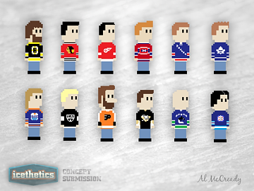
1 ∙ 8-Bit Hockey Sweaters — Al McCready
 It can be lonely at the top. This one-of-a-kind concept by Al McCready definitely broke the mold in terms of what constitutes concept art. But it did so with gusto. Icethetics readers were in love.
Al adapted 12 NHL sweaters into 8-bit computer style artwork in 8-Bit Hockey Sweaters, posted on Sept. 4. And actually, the piece of art sat in my inbox for almost a month before I realized the world needed to see it.
As it turns out, it was the highest rated item to be posted on the Concepts page in all of 2012. The good news is that if you like this, there's more! Al posted all 30 teams (plus a few vintage extras) to his Tumblr page for all to enjoy.
In the post some commenters speculated whether the difference in physical features was an attempt at recreating specific players in the 8-bit world. Al chimed in to say that, in fact, the Flyers character was a self-portrait!
So what do you think of this Top 10? Generally speaking, you should love it as it was your collective vote that determined this ranking. I hope to do another one of these to start 2014. Until then, keep checking the Concepts page for new artwork every day!
 Thursday · Jan 3 · 2013 | 1:28 AM PST
  10 Comments


