Rbk EDGE Review: Flames
 Saturday · Oct 13 · 2007 | 6:22 PM PDT
  10 Comments
 Part 20 of 30. All 30 NHL clubs have unveiled new jerseys under the new Rbk EDGE Uniform System for the 2007-08 season. Here at the NHLToL, we're going to review every one of them. Read up and then rate the new sweaters. We'll do a full ranking after completing all of the reviews.


The Unveiling
Tuesday, September 4. The Flames unveiled their jerseys to fans at Flames Central in Calgary.
Home vs. Road
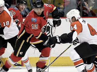
Home: Red. Road: White. The two sweaters are essentially mirror images of each other and feature national and provincial flag patches on the shoulders.
The red home jerseys feature a unique striping pattern. Black piping circles from the sides to the sleeves but stops short before meeting on the outside of the arm. Black-white-yellow-black stripes are featured beneath the piping up the sides and extend down to the bottom of the jersey. White-yellow trim runs across the bottom of the sweater horizontally, stopping at the vertical black striping on the sides. The sleeves feature a black stripe above thinner white and yellow stripes. Beneath that, the cuff is black. The lacing and collar are black and the black version of the primary logo serves as the crest.
The white road jerseys feature a unique striping pattern. Red piping circles from the sides to the sleeves but stops short before meeting on the outside of the arm. Black-white-yellow-red stripes are featured beneath the piping up the sides and extend down to the bottom of the jersey. Red-yellow trim runs across the bottom of the sweater horizontally, stopping at the vertical black striping on the sides. The sleeves feature a black stripe above thinner white and yellow stripes. Beneath that, the cuff is red. The lacing is red, the collar is black and the red version of the primary logo serves as the crest.
In The Details
On both jerseys, the right shoulder features the Canadian flag and the left shoulder features the Albertan flag. The same numbering and lettering style has been retained.
New & Old
The differences between the old and new sweaters is primarily the striping as well as the secondary logo patches. The striping has completely changed and the secondary logo has been eliminated and replaced by national and provincial flags.
Standard FAQ
Numbers on the front? No.
Laces at the collar? Yes.
NHLToL Editorial by Chris
I can't lie. Those stripes bother me on the Flames' sweaters. I think the striping on the sides is unique. But the piping is odd. Also, I feel like the horizontal stripes along the bottom clash with those vertical stripes. The jersey just feels poorly put together in that area. However, to balance that out, I do like the sleeve stripes, the collar style and the flag patches. So I can't reconcile calling it bad. It just averages out overall to me. 3/5


Reader Comments (10)
wow too many lines and the red/yellow combination doesnt look good to me. I give it 1/5
They ruined this jersey
2/5
I'm biased (Oilers fan) but I think these are the worst jerseys in the league. Even worse than ours. And honestly, I thought the flames looked great last year.
An abridged list of the fashion crimes this jersey incorporates:
clashing horizontal/vertical lines
weird piping
bullseye in the armpits
German flag on socks (away)
geography lesson shoulder patches
there's BLUE on one shoulder
There are a lot of bland jerseys in the new NHL, and a lot of busy jerseys, but this one stands apart as a true eyesore.
Unlike most, I like the patches... I think the little blue flag is a really nice and fresh addition to the jersey... It's just a little rectangle, people... Don't be paranoid... : )
The piping is weird though... But it could have been much much worse
Of the piping jerseys that I've come to not like at all this one isn't the worst of the bunch but it is too busy and on the verge of an eyesore
I forgot the patches god those things look bad they look to stretched out and on the wrong team put them on the countries capital not a city that isnt even a capital of its own province
The flag patches really take the piss. Even Alberta's capital dosen't have them (and the colour might actually half-match the Oilers jersey, even), where does Calgary find the nerve?
I'm a Flames fan.
I -want- to like this jersey.
But it isn't happening.
Every time I get a chance stop by the local jersey shop and try it on, I fall in love with the cut, shape and design of the RBK uniform.
Its just a damn shame that little justifies the fashion crimes it commits.
The striping is worse than the 1995 Flames jerseys. I loved the 2004 jerseys minus the shoulder patches.
I just noticed that both home and away have side paneling like the Ducks'.