Stars, Sharks Fan Art
 Saturday · Oct 13 · 2007 | 3:02 PM PDT
  9 Comments
 Some days I just love the concept art I get to post. I've got some well-designed stuff to show off today that I'm predicting will be met with an overall negative response. But that's never stopped me before, has it?
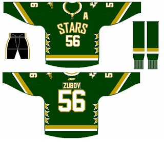
Personally, I like the Dallas Stars' new home sweaters. I know I'm among the minority on that. But here's something I would consider to be a great alternate in a year or so. I like that the shoulders have the primary and secondary logos. The Columbus Blue Jackets did that for a while prior to this season.
My favorite thing is the fact that it's a green jersey. My least favorite thing is that it has no black. I like the black. I think the jersey should be green overall, but I like the black.
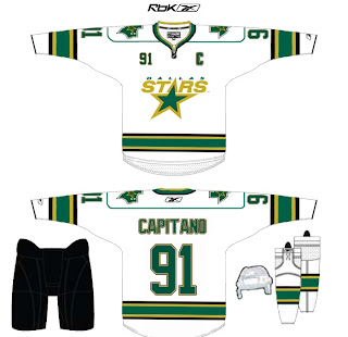
And here's another idea for the road sweater. It's pretty much just an alteration to the striping, but it works well. It's not quite as boring as the current jerseys. I don't really understand the shoulder piping though. Carolina did that and I feel like it just bogs down the whole uniform.
Maybe that's just me.
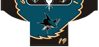
Another reader sent in this concept for the San Jose Sharks.
Before you tell me it looks like a roller hockey jersey, let me stop you. It is. He said the design was based off of his own roller hockey team's uniform. And while NHL teams tend not to wear things like this anymore, I totally could've seen it back in the late '90s alongside the Tampa Bay Lightning's storm jersey.
Oh and about that, speaking as a Bolts fan, I loved those jerseys. The regular ones were so boring. There may have been a lot going on with those blue sweaters, but at least there was something going on!
Enough about that. Feel free to leave your comments about these concepts. What are you thinking?


Reader Comments (9)
It amuses me that you think the original Tampa Bay jerseys were boring, yet you absolutely love their new ones which are 3000% more boring. hehe.
i actually love that sharks jersey... very modern, goes along with the logo well. and about the shoulder piping on the stars jersey, i love that too. to me the shoulder piping is a very cool and original aspect of the hurricanes jerseys. sets them apart from the other teams.
i like the sharks jersey,it's cool how they put the # in the bottom corner of the jersey.
That is why Bruins fans and a lot of others really hated the yellow 3rd jersey with the big teddy bear on it...the jagged striping
As a Sharks fan I didn't think that the jerseys could get much worse, but I guess I was wrong. The only good thing about this idea is the fin logo on the shoulder. While it's not as good as the original fin, it does belong on the uni somewhere. As far as the number o the front, it seems like a waste putting it there. On most players it would be illegible most of the time, defeating the purpose all together. Whew...long post for a concept...
Oh, one more thing. I agree that the 'Bolts 3rd was probably the second best third ever. I loved the storm concept, and the lightning bolts down the arms was great.
this Sharks jersey is better than the god awful wreck they are wearing now i like that it got rid of the awful horizontal striping
Chris - so you like Dallas wordmark-only jersey but you hate the Rangers' or the Ducks' workmark-only jerseys? Wut?
Chris - so you like Dallas wordmark-only jersey but you hate the Rangers' or the Ducks' workmark-only jerseys? Wut?
I'm a conundrum.