Fan Art For Sabres, Devils
 Tuesday · Oct 16 · 2007 | 2:44 PM PDT
  18 Comments
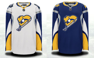
 Got some good stuff to share today. We'll start with some improvements on a Buffalo Sabres concept logo I posted over the weekend.
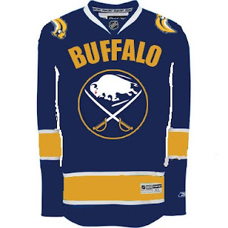
The logo has been altered slightly and overall looks much better. The response to this over the weekend, however, has me concerned for a number of Sabres fans who won't even attempt to accept this logo in any way. I think this is better because it hides the fact that the buffalo has no legs — the primary reason for its being dubbed the "slug."
So I pose this question. A lot of people around the league have responded negatively to the use of the giant text on the front of the Vancouver Canucks' sweater. Would you guys (Sabres fans) still want to go back to the '70s logo if it meant having the name of your city floating above it?
Which element is more important to you? I'm curious to read your responses so please comment!
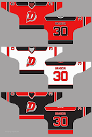
 Next is a concept I came across recently for the New Jersey Devils. It toys with the idea of an alternate logo — though we all know Lou Lamoriello would never have it.
I think it's really cool but I'm not sure a change like this is required. I do think that black jersey would be interesting though, perhaps has an alternate in the future?
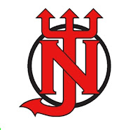
The same designer also came up with another logo concept.
The current one is definitely better.
Leave your reactions to these concept designs below if the spirit compels you. I look forward to reading your thoughts.


Reader Comments (18)
It looks like the slug is playing peek-a-boo. I don't care for that single-sword logo.
Original crest, with BUFFALO above it? It would never happen, and it would be redundant, as there is a buffalo in the logo, which is what made the original logo so great. It incorporated the city and the team name into one design.
But if we had to go the Vancouver route to salt the slug... so be it.
Buffalo's logo needs to not have any damn buffaloes in it.
the buffalo jersey is awesome!
Is it so hard to put a nice logo of sabres on it and not a buffalo? I love the vintage logo for the sabres though, dont get me wrong. But only one sabres jersey so far has not contained a buffalo.
I love that devils concept! I would love that black alternae =]
Notice, Drew... that the slug is the secondary logo on the "Canuck-styled" jersey. Haha
The New Jersey concept jerseys logo is pretty cool because you get the "N," "J," and "D" all in there.
As a huge Sabre fan, honestly, as long as they're in blue and gold instead of *yeck* red and black *retch*, i'm happy. Yeah, the original logo was best, but at least the team, it's apparel, and the arena "feel" like the Sabres again now that they're back in blue and gold.
And hey, the current logo isn't great, but it's still 10,000x better than the Goathead.
Call me crazy, but that Devils "D" logo kinda looks like the face of an Elvis impersonator with a goatee.
"Notice, Drew... that the slug is the secondary logo on the "Canuck-styled" jersey. Haha"
I noticed... I think you know where I stand with that one. lol
"And hey, the current logo isn't great, but it's still 10,000x better than the Goathead."
I agree that it feels great to see the Sabres in their true colors again, but no way does the slug have anything on the goat. I hate the goat, but the slug is just THAT terrible.
Hmm.. I think I like the slug better than the goat, actually.
Red is overused in the NHL.. i'm very happy buffalo went back to blue and gold. I love my canes, but they just had to choose red, didnt they.
At least it looks good on them =]
i like that new buffalo idea, but id like to see the sword directed to the left and the buffalo head looking to the right instead, for a better look
The first Buffalo one is pretty good - The others...not so good
that first one is amazing if you shoed me the one they use know and that one and i had no knowledgeof the NHL i would choose this because it looks more professional than the actual professional one i give it 5/5 and i like it more than about 27/28 of the jerseys in this league, I hate that vintage logo for buffalo and that wordmark makes it just horrific, and thew first devils concept looks good too i like that the J doubles for a D
And why is everyone so pissed at the buffalo logo(Current One) i think its better than Van, Det, Bos, Chi, Nyi, Nyr, Phi, Pit, Mon, Ott, Car, Fla, Stl, Cal, Edm, Phx, Dal, and La...So basiccly its 12/30 for me
"I agree that it feels great to see the Sabres in their true colors again, but no way does the slug have anything on the goat. I hate the goat, but the slug is just THAT terrible."
I guess this is where one's subjective taste comes into play. I really don't perceive the current logo as a slug (I see it, but it just doesn't overwhelm the logo to me), whereas whenever I saw logo v2.0, all I could think of was an albino goat.
It seriously now looks like the slug is a big horned glob of butter about to be smeared on my toast.
Devils jersey is kinda cool but i would like too see the skating devil through the D. And for the black jersey; no stripes just solid black with red/orange flames starting at the bottom of the sleeves and waist and working there way up about 3/4.
"I hate that vintage logo for buffalo"
You're dead to me. :p
The D logo looks great. Would be perfect as a 3rd jersey. I would probably change the striping a bit, just to be different, but the logo is a good compliment to the classic "NJ".