Couple Of Quick Concepts
 Wednesday · Oct 24 · 2007 | 12:43 PM PDT
  14 Comments
 Hmm. That may be misleading. I don't know how "quick" the concepts are, necessarily, but you should get through this post quickly. I'm keeping it short.
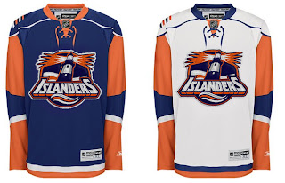
First, a New York Islanders logo I think is awesome!
I may stand alone in loving it, but so be it. My only suggestion for improvement would be to rid it of the text. Maybe save that for a secondary mark or something. But I like the lighthouse tack. I know certain "Islanders fans" are opposed to it, and being a Lightning fan, I'm sure I don't have the proper standing to say, but I just can't help myself.
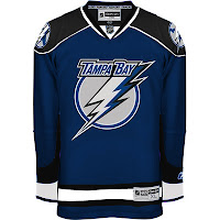
And speaking of the Lightning...
You had to see that coming. First off, wow! That is an amazing looking sweater. That's how you make blue work as a Bolts jersey color. Save this and make it a third jersey. Don't want to wear it out by wearing it every night! I'd buy this one too.
That's all for today. Short and sweet. I'll attempt to have some more up tomorrow.


Reader Comments (14)
i agree sweet concepts especcially the bolts
I honestly really like both of those. A lot!
Both concepts are awesome. The Islanders jersey would look even better if the Light didn't look like whiskers! lol
also, how close are we to 3 million hits?
I really like the Tampa Jersey, I agree it would make a great 3rd jersey. I like the lighthouse in the Islanders jersey. I don't like the all the colors on the sleeves. I prefer a more traditional look. Like what the Islanders used to wear.
The islanders jersey is amazing...would be the best in the league, imho
okay... first of all can someone tell me what imho and ftw means? i think the lightning jersey is really nice and the islanders jersey looks pretty good, the sleeves need to change though... we need more sens concepts...
I like the Lightning concept with the caveat that I still have the same complaint as always - I'm not wild about the logo. The Islanders concept isn't bad either.
ira...
imho = in my humble opinion.
ftw = i really don't know, so i'll make something up... "Fast Thinking Whitey!"
If you don't know what FTW means, it's time to go back to newspapers guys. LOL (do I need to explain that one?) ;-P
FTW = For the Win!
The lighthouse is what they should have done back in 1996 and they could have avoided all of those unwanted associations with fish sticks and various other processed fish products from the fine folks at Gortons...
Unwanted associations normally kill logos...The slug however, is a cockroach of a logo.
Both are great, especially the Lighting. That EXACT uniform should find its way on the ice in 2009. I would buy it in a heartbeat. Chris, send Tampa Bay's Creative services director that designer's contact information NOW!
Yeah, that blue is SHARP. I really like it.
If I'm not mistaken, the lighthouse (or one very similar to it) was the shoulder patch on the Gorton's jersey. I thought it was a much stronger image than the fisherman. The Islanders wordmark was the one from the front the fishstick one. Cool look, though.
Nice work on this blog, btw. Been checkin' in regularly!
Yep, here it is...
http://www.sportslogos.net/logo.php?lo=889
The Lightning concept is sweet and I would buy one in a heartbeat! Keep up the good work! This site is great!