Just To Freak You Out XII
 Friday · Oct 26 · 2007 | 4:54 PM PDT
  10 Comments
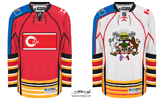
 Welcome to the 12th installment of the Freak Out Fridays. Hope you enjoy this one. We'll kick things off with one of the craziest things I have ever seen.
Like the designer said, who needs a logo when you've got municipal and provincial art to plaster across your sweater? And I counted well over 50 stripes on each sweater. I love those right sleeves. So much so that I've gouged out my eyes. The rest of this will be written by touch-typing.
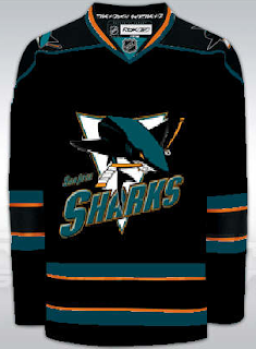
Now keeping it in the Western Conference, check this out.
I guess what troubles me the most is that someone has removed the shark's fin. That's just cruel.
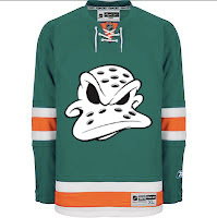
Speaking of cruel...
I dare any league to dress any team in that uniform. Make that a double dare! (Actually, I'm half-expecting to see that duck morph into a dolphin.)
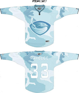
But wait, there's more. Say you're a team looking to blend in with your surroundings. Let's say your hunting ducks, for instance. Might this be a good way to camouflage yourself?
I think it might.
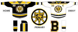
And finally, anybody here watch Conan? One of my favorite segments is "If They Mated." Someone sent in a concept that fits into that category well. What if we mated the Boston Bruins and Chicago Bears (of the NFL for those of us who think football is a waste of time and energy)?
Behold the answer.
I just don't know how I feel now. A little dirty. A little freaked. A little worried about the nightmares I'll have tonight.
Anyway, I hope you guys have enjoyed this Freak Out Friday. Looking forward to finding some great content in my inbox this week for the next episode! You can email me at nhllogos@gmail.com.




Reader Comments (10)
The Flames master the art of no-effort-patriotism. Not that they didn't with just the shoulder patches, but...
Those Flames jerseys are great. Good job, whoever made those!
flames jersey is hillarious, good work lol
i think the Sharks jersey if Terrific 6/5 for the Sharks jersey the Flames jersey is also good but not as good as the Sharks jersey
Sad thing is, I actually think the Atlanta design would be a step up over the current jersey...
That's how bad I had that sweater!
The ducks jersey rocks!
I just have to say as long as there is orange in the Sharks jersey, it will be second rate. That said, this is the only one that didn't make me want to immediately puke. Wordmarks on the jerseys also make them look second rate unless they are part of the main crest (ie Tampa). I also felt that the full shark was a bit much for a main crest. Those old school stripes need to go, period.
Oh hell. That Ducks jersey is a hell of a lot better than what they have now. They're current uniform and logo is the worst in the league.
I guess I just like cartoons.
That Bruin one is really good too.
The Atlanta one is pretty scary.
The Calgary one is hilarious. Good satire. :D
Ohh and the Sharks one isn't bad..I still prefer teal. The Shark just doesn't look right without the fin though..
i actually like that bruins one a lot.
if you'll notice, there are only numbers on the left sleeve and a patch on the right sleeve. it makes the numbers on the front of the jersey seem less extraneous