Red & Black
 Saturday · Oct 27 · 2007 | 5:43 PM PDT
  12 Comments
 We've got a color theme for this concept post. Check it out.
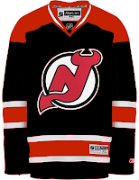
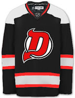
The most obvious place to start is the New Jersey Devils.
They both offer unique ideas for an alternate jersey. I don't think we'd really want to see the Devils in anything but red on a regular basis. Very interesting how these two different artists came up with something so similar yet so different.
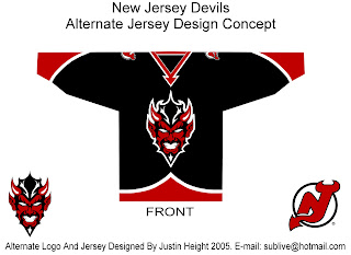
But for something completely different, look no further.
That's a pretty scary logo. Looks like somebody's tattoo.
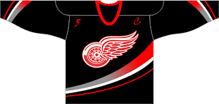
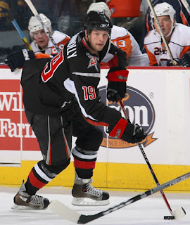
And here's a team you don't often associate with black.
The ironic part is the Ducks' template on a Red Wings jersey. Just so many things wrong with that. I know the Red Wings are sworn enemies of third jerseys, but I think they should try one out some day. Maybe not this design, though.
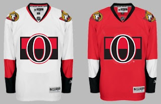
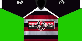
Another black and red team is the Ottawa Senators. Here's an example of what they shouldn't do with a third jersey. Ever. And here's another.
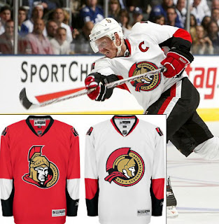
Now here's something that would work — even as a full-time road jersey. This 2D Senators logo is quite possibly better than the primary. It's unfortunate it's nowhere to be seen on their uniforms. Rumor was that it would be featured on various bits of team merchandise. If anybody owns anything with that logo, send me some photos.
And while we're on the topic of doctored photos of jerseys, more and more I'm in favor of the black/red/silver color scheme for the Buffalo Sabres — who are presently being conquered by my Lightning (that goes out to all my email hecklers).
Yeah, it's true. My Sabres-fan readers have taken to email trash talk. Well we'll just see how that goes, won't we? It's 2-0, not five minutes into the second period. Hope you're watching.
UPDATE (9:33 PM): Sadly, I may have spoken too soon with regard to the game. It's now tied.
UPDATE (10/28 8:17 AM): Stupid overtime.



Reader Comments (12)
I have seen the new profile Senator on hats, but unfortunately I have no pictures.
I would just take the Sabres things out. Lol. We're gonna win don't worry.
O yea... Lightning with an OT loss, Swords with the win
what happened with the RBK edge review desktop background?
Sorry Chris. Black and red is never returning, and my Sabres are serving you up those words on a platter. Bon appetit!
sabres suck, lightning suck, wings rule. those two teams combined could lace hank's skates
Even though Tampa should of won it 4-3 in the 3rd. Goalie interference my ass, he gets pushed in and skates out of the crease before the puck is in, and disallowed? Bullshit. Also, offside on Vanek's goal. Oh well, Buffalo won't make post season.
Chris, you jinxed it for yourself! Haha..
For once.. I was actually rooting for the Sabres (apocalypse) because the longer the Hurricanes are ahead of the Lightning, the better!!!
8-3 win for my Canes tonight =]
Even Tortorella said it was goalie interference chris. Funny how we like to pretend rules don't apply when it's our team on the short end of the stick. ;-)
Lot of hate some of you have. It's actually kind of sad. So much for respecting other teams for the talent they have. Oh well. That's hockey.
That sens logo is is on the senators pants in NHL08 for PS2.
Back to the sweaters:
Never liked the Sabres in red and black. It's just not "Buffalo" in my mind. And when they switched to those sweaters it smacked of destroying a good thing in order to sell more sweaters to people outside of the market who could give two cares about the team that has to wear them.
As for the Ottawa concepts, I liked the ones with the secondary logo and the third one with the red, black and white stripes. They're "throwbacks" to the 1920s glory days of the original Sens, who were the terror of the NHL with Conacher and Finnigan.
Yeah, cause there's not enough red and black in hockey already.