Rbk EDGE Review: Capitals
 Monday · Oct 8 · 2007 | 1:54 PM PDT
  9 Comments
 Part 15 of 30. All 30 NHL clubs have unveiled new jerseys under the new Rbk EDGE Uniform System for the 2007-08 season. Here at the NHLToL, we're going to review every one of them. Read up and then rate the new sweaters. We'll do a full ranking after completing all of the reviews.


The Unveiling
Friday, June 22. The Capitals unveiled their new jerseys to fans at a draft day party in Washington.
Home vs. Road
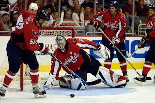
Home: Red. Road: White. The two sweaters are essentially mirror images of each other and both feature secondary logo patches on the shoulders.
The red home jerseys feature blue piping that extends down the sleeves to the cuff where blue piping also goes around the wrist. A unique-shaped white stripe under the inside of the arm runs the length of the sleeve. A thin blue stripe goes around the waist a few inches above the bottom of the sweater. The collar is blue and the new primary logo serves as the crest.
The white road jerseys feature blue piping that extends down the sleeves to the cuff where blue piping also goes around the wrist. A unique-shaped red stripe under the inside of the arm runs the length of the sleeve. A thin blue stripe goes around the waist over red. The side panels are blue and the collar is blue. The new primary logo serves as the crest.
In The Details
The Capitals introduced new colors and a newly designed logo with these uniforms so the numbering and lettering style has also changed.
New & Old
Because the Capitals revamped their look entirely, the new uniforms bare no resemblance to the old ones in any way. It was a complete makeover.
Standard FAQ
Numbers on the front? No.
Laces at the collar? No.
NHLToL Editorial by Chris
I was disappointed by the Capitals' choice to return to colors that have been overused in the NHL and to a logo that is no more than a wordmark and symbolic of really nothing except the past. But even having said that, both have grown on me. That's why I think it's important I'm doing this reviews after all the new jerseys have had time to sink in a little. While I was a huge proponent of the bronze and blue era of this club, red, white and blue honestly seem to suit them best. And I love the new logo on the shoulder. Overall, while these uniforms have their quirks, they're certainly better than average. 4/5


Reader Comments (9)
i just got a new red blank jersey at the caps home opener. i love it. thanks for all the great reviews.
P.S. sorry chris but im afraid your lightning is going down this year against the caps
I'm currently wearing a Caps red jersey and he is awesome.
Added a cap today, these colors blend so mutch together.
Also, that eagle shoulder is so strong it can be used as a primary logo on his own.
I just can't get past the thick vertical arm stripes.
wow, those home reds look beautiful on ice. cannot wait to see them again in person; and that Weagle looks Eerily close to D.C. United's but more or less is still a powerful symbol.
Chris what would you expect the Caps' colors to be? It was absurd to have black,bronze and blue as the colors for a franchise named the Washington Capitals. Thankfully some common sense kicked in to return to the appropriate colors
Really like this jersey - They did go back to the overused red, white, and blue but no one else could get away with that...I like the change - I like how the pants set off the jerseys and really give it a punch
sorry chris but im afraid your lightning is going down this year against the caps
Ovechkin's got nothing on Vinny!
Chris what would you expect the Caps' colors to be? It was absurd to have black,bronze and blue as the colors for a franchise named the Washington Capitals. Thankfully some common sense kicked in to return to the appropriate colors
I'm not sure I'd categorize it as absurd, but like I said, it does make sense. And somehow despite using the most common colors in the NHL, they managed to come up with a jersey that's entirely unique. I can't think of another team I'd confuse them with on the ice.
Thanks for the comments, everybody!
Way to get the ONE PICTURE EVER where Boyd Gordon looks lazy.
Even though I liked the old new ones these are mind blowing. Just awesome in every sense. They make Ovechkin look even faster on ice! Very modern and clean design. Best new jersey by far, IMO.