NHL Tournament of Logos

Entries in capitals (60)

Wednesday
Jun182008

Wallpaper Wednesday II

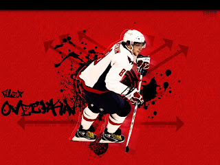
This week brings the second edition of Wallpaper Wednesday and this one is focusing on player-centric designs. We'll start with Alexander Ovechkin.

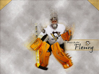
And we have lots of goalies too — like Marc-Andre Fleury...

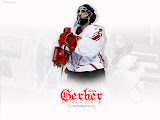
...along with Henrik Lundqvist and Martin Gerber.

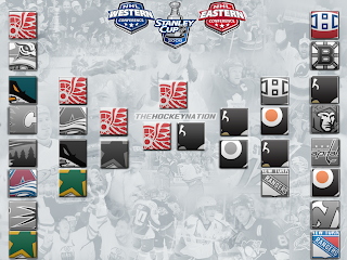
And I thought this was cool — this year's complete playoff bracket.

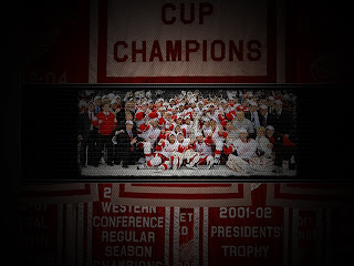
Speaking of the Stanley Cup champion Red Wings, check this out.

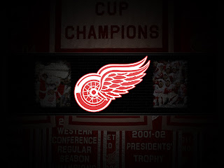
And this, also designed by SnyperP.

He's actually gone and fulfilled several requests but unfortunately I don't have room for all of them here. I'm putting together a gallery that will be available soon. In the meantime, here are a couple more.

And I chose those two to post because they were voted best secondary and third jersey logos by you guys in earlier logo tournaments.

So keep sending in your desktop wallpaper art. You never know, it may one day appear right here on a Wallpaper Wednesday.

Thursday
May152008

Capital Conceptualizing

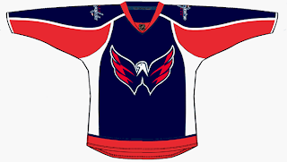
I've got some third jersey concepts for the Washington Capitals to share tonight.

The first one is based off the current uniform with colors and logos swapped.

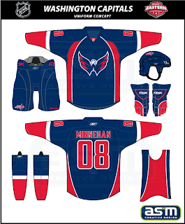
Not bad at all but I'm partial to this next design.

The striping and style fit in with the current sweaters while also being different in their own right. Really, they could do a lot worse.

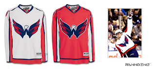
And I know a lot of people like the eagle secondary logo, so much so that they've asked to see it as the primary. Well here you go.

I think it could be smaller on that jersey, but I certainly like it better than the wordmark. The Ducks could learn a thing or two from this but we'll save them for another day.

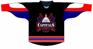
And don't take this last item too seriously.

I was going to save it for tomorrow's Freak Out post but it fit with the Washington theme today. Anyway, check back tomorrow for the 35th installment of the Freak Out Friday.

Friday
Apr182008

Just To Freak You Out XXXIII

Hell has frozen over!

Indeed, the Freak Out Friday has returned. After two weeks off, it's been resurrected. All the talk last month about the league returning to the third jersey program next season has died down, but folks are still trying to come up with the best solution to this alternate sweater issue. The ones that fail tend to end up here.

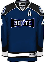
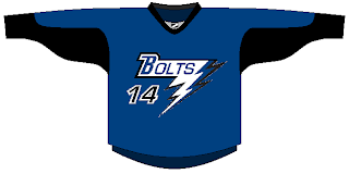
See what I mean? What happened with the D there? And don't get me wrong, I like that blue for my Bolts, but I can't imagine having that written on the front of the jersey. There's more.

Same goes for the other team that joined the league the same year as Tampa Bay.

I know these are designs based on previously discussed rumors, but I always thought they were too horrible to actually see.

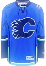
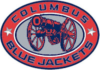
I've got some other stuff too — like a new alternate logo for the Blue Jackets.

And a sweater to boot.

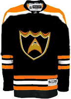
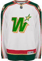
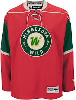
But my favorite pair of sweaters for this week's Freak Out are based on the Minnesota Wild and the previous NHL club that occupied the state.

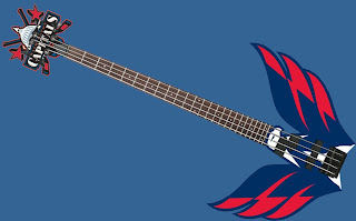
And finally, I know you guys hated the guitar thing, but someone else made this one and I thought it was kind of interesting.

So keep the crazy artwork coming in each week if you want me to be able to continue this series. I'm counting on you! Yes, you! And that's that for this week. Hopefully I'll return next Friday with a brand new batch of insanity.

Sunday
Mar302008

Fan Art To Finish Your Weekend

I think I promised you guys a concept post before the weekend was out, so here it is. I've assembled some of my favorite designs from my stash. There's a lot of quality work, so let's dive in.

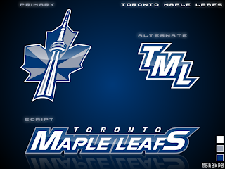
First, an interesting new look for the Toronto Maple Leafs.

I'd like to see the jerseys that go with it. If nothing else, the production value is through the roof on this one.

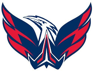
But if you want to talk excellent concept logos, look no further than this one for the Washington Capitals.

I admit I had to stare at it a while, but there it is, a "W" and a "C." And I don't know why it took us so long to realize that if you put those two letters together the right way, it forms a star! However, I'm not sold on the wordmark. I get the whole Declaration of Independence thing (been watching John Adams today), but for a sports team it's not a good idea.

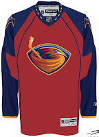
I like that Thrashers jersey as well. With much thanks to Jacob at We're Revolting! for that one.

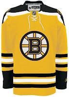
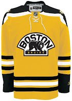
You guys always give me trouble for my aversion to yellow jerseys, but I've come across a bunch that I actually like — despite their resemblance to what I can only assume is Hillary Clinton's favorite suit.

Well, it's the Boston Bruins of course. Can any other team really do a yellow sweater?

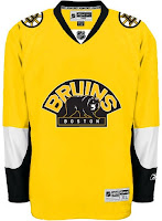
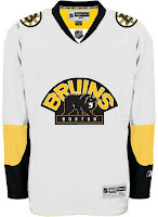
This second set wouldn't work because yellow is still a light color. It wouldn't work as a dark home jersey. However, I am intrigued by the use of the secondary logo with a black background and yellow text.

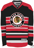
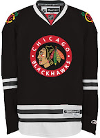
Up next are the Chicago Blackhawks.

All those stripes do weird things to my brain. And there's not enough contrast in the other one. But I don't know, either could work as a temporary third jersey.

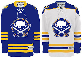
Finally, it's the Buffalo Sabres.

It's a nice logo on a traditional uniform design. I think you'd be hard-pressed to find nay-sayers.

That's good for now. Stay tuned for new polls going up tomorrow both here and at ToHL. Here, we'll have Cam Ward and Josh Harding going head to head and for the WHL Tournament of Logos, it'll be the Calgary Hitmen and the winner of the Americans/Thunderbirds poll which closes tonight.

Thursday
Mar272008

Third Jersey Ideas

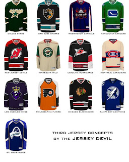
I haven't written a concept art post since the weekend so I think we're due. But it's going to be a short one. One reader came up with 13 different jersey designs he'd like to see implemented for various teams at some point in the future.

I told you it'd be short, but we've got 13 different teams covered. Hope you enjoy it.

We've got a Freak Out Friday post coming tomorrow and hopefully some more concepts for the weekend. I've been keeping pretty busy with the Goalie Mask Tournament. Voter turnout is great so far. Keep 'em coming!

Friday
Feb222008

1000 Posts!

That's right, this post I'm writing here is my 1,000th! I began this blog on May 9 and as of today, it now has a thousand posts. I'm very proud and as always, I'm more than appreciative of you guys for continuing to drop in. Obviously, you all are the reason I keep doing this. So as a thank you, I have some third jersey news.

Well, it's not so much news as concept art. It's all the ideas we've had for next season's new third jerseys... visualized! I'll begin with our friend Gary who's emailed in every other week or so since way back in October. He came up with designs for most of the teams we're expecting to see thirds from in the fall.
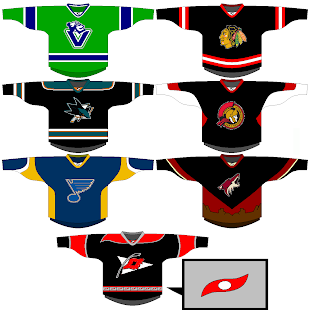
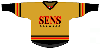
Vancouver's all right. Needs more of a forest green. Chicago, San Jose and Ottawa are pretty much what I'd expect. I like the 2D logo on the Sens jersey. Nice touch. We already know the Blues will have a new logo for their third. The desert scene didn't work out to well for the Coyotes last time so I doubt they'll try it again. And I like the idea of using the Hurricanes' secondary logo as the crest.
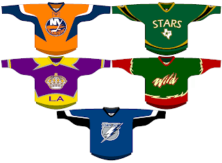
The Islanders and Lightning designs meet expectations, but the rest are a little out there if you ask me. I can't see the Kings bringing back the gold anytime soon. They'll probably stick with silver and black. The Stars sweater is interesting but could use some work. I like the green. Speaking of green, I can't imagine the Wild using that wordmark as a crest. I'd expect to see the bear head and a much cleaner design more along the lines of the current road jersey.

Among that list but not included in Gary's designs were Thrashers and Maple Leafs. Other readers came up with some good designs for them. First, a white version of Atlanta's home sweater.
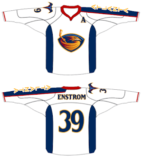
It's nice but I can't see the Thrashers adding another white jersey — especially as an alternate. As for the Leafs, we've got a lot to consider.
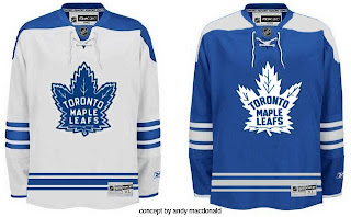
When you think Toronto third, you automatically think vintage/retro/throwback. These fit that bill quite well.
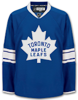
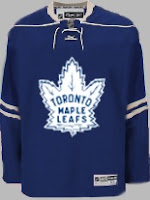
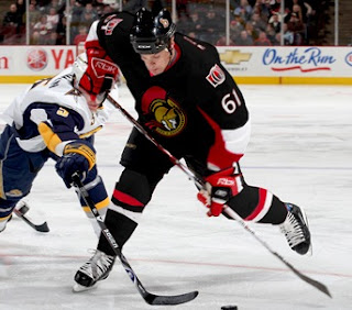
Anyway, I also had a lot of submissions dealing in black. For instance, take the Senators jersey above, painted on Cory Stillman.
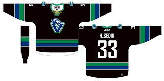
Also a black version of a jersey with the new Johnny Canuck logo.
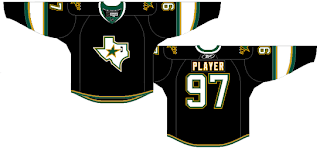
And a black Stars sweater with the Texas state logo.
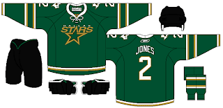
Personally, I'm more a fan of this green version.
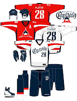
And finally, we'll look at a team who hasn't said a word about a third jersey in the future, but one for which it could work unbelievably well — the Washington Capitals. Imagine a uniform set that looked like this.
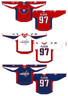
Now those are some nicely designed jerseys.

Remember, if you've got some quality work you'd like me to post, send it along to nhllogos@gmail.com.

Saturday
Jan122008

Just To Freak You Out XXIII

I've been pretty bogged down with getting this next tournament ready. I really hoped I'd have it posted by now, but obviously it hasn't happened yet. Patience. In the meantime I've got some other cool stuff for you guys to enjoy.

First thing, a reader emailed in a link to a site called MG's Helmets — specifically to a page where the designer has come up with a bunch of NHL concept football helmet designs. It's quite clever actually. My favorite thing is how any references to hockey have been removed from the logos. You'll find no hockey sticks and no pucks. Haters of the "Buffaslug" might notice at a quick glance how ridiculously appropriate that logos looks on a football helmet. The only other logo that even comes close to looking good on a helmet is the Flyers.
It's just weird.

Now you're good and prepared for the freak out stuff. I would've done this yesterday, but I didn't. This one is all wacky logos.

First, the Atlantington Thrashitals.

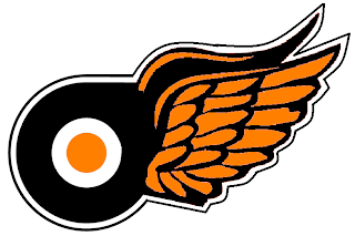
Then the Phitroit Flyer Wings. I know, creative names.

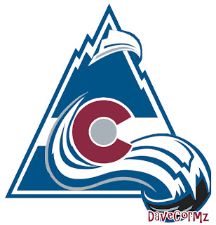
This next one here is a combination of the two Colorado clubs that have graced the NHL — the Rockies and Avalanche.

Not too horrible. I haven't quite figured out how the avalanche of snow has passed directly through the mountain, but I've found in my life it's best not to ask questions.

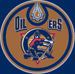
Here, I think we've got an amalgamation of just about every Edmonton Oilers logo ever used.

Learn what it means to be freaked out. Learn it well.

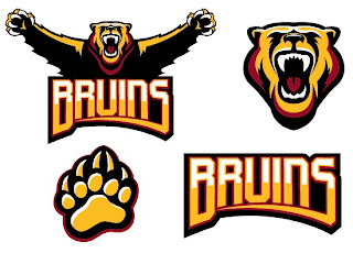
And finally, a weird generic Bruins logo design that could be used for absolutely any team called the Bruins whether they happen to be located in Boston or not.

Thanks, but I'll keep the spoked B.

Saw Charlie Wilson's War tonight. Philip Seymour Hoffman is my hero. Enjoy the other half of your weekend. The Quest For The Worst is imminent.

Tuesday
Jan082008

Hi Ted, Caps Fans

I noticed yesterday the blog got a mention on Washington Capitals owner Ted Leonsis' blog at AOL.com. On Ted's Take, there was this post.

Then also, right there on the Caps' official web site is a link touting the secondary logo's recent victory in the logo tournament.

Unfortunately they got the name of the site wrong (also misspelled the word "competition"), but I guess I can forgive them. And then combining both Leonsis and the official team site was a mention in the Owner's Corner column posted today.

...

And finally, congratulations to our secondary logo mark, which won the NHL Tournament of Logos at nhllogos.blogspot.com. We edged Vancouver’s secondary mark in the finals. Previously we had tied for second in the Rbk Edge Uniform Ranking, joining Montreal behind Boston. The Hershey Bears were edged out in the semifinal round of the AHL tournament by the Bridgeport Sound Tigers.

That’s why I love the web; there are so many ways for fans to interact and connect. Well, I look forward to seeing many of you at our season-ticket holder Meet the Team Party Thursday night and others at the stretch of home games we have ahead. I hope you share in my excitement for what I believe will be a promising 2008.


Pretty cool stuff. I can't believe the kind of recognition this site is getting. My thanks go out to Ted and all the folks with the Capitals' organization for supporting the site — and coming up with such an outstanding logo!

Sunday
Jan062008

Result: Canucks vs Capitals


CAPITALS NAMED CHAMPION!


Congratulations go out to the Washington Capitals' secondary logo tonight for being named by the voters here at NHLToL as the best in the league! The Capitals finished the final poll with a 52% of the more than 2,200 votes.

Thanks to everyone who voted!

As far as what's next, you guys have been putting in your nominations over the last few weeks for the NHL's worst logo. Stay tuned for news on which logos will make it into the bracket on the way to being crowned the worst in the league.

Tuesday
Jan012008

Poll: Canucks vs Capitals


vs
Vancouver
CANUCKS
Washington
CAPITALS


Time now to decide on the best secondary logo in the NHL! It's come down to the 'Nucks and Caps. Place your vote and then feel free to leave a comment as to how you came to your decision. Tell all your friends to drop in and vote! The more voices heard, the more accurate the results!

Poll opening date
Tue Jan 1
Poll closing date
Sat Jan 5

07SCTRN | #4A | VANvWSH