More On The Sabres, Pens Topic
 Saturday · Nov 10 · 2007 | 2:18 PM PST
  6 Comments
 Since we're on the subject of the Buffalo Sabres and Pittsburgh Penguins today, I thought I'd share a few concept designs I thought were especially cool.
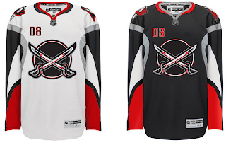
I'd consider the Sabres to be one of the best-looking teams in the league if they wore something a little like this. For one thing, the logo actually has sabres in lieu of a buffalo. Always a welcome change of pace if you ask me — you know, the whole thing about having a logo that actually represents the name of your team.
That being said, it should have a buffalo logo on the shoulder. My vote is for the white one you see in the vintage logo. Wrap a red outline around that buffalo and stick it to the shoulders and you've nearly got your winner. The other big change I'd make is to change the circle behind the swords to red. Either that or make the dark sweater red instead of black. Too much blending in there.
With those changes, I'd almost buy one myself and I'm not just saying that.
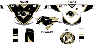
As for the Pittsburgh Penguins, this would be an improvement. This logo needs a bit of work, but it's got a ferocity lacking in the skating penguin. It's even got a nice shoulder patch with that hint of vintage. Any thoughts on this?
Or perhaps we could inject a little more of a retro feel.
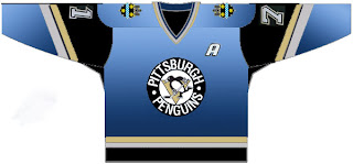
Not only does this design reintroduce the blue sweater, but the designer even went so far as to add the city crest to the shoulders — taking a page out of Calgary's book. But actually, I don't hate it. My only hope is that the gradient thing is just for this graphic and wouldn't have any part of an actual jerseys.
We can dream, can't we? Anyway, leave your thoughts below. I'd like to see what the consensus is on all of this. It's pretty drastic compared to a lot of the work I post on a regular basis. And as always, my thanks to the artists.


Reader Comments (6)
If it were blue and gold, I'd dig it. Stop gushing for the black and red Chris. It's generic, it's bland, it's been done, and it was never truly "Buffalo." Blue and gold forever. That's just how we roll in this town.
The first Pens concept, not too fond. It took me a while to see what that logo was. I couldn't make it out for quite a bit. Not a good litmus test for a logo.
But the second is actually REALLY sharp! Lose the gradient and wow, that's a winner!
The shoulder crest on the second Pens concept is not copying Calgary. It's a tip of the hat to Pittsburgh hockey history. The NHL's Pittsburgh Pirates in the 1920s had the same City of Pittsburgh crest on the shoulders.
Love the second Pens design! I was a fan back in the blue and white days and would love to see the Pens reintroduce blue to the color scheme, even if only as a third jersey design.
The first Penguins set is half way there. Not feeling the logo, but the jersey design is nice. Where have I seen that before? Why was that dropped? Eh.
I agree that the Sabers should wear blue and gold. That being said, this is a very good looking jersey.
I like the current look of the Penguins (even if they looked a lot better last year). I don't think the primary logo needs to be changed, but the P shoulder logo looks great. They should adopt something like this when they take that lame circle off their shoulder next year.
Jacob, I agree that those are nice jerseys. If the Sabres were still in black and red, those would be fantastic. But alas, we're a blue and gold team.
I'd love to see those re-done with blue and gold actually. Maybe if I have some spare time today, I'll tinker.