More Habs Anyone?
 Saturday · Nov 17 · 2007 | 5:33 PM PST
  8 Comments
 On Thursday, I ran an Atlanta-themed concept post. Tonight, it's all about the Montreal Canadiens. I have several concepts I feel like sharing.
Last week I posted a bunch of third jersey artwork which included a half blue, half red Habs sweater. I wondered aloud what such a thing might look like on a player. And because you guys are just awesome like that, someone took to Photoshop and here is the result.
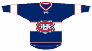
I'm thinking that's probably a no. But as far as a blue Canadiens jersey goes, we shouldn't toss out the idea altogether should we? The AHL's Hamilton Bulldogs handled a similar jersey effectively — as proven by the club's mascot.
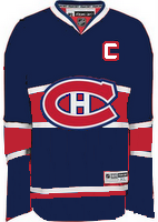
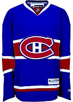
Here's what that would look like in Rbk EDGE template form. They could do a lot worse. That's all I'm saying.
Though there is one element here that doesn't work well. The white stripe across the middle makes it difficult to put contrasting numbers on the back. The cure for that is running a red stripe in its place.
I'm posting both of these graphics to show different possibilities for the shade of blue. Personally, I'm more a fan of the darker blue.
Overall, I think blue would be a good direction for the Habs if a third jersey is in their future. I never cared much for the white ones they used to sport. What do you guys think? Post your comments below.


Reader Comments (8)
their third jersey should have a fleur-de-lis on it somewhere.
They can't use a fleur-de-lis because that was an essential symbol of the quebec nordiques their ex-provincial rival and I am sure the fans would not have any of it. Apart from that, i would have to agree with you.
I actually don't mind the dark blue jersey with the red stripe. Being a habs fan my entire life, i would hate to see them change their home jersey to the blue but a third jersey would be interesting. The main problem is that blue has never been used as a primary colour for the habs and given their longevity and iconic status, i can't see them creating a 'new' jersey anytime soon .. the white one was just a throw-back to 1945. There ARE, however, many interesting variations which the habs have used over the years and considering next year is their centennial (i wonder if anyone will send you some designs for their centennial) i would like to see the habs don some several vintage jerseys throughout the year to honour their past.
actually, id have to go with the lighter blue. sure it looks bad on a screen, but i think it would look pretty sharp
I don't like the half-and-half look, but all the blue ones are pretty cool.
As a habs fan I would agree with James. I would love to see a dark blue as a third jersey, say the blue they use on their practice jerseys. As for their centennial I think it would be great if they did have some throwbacks to wear during the year. Maybe wear the jersey from their 24 cup years or something like that.
I like the blue jersey much better the the half red, half blue. I think the Habs have the best jerseys in NHL. I would only want the blue jersey as an third alternate. I also liked the white jersey they wore for the winter classic they wore a few years ago against Edmonton. No fleur-de-lis.
Chris, just a thought the contrasting numbers wouldn't be too hard to accomplish, a red number with a white outline would suffice, i'm just not feeling the red stripe across the chest, the white isn't as prominent as it should be. just trying to defend the bulldogs mascot concept i made for you xD
i agree with charles.
i like the lighter blue - good for a 3rd jersey.
also they should change their white jersey permanently back to the one they used in the mid 1940's - much better looking.