A Third Jersey For The Wings?
 Monday · Nov 19 · 2007 | 3:11 PM PST
  21 Comments
 The third round of voting on the Third Jersey Logo Tournament will begin on Wednesday so keep an eye out for that. In the meantime, I've managed to break away from Super Mario Galaxy (80 stars) if for only moments to share with you some Detroit Red Wings concept art. This, of course, coming on the heels of the Motor City being named the most dangerous city in America. Kudos on the whole gas station owner feud thing.
Crazy.
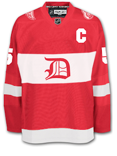
All right, so moving right along into the hockey stuff now. We'll begin with what you'd probably consider your basic throwback alternate.
I don't think many Wings fans would lodge a lot of complaints over something like this. It's still got that traditional look and feel but at the same time it's something new.
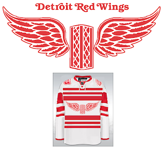
For a change of pace, how about a new logo entirely? Get it en-"tire"-ly. I should stop that now.
Personally, I'm not the biggest fan but it's definitely got the old-time hockey feel.
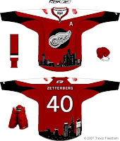
Now, if it's something completely and totally different that you're after, look no further. I've got you covered there as well.
The designer described his work this way: "As you can see, the skyline wraps around the base of the jersey. I'm sure you're wondering about the logo. It is an image that has been familiar with Detroiters for decades. It's a statue called the 'Spirit of Detroit.' If you google it I'm sure you'll find a good photo. I think it's a great representation of Detroit that many Detroiters would appreciate."
So Detroiters, how do you feel about these? I'm interested to get some feedback here.
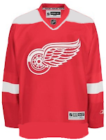
But just so you guys don't think I've gone completely crazy, I've got a couple of very conservative redesigns as well.
So now let's hear it. Could any of these pass muster for a potential Red Wings third jersey? Or is Hockeytown destined to never join the alternate sweater club? Post comments below.





Reader Comments (21)
I like the one with the black red wings logo, but I'm sure red wings fans wouldn't want that. And I think that unless you're from Detroit or Michigan you probably wouldn't know what that statue is.
Also, I think maybe its the principle that red wings fans don't want a third jersey, and not the jersey.
that first one is probably the only detroit concept that I don't hate...
Your thought about people not knowing what that statue was was the reason why I created the 2nd jersey with the black logo.
I've been a Red Wing fan my entire life, and while I love their traditional uniforms, I wouldn't be opposed to a tasteful third jersey such as the ones in this post.
Funny i just managed to pull myself away from Call Of Duty 4. Once you start playing you just cant stop even after beating it...
I llike the first one
I think this is a first but I liked every jersey in your post
The spirit of Detorit jersey doesn't need the skyline but it's not awful I like that statue thought
its pretty sick
wings + third jersey = apocalypse.
nuff said
That gothic-D jersey is essentially the design of their first Detroit jersey (in the few years when they were known as the Detroit Cougars). Would need some tweaking but I could see it being used for some kind of historical theme night.
I've always thought the red wings looked like skating santa clauses. But thats just me.
wings third jersey no
Hockeytown destined to never join the alternate sweater club
The throwback is probably the only one that would ever see the light of day. Take away the shoulder patches though; they just don't look right on a Red Wings jersey. The Spirit of Detroit jersey and the black logo skyline jersey look more like gimick jerseys that you'd find at a department store, not on the ice. The Spirit of Detroit is there to wear jerseys during playoff time; not be on the jersey itself. The stripe jersey with the two wings on a... building? Well, it's basically the same as my vintage jersey of the same design only sporting the word Detroit. Love that jersey look. Wings and Blackhawks used to wear their vintage jerseys during the 91 season at times when they'd play eachother (wait, Detroit had a third jersey!). In reality, we love our current jerseys, so a third jersey is useless. Wouldn't mind seeing a throwback night though with original 6 teams now and then...
I did the first one that was posted, and I tried to keep to some level of tradition but add a little "contemporary" to it (hence, the winged wheel on the shoulders). I essentially reversed the color scheme of the original "D" jersey, obviously.
True, Detroit is probably never destined for a third except the '91-92 throwback year. Thirds tend to be somewhat difficult with Detroit, I think, because we're limited to only two colors (adding another color is really touch-n-go; gotta be careful with which color one uses). Hence, Toronto's throwback-style alternate that they used (which I thought was pretty slick).
A while back, I created a thoroughly modern style, using a falcon as the crest (another nod to Red Wings history, of course), with a stylized winged wheel logo as a secondary, but of course, most Detroit fans I showed it to hated it for exactly the reasons mentioned here -- "don't mess with my jersey" ;)
No, no, no. I despise the Red Wings, but I hope they have more class than this. If they're gonna bring back the third jersey, make it the vintage ones they brought back in 1992. I just don't think the old D concept would work on the reebok jerseys.
The first one is the only one that would fly. Throwback but simple.
i made the second one and what i was try to do is take the original logo and view it from a different angle it is the winged wheel viewd from the front instead of the side and it also forms a "W" and it is a tire, not a building
While I took the time to create two of these concepts, I'm not at all surprised by the reactions. I really wouldn't mind if the Red Wings never had a 3rd jersey. I believe their traditional ones are awesome one their own merits.
However, I wouldn't be angered if any of these jerseys saw the light of day. None of them are gaudy or outright ugly in my opinion.
kotollefsen, don't worry, i could tell it was a tire and not a building. i think it isn't bad looking too. i agree with everyone else who says the Wings will never have a 3rd jersey, but if they ever did, the first one is the most likely to cut it.
The wings DID have a third jersey.
http://cgi.ebay.com/NEW-DETROIT-RED-WINGS-THROWBACK-VINTAGE-1992-JERSEY-XL_W0QQitemZ110193091812QQihZ001QQcategoryZ24988QQssPageNameZWDVWQQrdZ1QQcmdZViewItem
That was just a throwback for the leagues 75th anniversary. It is just a copy of the Detroit Cougar's jersey from the 1920s
I don't like the first two at all, but the other ones are pretty sweet.
The first one would be acceptable if they used their actual Winter Classic olde English "D" and not that horrific looking one you have posted. The other two are some of the worst jersey concepts I have ever seen in my entire life.