Art From Music City
 Monday · Nov 26 · 2007 | 2:35 PM PST
  16 Comments
 Today's concept art is all about the Nashville Predators. Although you might not know it from where I'm starting. Remember all the noise that was stirred up over the summer regarding the possibility of the Preds being sold and relocated to Hamilton? It may be all but out of the question at this point but I've got some artwork that by itself may want to make folks reconsider.
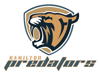
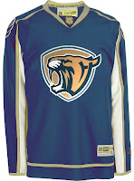
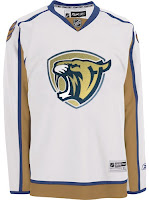
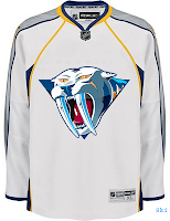
Ladies and gentlemen, the Hamilton Predators.
I have to say that this logo looks so professional that I might have to wonder whether it's been "borrowed." (Let me know if has.) But still, I can't help but love it. And although the jersey set is a recoloring of the Washington Capitals' threads, it's no less awesome looking.
I doubt I'm alone in that opinion. What do you guys think of this concept?
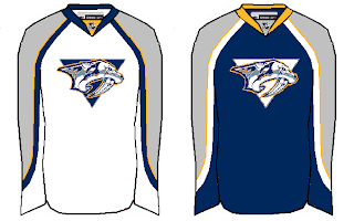
Anyway, we'll move on to some more conservative concept designs. These two really do nothing more than make adjustments to striping patterns. They're nothing special but they aren't terrible.
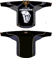
These next two are a little more unique and perhaps more worthy of an alternate jersey than a primary.
On the left we see the old third jersey logo on white instead of gold. Personally, I was always a fan of the gold jersey that critics have called "baby puke yellow." While I think that's funny, I don't think it's all that accurate.
The design on the right is the new fossil logo on black accented with dark blue. While this design isn't as neat as it could be, if cleaned up, I bet that would look like a killer sweater.
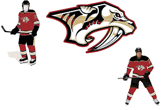
And finally, our last Nashville concept of the night basically deals with some altered colors. How about red and gold instead of blue and silver? It's not a common color combination in the league, but I definitely think there could be worse.
As always, feel free to leave your comments below. I enjoy getting feedback from you guys.



Reader Comments (16)
the hamilton concept is really good great artwork as well the colour combination of red gold is stellar
The logo itself is awesome! however im not a big fan of the jerseys. they colors, to me, dont seem to flow.
I think Hamilton concept (both logo and jersey) are amazing. It certainly beats many of the existing NHL logos and jerseys (including the preds).
The Hamilton jersey's not great but the logo is beautiful... except for that big line that chops through the ear. What's with that?
The Hamilton logo seems really AHL-ish to me. Definately one of the better logo concepts out there but it dosen't look like it quite fits in with the NHL.
Jacob, the line thru the ear is the left line of an H that spells HP (for Hamilton Predators). That was posted on the cancuks.com boards a few months ago and the creator of it had to explain that to a few people.
I like the Hamilton logo. There are even some "H"s hidden in there! Very cool.
Not digging the jerseys they're attached to for some reason, though.
those are some pretty sick concpets
the red and gold logo is waaay better than the real predators colours
i think that they have the worst colours in the league
that Hamilton Predators logo is awesome and the P in the HP isn't really as easy to spot as the H is
the logo is great but the jersey could be a lot better
Can't say I care for any of these.
the colors and logo for the hamilton predators are pretty cool. but a different jersey pattern would be better
The Hamilton Predators logo/jerseys are stunning. Makes me wish they got to become my hometown team...
The, uh, New Jersey Predators concept at the bottom was also quite the nice look, albeit an unexpected turn for the team.
I love how the Hamilton concept pays homage to the old team name in Hamilton, the Tigers.
red and gold do look better than the confusing colors they have now
I have never been a fan of that third jersey "head on" sabre-tooth cat logo.. the original logo and the "hamilton" logo you posted are badass though. the sabre-tooth cat in general is a great idea for a team logo. too bad the "head on" version has to look like a drawing done by a 3rd grade boy :(
i agree that the colors don't seem to flow with the hamilton designs. i think it's the mixing of gold and copper.
I like the nod to the Hamilton Tigers in the first logo. Looks more like a cougar though.
Re: the "Baby Puke Yellow" 3rd Jersey (I always called it the "Mustard Bomb") - nothing right going for that one. IMO worst 3rd Jersey ever. SJ Sabercats would pwn the 3rd Predator.