Connected By Blue
 Monday · Dec 10 · 2007 | 3:32 PM PST
  13 Comments
 So what do all of tonight's jersey concepts have in common? The color blue. That's it.
We'll begin with the Buffalo Sabres and a design that despite its stripes is actually rather cool.
Yeah, the striping does ruin it though, doesn't it? I like the logos and the colors (though I'd go with a white circle on the blue jersey) but I don't really understand the weird stripes. In case you can't really make it out, the logo on the shoulders appears to be the buffalo from the original '70s logo sans the swords beneath it.
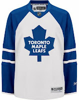
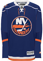
These two deal with some simple modifications. The white Leafs jersey with the blue stripes leaves me wondering whether this would be a home or away jersey. It seems to have too much blue to be a road sweater yet it has too much white to be for home games. The Isles jersey, however, is a nice adjustment. Not great. But better.
Here are a couple of dark Thrashers jerseys. Your pick as to which is home and with is an alternate.
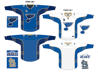
And finally, I promised a Blues fan I'd get this one posted tonight.
You know what to do now. Comment away. I'm interested in seeing what you guys have to say about these.


Reader Comments (13)
Straighten and connect the stripes on the Sabres jerseys and they'd be pretty good.
I like the "STL" logo on the Blues jersey, but not where it's placed. Put it on the shoulders. We don't need two logos on the front of a jersey.
Sabres. Great Striping Concept. Would Love to See it In the Future.
Leafs and Isles. Needs work.
Thrashers. The Right Should be a Home Jersey Left is Alternate.
And Blues. Nice Concept, The Word Mark in the Primary Logo Though Used on Previous Logos Doesn't Look Too Good. Cut out that STL where a Stanley Cup Patch or All-Star Game Logo Would Go and it looks good. The Shoulder Patch Looks Quite Good. Though the Trumpet logo Cut Out From the Thrid Jersey shown earlier would look Good Too.
Making me think you should do a year in review post Later this Month of all the great concepts recieved this year
The Blues concept is not bad...
But IMO, the Blues jersey is the third best RBK Edge jersey, after the Bruins and the Capitals (I'm a big fan of the retro Caps)
not a good one in the bunch IMO
its funny that the blues jersey uses one of the rams old secondary logos and the cardinals secondary. also the wordmark in the logo just does not work.
not so good.
this has nothing to do with these jersey but the allstar jerseys will have the number under the West/East logo on each jersey
heres the link to where i found it, all you have to do is put in any name and number and it will show where the number goes
http://shop.nhl.com/product/index.jsp?productId=2805362&cp=2944445&ab=OAS_HP%3AAllStarShop&parentPage=family&clickid=body_bestsell_txt
I don't like the St.L on the front, bur otherwise it's a great jersey. I like the arch on the wordmark.
I absolutely love the Sabres jerseys.
I really like the Sabres jerseys. I like the Blues jerseys, I don't like using the Rams and Cardinals logos. I think that the Blues have one of the best jerseys. The Islanders is an improvement, still needs work like Chris said. I don't think the Leafs jersey will work. Looks like a typical long sleeve baseball shirt, or something you would find in the pro shop that would never be worn on the ice.
@Blackhawk
nice find! I don't know if i like the numbers on the front though
My biggest problem with the Sabres latest logo was that it removed the whole "sabre" thing from it.
I'm not a fan of this sweater as it takes away from the traditional Buffalo (or Bison, Bull, etc) that appears on a large portion of city of Buffalo logos (Bills, Bisons, Bulls).
Wow...yet another Sabres concept that kicks the slug's ass...
Okay... the team is the Buffalo SABRES, not the Buffalo BUFFALOES.
They need a logo that has some swords, and no damn bison in it!
So in other words, the primary logo on that sweater is fine, but the secondary one isn't.