Just To Freak You Out XIX
 Friday · Dec 14 · 2007 | 3:31 PM PST
  10 Comments
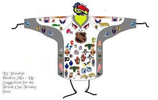
 Finally, Freak Out Friday is back on Friday! And boy is this one a doozy. You won't believe some of the whacked out craziness your fellow readers have come up with this week. Let's start with an eyesore I probably never should've posted at all.
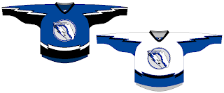
Yeah, there's no excuse for that. Speaking of inexcusable, here's a rather scary concept of a Tampa Bay Lightning logo.
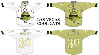
Oh wait, it gets better. You know how Las Vegas has been involved in all the buzz about a possible future expansion of the NHL? Here's what they shouldn't do when it comes to naming the team and designing a uniform.
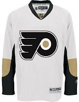
And then as always, we have our "If They Mated" blends. First, we have Pennsylvania's teams...
...and then all three New York clubs.
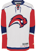
Plus as a special bonus, someone redesigned the Sabres' pants. But you know what I say? If the Lightning can have lightning bolts down their legs, than why can't the Sabres have swords?
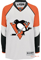
Oh, and I mentioned the Penguins a second ago. I need to post this just so it's out there. I'm all for the retro blue jersey for the Winter Classic, but let's not go too far. Here's something to avoid at any cost.
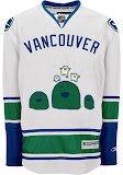
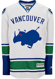
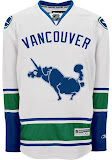
And finally, I can't determine whether the designer of these hates the new Canucks jerseys, or loves them. You be the judge.
Hope you enjoyed your week — or at least your Friday. Christmas comes in just 11 days and you know what that means!
See you right here for another Freak Out post next Friday! And remember you can send in your concepts for consideration to nhllogos@gmail.com. I look forward to seeing them!




Reader Comments (10)
Okay...For Every Single Concept Except maybe the Tampa Bay one, All I gotta say is...What The F***!!!!!
First One Makes No Sense, Looks like a poorly done making of the best or worse logos in the league. Lightning Jersey, Not that Bad. Vegas Team, Careful What you Wish For. If they got a team and chose that jersey, they would be the Worst Dressed Team in the NHL, Those look worse than the Canucks Flying V Jersey. If they mated 1. The Penguins/Flyers Colour Swap would look good. More So for the Flyers though. If they Mated New York Edition...Wierd. If you want Sabres on the Pants make sure they're the sabres used on the third jersey. If they decided on a Penguins Jersey that looked like that, somebody probably wasn't thinking when they approved it. And the last 3 Concepts...WTF...Suddenly Made Me Think of the Vancouver 2010 Olympic Mascots for some odd reason.
I wonder what it would look like if Somebody Put the 2010 Mascots on an olympic styled Canuck Jersey...
First off, curtle, very critical,by the way this is "Freak you out friday" like do you expect?
But I have to say the Philly mate with Pittsburg works for me!
curtle, relax...
most of those jerseys were intentionally designed for laughs...
I love the series... Every time I come home on Friday, tired after long week, this series cheers me up for the weekend!
The Pens/Flyers swap doesn't look bad at all.
The very first one would be really funny to see as an all-star team jersey.
About that last jersey ... is that a rhino taking a dump? A juiced up unicorn with hemmoroids?
Whatever it is, it made me laugh at work. Good job!
my initial reaction is ... turdy.
not just in the sense of what I think most look like figuratively, but literally.
with the bolt covering the FL panhandle, the state looks like a turd (no offense meant to FL residents). Plus the unicorn in Vancouver's looks like it's getting ready to drop a load.
Anyone else see what I see or am I just crazy?
Good gravy! I want the head of the designer of the Pit/Philly design! That is absolute heresy for a Pittsburgh fan such as myself. Ick! Agh! My eyes bleed!
I do agree that the Philly logo looks good in black and gold, though...
the first one is just stupid but can anyone tell what the logo is beside the islander lighthouse, below dallas bull and beside buffa slug cant tell
Looked at that place thehurricane mentioned, and those symbols look like if Mogwai from teh Gremlins movies were playing hockey