Talking Teal
 Tuesday · Dec 4 · 2007 | 3:33 PM PST
  8 Comments
 Tonight's post is all about the San Jose Sharks. No reason in particular. We'll start out with one of my favorite new concept designs. Remember this? And remember how I said that black jersey was my favorite?
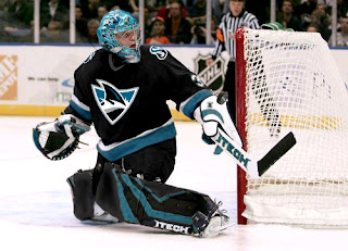
It looks even more spectacular on the ice. Seriously, who disagrees? Is that not what a hockey jersey is meant to look like?
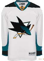
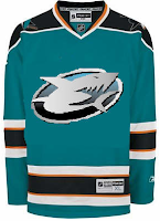
I probably should've finished with that image because what could possibly follow it? These two are just designs I thought had interesting aspects to them — not the least of which being the crazy logo on the right which almost won it a spot in Friday's Freak Out post.
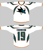
The white sweater is a recoloring of the Lightning's road jersey with an odd addition to the shoulders.
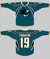
This set is really nice because of the striping. Yet for some reason, it makes me think of a spider more than a shark. Still, I do like it.
Lastly, there's this one which only warrants posting for its comical shark's-tooth zig zags around the waist.
Please don't eat me.



Reader Comments (8)
HA thats the gameshark logo.
sure is:
http://www.viewonline.com/pages/articles/images/GBA%20GameShark%20Trim.JPG" REL="nofollow">http://www.viewonline.com/pages/articles/images/GBA%20GameShark%20Trim.JPG
i think the fin jersey looks way too ECHL or something. i don't like it. although i guess when your logo is a shark, it's going to have to look a little ECHL.
i knew i saw that shark from somewhere
way too much black in the nhl right now. do we really need to have every team in california wear black? sharks should stick to teal, that is their identity. they had the balls way back in 1991 to not use red and blue. i have never liked the sharks, but i respect the organization for branding themselves with a unique look.
u have very clever post names...also that jersey looks OK. im a huge fan of the current one however
and by that jersey i meant the first one. from the "rebranding the [insert team name]" series
I love the black jersey concept, especially since my 8 year old's art is better than what they have now. I won't buy anything of their's til they redesign it, but I would definately buy the black jersey with Steto's name on the back if they came out with that black concept jersey. =)