Bruins Unveil New Logo!
 Thursday · Jun 21 · 2007 | 7:56 AM PDT
  13 Comments
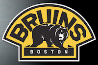
 All right, here we go. We have the first of the official new logo unveilings as the Boston Bruins unveiled this:
My first instinct was a dislike of the black outlining of the "B" in the center, but after having stared at it for about 10 minutes, it's growing on me. Anyway, the logo barely changed as you can see. It's a minor update but it was what's required at this juncture. Anything drastic would have sent Beantown fans overboard. We'd have the equivalent of another Boston Tea Party on our hands, to be sure. (Oh come on, you know I had to do that joke. It was just too obvious not to.)
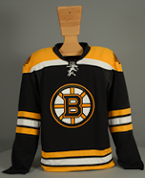
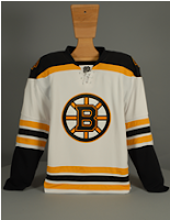
And then there's these gems. For your viewing pleasure we have the home and road Rbk EDGE uniforms for the 2007-08 Boston Bruins.
Proving once and for all to all those frightened ultra-traditionalists out there that these new uniforms can in fact deal with horizontal striping. Not that losing it would really hurt anyone.
But I'm grown up enough to move on.
 I also felt like it was worth posting this. It's the secondary logo — or as their calling it, the "vintage crest" — which will be worn on the shoulder. It's pretty cool. I'd even like it as a primary but we can't have everything, can we?
For those of you following along in the tournament, the Bruins have had one match already, against the Flyers in which we used what is now the old logo. Their next match is June 25 and will feature the new one. In case you were wondering.


Reader Comments (13)
By the way on the shoulder patch, the big arch says BRUINS on the home duds (and Boston underneath) and BOSTON on the road duds (with Bruins underneath).
Thank you for mentioning that. I read about that and meant to add it to the post. Now I don't have to. Much appreciated!
Wow. As a Montreal Canadiens' fan, it's AMAZING NEWS to me. Can't wait to see the HORIZONTAL STRIPED Habs jersey. You may call me a traditionalist, but who would like to change something that has 24 Stanley Cups in its history? The Jersey's all we have left after many years of mediocrity, so I'd like to keep it.
I don't think the logo will change at all, though I love what they did with the Bruins'. It's simple, barely anything, but it changes it all.
basically isint this jsut the retro throwbacks that the bruins were wearing last year, im pretty sure i read that this is the exact same design that the bruins wore in the days of bobby orr, as for the montreal canadians they should probably just not dress a team this year at all, or any year for that matter
Any idea on the color of the socks?
Check out http://picasaweb.google.com/nhllogos/BostonBruins" REL="nofollow">this link for even more photos of the new B's uniforms.
This is great! They've returned to the shoulder bars of the early 70's! Those bars always made their jerseys look so mean, and I hated when they removed them circa 1977. Not too crazy about the inline on the "B" though, but overall, this is the way a Bruins jersey SHOULD look!
And that secondary logo is fantastic also.
That is definately an improvement, but I don't really like the angled serifs. And the shoulder patch is a major improvement.
Good catch, anonymous, I didn't spot that they had angled the serifs on the B!!
sharp!
The shoulder bars on the white uniform are inverted from the 70's. Back then they had a yellow shoulder panel with black along the bottom edge, and that has been reversed for the new uniforms. But they do look sharp.
I like how the serifs blend down to the rest of the logo. Does anyone know the history behind this logo?
I'd like to see a poll for all NHL logos, all-time, and see which one comes out on top - including shoulder logos, retired, etc. I'm willing to bet the Boston shoulder logo would do well.
Nice! Very glad to see them go back to the shoulderbars, now if we can just PLAY like it's the heyday!