NHL Tournament of Logos

Entries in new logos (52)

Saturday
Apr052008

2009 All-Star Logo Surfaces

Quick note tonight. An NHLToL reader ran across the 2009 NHL All-Star Game logo while browsing NHL.com today. Figured I'd share it with you guys. The game will take place in Montreal to celebrate the Canadiens' 100th anniversary.

I'm a fan. It seems a little odd to have the actual Habs logo in the design, though. Usually, the host team's logo is in the all-star logo but altered in some manner. Guess nobody wanted to alter the CH. Makes sense to me.

What are your thoughts on it?

Tuesday
Feb122008

Sens Logo For Your Cap

Back in August I first posted images of the Ottawa Senators' new logos. And everybody was hoping they'd be making the new 2D logo the primary. But the team went the other way and said the 2D logo would only make appearances on fan memorabilia.

But I had yet to see any of it until I got an email this afternoon.

Check out this hat.

No one can deny this is the superior logo. Much more balanced than the "3D" version currently donning the Sens' sweaters.

Now you want to laugh? Seems they've also put together a special edition St. Patrick's Day cap. I'm not making this up.

Plaid accents?! Sign me up!

Anyway, sometimes I find real items make for a better post than concept art, you know? You can't make this stuff up. So I'd like to hear from actual Ottawa fans. How do you guys feel about the new logos? Have you got a beef? Or nothing really to complain about here? Comment!

Sunday
Feb102008

New Playoff Logo

I'm not sure how new this news is, but I thought I'd point out that the NHL recently unveiled a new logo for the Stanley Cup Playoffs. You know you want to see it so here it is.

Not that my opinion matters but I like it a lot. Much more than what's been used in the past. For a look at what more recent logos looked like, check out 2007 and 2003.

If you want to see what the rest of the set looks like for this new design as well as past logos, SportsLogos.net seems to be a decent resource.

Tuesday
Jan012008

NBC, Update Your Graphics!

The second period of the Winter Classic has just begun and as a live television director, I have to take issue with some of what's been going on during the NBC telecast. For one thing, the graphics are out of date!

This site is dedicated to NHL logos so naturally my biggest nitpick has to do with said logos in broadcast graphics.

I photographed my TV screen earlier this afternoon to demonstrate my point. Of the 16 logos seen on this particular graphic, a quarter of them are WRONG! From left to right, the Sharks, Blue Jackets, Bruins and Lightning all got new logos this season. NBC apparently opted to ignore that fact and just use last year's graphics.

NBC, update your damn graphics!

The abominations only continue but for the sake of sparing you guys, I won't go on about it. But just know that I'm very disappointed in the disrespect of American network television toward an obviously huge moment in the sport of hockey.

End rant.

Wednesday
Dec122007

Concept Art Grab Bag

I don't really have a theme for tonight's concepts post. Mainly, I just thought these were different and interesting. Kind of curious to see what sort of feedback they get.

One of my favorite things is seeing really nice concepts painted onto game action photos. So I'll start with those. There's this one Kings design from a while back that I liked a lot.

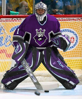
I think it's kind of funny that Roberto Luongo is wearing it. I guess L.A. fans can dream, right?

There was also a bit of Canadiens artwork that I made part of a Freak Out post that a lot of people responded rather well too. Here you can see what it looks like on Cristobal Huet.

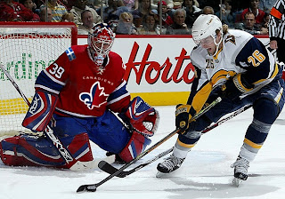
I wonder why both designers decided to paint fake jerseys onto goalies. Hmm.

Anyway here are a few more wacky designs that don't quite warrant being included in the Freak Out series.

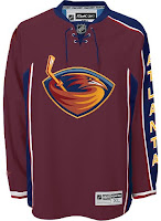
For those who don't care for the sky blue, how about maroon? Doesn't look terrible either. I'm sure the asymmetry is still driving you nuts though. And how about the Ducks' logo and colors on a Sabres jersey? That's pretty weird.

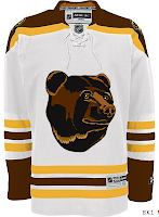
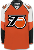
I thought the colors were interesting on the Bruins jersey. That logo really did wear out its welcome, though, didn't it? And for a complete change of pace, I've got a Flyers jersey with a redesigned set of logos.

And to finish things off, as far as ironies go, I thought this was a pretty good one.

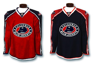
The Columbus Blue Jackets wearing red sweaters. Don't get me wrong. I think it's a really nice-looking jersey, but blue is in their name. It's one of those no-brainers.

Anyway, let me know what you guys think of those. I'll try to have more posted tomorrow.

Saturday
Sep292007

Mailbag: New Canucks Logo Looks Familiar

This morning I woke up to find one of the funniest emails I've received since starting this blog.

To set things up for you, one of the sites I frequent is Chris Creamers SportsLogos.net. It's an excellent resource for a blog like mine. When the Vancouver Canucks unveiled their new uniforms last month, a bunch of alternate/secondary logos appeared on that site — none of which I saw in any official NHL/Canucks capacity, however.

Anyway, among them was a logo that I personally thought could serve amazing well as a primary mark for the club. This is it.

Now the email.

Hey Chris!

Is that really an official secondary logo? If so, I've attached this! You may find it funny!

In Canada, we have these things that are like Hostess Cakes in the States.... Vachon Cakes! They're very popular.... and tasty! And I've heard that ol' goalie Rogie Vachon is a close relative to the family that started the company!

I knew I had seen the Vancouver 'Johnny Canuck' logo somewhere before..... hmmmm! I mean, mmmmmm!

So what do you make of that? I just thought it was very funny and felt it was worth sharing.

Tuesday
Sep042007

Canadiens Unveil New Uniforms!

This morning, the Montreal Canadiens unveiled their brand new Rbk EDGE uniforms to little fanfare. Overall, there were no major changes. The jerseys were merely adapted to the new style and cut, just as we'd expected. I have all the juicy details and photos below.

Before I go on though, I really need to send a huge thanks to the huge number of readers who emailed in links and photos. You guys are awesome! And you're the reason why I write this blog! I'm sorry I couldn't get stuff posted earlier, but I was amidst a live television show that begged my full attention. Moving along now.

Here's a shot of the back of the home sweater.

I also got an email with someone wondering whether the LNH logo would be used on the collar as opposed to NHL.

There's your answer. One last extreme close up photo and then I'll turn it over to you all for your comments.

I think these uniforms are great! Habs fans should be proud. Enjoy your big day!

UPDATE (1:40 PM): It's always nice to see what these jerseys actually look like on players. Here you see Cristobal Huet and Maxim Lapierre donning the new duds.

Remember you can find these and many other photos of all the new sweaters in my official Rbk EDGE photo gallery.

And if you have other photos of the jerseys that I haven't posted, send them along and I'll add them to the gallery.

Wednesday
Aug292007

Mixed Reaction To Canucks Makeover

It's officially official. At the time I'm writing this, there have been almost 150 comments posted on the previous post. Vancouver Canucks fans mostly seem to be upset by the new Rbk EDGE uniforms unveiled today at GM Place.

A lot of you guys seem quite unhappy. Specifically, you seem to loathe the wordmark above the crest. As a non-Canucks fan, I think it's great and that these jerseys are very sharp. Honestly, I don't have a single complaint. But I'm one voice against thousands. As a Lightning fan, I can somewhat understand your distress though. I've never been a big proponent of "TAMPA BAY" in the logo. At least the got rid of "LIGHTNING" in the new design.

Anyway, this post is about the Canucks.

The "C" on Markus Naslund's sweater is a little close to the wordmark on the chest, but it's not the end of the world.

The stylized stick-in-the-rink logo is an excellent touch that moves the uniform forward. And those colors — you can't beat them. I also find interesting the choice to put green on the jersey but not in the logo itself. A little unusual but that wouldn't be the first time.

That shot should offer a better look at the rest of the uniform as a whole. Nice touch with the logo on the pants. I'm adding all of these images and many more to the official Rbk EDGE photo gallery. Go check it out!

Wednesday
Aug292007

Canucks Unveil New Colors, Uniforms!

Take your first looks now. I'll have more in a little while. These images are from the streaming online video of the launch that took place this afternoon at GM Place in Vancouver.


Tuesday
Aug282007

Reminder: Big Day For Canucks Fans

Just a reminder that tomorrow the Vancouver Canucks unveil their new uniforms. Hopefully once that happens, I'll be able to go more than a day without posting Canucks concepts.

Here's what we're expecting: The new uniforms will likely don the orca logo in the traditional colors of blue and green. Some evidence has suggested green will be a uniform color but not found in the logo itself. We've also heard the old stick-in-the-rink logo may be a secondary mark — a shoulder patch. And there's also the possibility that the orca logo will feature different colors for the home and road sweaters (like the Calgary Flames, for example). Nothing is confirmed and it all remains to be seen, of course.

Fans will first set their gazes upon these new sweaters at 12:30 PM — which is 3:30 PM my time as I'm on the east coast. As has happened in the past, as soon as photos surface on cyberspace, I'll do my very best to have them right here for you.

Also, if you haven't voted on the Sharks vs Canucks poll in the tournament, I'll be changing the logo over to the new color scheme just as soon as I can. So you might want to hold your vote until we see what the new logo looks like.

Good luck, Canucks fans! I hope your day turns out as well as mine did. I was really happy with the new Bolts jerseys. Hopefully you'll be thrilled with yours.