HF&P, Part 17: San Jose Sharks
 Monday · Jun 4 · 2007 | 11:57 AM PDT
  Post a Comment
 There's more in the "Hockey Fans & Photoshop" series today. Now we take a look at some interesting concepts for the San Jose Sharks.
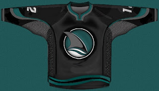
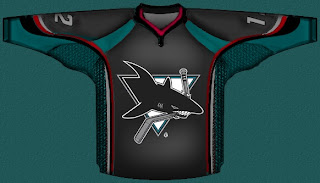
So that's one, simply replacing the shark-biting-hockey-stick logo with the shark fin logo, which I sort of like. What I think is really cool is this design.
The red trim adds an awesome "blood-in-the-water" feel. So I like it. However, I'm pretty sure the Sharks have plans to unveil a new logo this offseason so I wouldn't count on this one sticking around in any form.
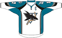
 This is the last of the designs I wanted to post. It simply shows the current road jersey in the new Rbk EDGE style. It's rather basic and I kind of hope San Jose doesn't try anything similar to it.
There you have it. One more possibility for new uniforms come this fall.
Up next: the Los Angeles Kings — yes, for the second time. That will come tonight at some point.


Reader Comments