HF&P, Part 25: Dallas Stars II
 Friday · Jun 8 · 2007 | 6:28 PM PDT
  Post a Comment
 What? I realize we already covered the Dallas Stars once in this series — back in Part 11. But I've found more artwork in my web searches. Check it.
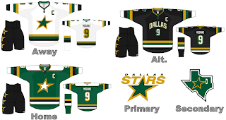
This masterpiece again comes to us by way of our favorite nostalgic designer. Not only do we see a rather severe case of Minnesota North Stars tomfoolery, but we're treated to Rangers numbering on the back. Also, gotta say, I'm just nuts about the alternate design. The city written across the chest may make this hockey uniform feel more like a basketball jersey, but it's different and we all know how I like things that are different.
I also like the idea of dumping the DALLAS STRS out of the Stars logo but I have a feeling we should expect some rather sweeping changes to it entirely. I don't know why I have that feeling, though.
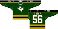
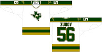
These designs don't really have any relevance beyond the fact that they're — yes, I'm going to say it — different. These are designed in the current style and makes use of the Stars' '90s uni layout and switches the primary and secondary logos. It's interesting but I don't like the state-of-Texas logo on the front of the jersey. It's not — balanced enough.
Anyway, that does it for the "Hockey Fans & Photoshop" series for tonight. Check back again tomorrow for a couple more designs, including — the Edmonton Oilers.


Reader Comments