Predators Unveil New Uniforms!
 Friday · Jul 20 · 2007 | 1:05 PM PDT
  9 Comments
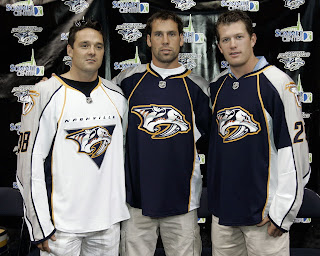
 The Nashville Predators have joined the small club of teams who have unveiled their new uniforms in the Rbk EDGE style for the 2007-08 season. And here they are.
Vern Fiddler, David Legwand and Ryan Suter modeled the jerseys in front of the home crowd at a team rally in Nashville. As far as differences from what they used to wear, you'll notice that the white jerseys now feature the word "NASHVILLE" written above the crest. I understand you can peel it off and replace it with "HAMILTON." No, but seriously.
Hope you like them. The Preds are the fourth team to officially unveil the new duds. I'm going to start keeping a running list of who's unveiled what. Some of the teams that have yet to do so have announced dates for said unveilings. You can find countdowns at the top of the sidebar.


Reader Comments (9)
"I understand you can peel it off and replace it with "HAMILTON."
Ha, chuckled out loud at that one. Cool site, keep up the good work! Looking forward to seeing what the Canadian teams do with their jerseys/logos.
Tough lookin' jersey!
I still don't like their logo, looks too much like a minor league team logo.
The silver arm bars on the white jersey is very cool, however I don't like how the bottom of the jersey is white. It needs a horizontal stripe of contrasting color at the bottom of the jersey. I hate when teams have a white jersey that stays white to the bottom of the cut without any horizontal stripe.
gary wat would u consider a major league logo cause uve been saying that some of the logos are minor wat is major league logo cause i no that there are minor league logos that look better then all of the nhl logos so please tell me
To anonymous: minor league teams (in baseball as well) have more tendency to go with goofy and/or aggressive team names, and tailor their logos to match. They also tend to go with animal names, which lend themselves to over-aggressive, cartoonish caricatures.
Look how powerful the Bruins jersey looks, without having a goofy cartoon bear or an aggressive snarling bear. Their secondary logo has a bear, but it is very classy looking. This is how I expect a MAJOR league logo to look, not like a goofy cartoon or some animal attacking.
I like the fact that they kept 2 logos. Almost every team that leaked ditched a logo. The jersey looks great, I like the sleeves once again.
of all the jerseys i have seen unveiled so far. to me... this is the SHARPEST jersey yet. very clean. it even COMPLIMENTS the new "shape" of the EDGE jerseys. almost reminds me of a motorcycle jacket. this gets the firs spot in my top 10 of the EDGE design jerseys.
Has anyone else noticed the collar, and where the nhl logo is... its different than all the other teams that have unveiled their jerseys. Everyone else has that little triangle on the collar where the nhl logo is. Nashville's is right on the jersey, they have a different style collar all together... i like it.
-Josh-
The road jerseys look great, with the silver arms, blue stripes, and the stylized "Nashville" above the logo. The home also pretty cool with their silver arms, the silver sides, and even the yellow vertical striping looks good. Big improvement over the old ones!