Kings' New Uniforms Official
 Saturday · Jul 21 · 2007 | 3:09 AM PDT
  14 Comments
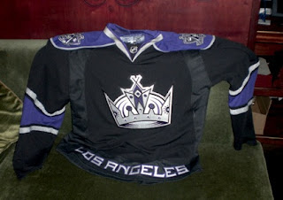
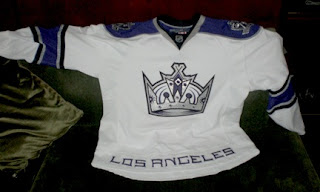
 It's been brought to my attention that there is in fact another team that has unveiled their new Rbk EDGE jerseys. The Monday after draft day, I posted photos I came across of what appeared to be said uniforms. Turns out, the Kings actually did unveil them officially at the team's draft day party.
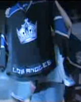
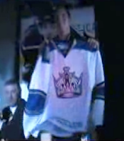
I know the image quality sucks, but you're looking at screengrabs from a video shot at the Kings draft party. They show Jack Johnson holding up the home jersey and Michael Cammalleri with the road sweater. For a better look at both jerseys, the photos I first posted were accurate.
Thanks to those of you who pointed this out to me. We now have five teams with OFFICIALLY unveiled jerseys for 2007-08. If you want to keep up with who's done what, there's now a tracker in the sidebar.


Reader Comments (14)
I like the new uniforms, but I wish they'd get rid of the "Los Angeles" at the bottom. I think all of the fans know which city the team is from.
the la at the bottom is like the only good thing besides the crown on those jerseys it wat makes em stand out from the rest of 29 teams dumb ass
All right, now. No need for talk like that here. Take it back to your message board or wherever you came from. I know not everyone will agree on everything, but that's no reason to start in with name-calling. Grow up a little bit have some respect for people or keep your opinions to yourself, please. Thanks for reading, guys!
Poor attitude, but I agree with anonymous, that the "los angeles" is a unique feature that is nice to see remaining on the jersey. I am not a LA fan but I do like the jersey. Holding my breath that the Canucks jersey and logo will rock. Thanks for the web site, a great resource for the fans, much appreciated effort!
I liked the old Kings jerseys with the black silver and white. I believe that any team that has black as one of their colors should use it as their (dark) uniform. The old jerseys are like the football Raiders' jerseys. Black is the best way to look badass unless you put it with purple. The only purple in a uniform should be from the bruises on the players bodies.
Those are indeed the Kings new threads. I know, because I took the pictures.
http://www.insidesocal.com/hockeywood/2007/07/post_12.html
Many Kings fans absolutely despise these jerseys. I'm indifferent myself.
--- Matt
I can live with the "Los Angeles" at the waist, but I think it would look better if it were inside a contrasting stripe. As I mentioned in other posts, I don't like when the body color of a jersey extends all the way to the waist line. I think a bold, contrasting stripe across the waist looks better.
I'm not a kings fan but I have to admit that's one nice looking jersey.
This jersey made me laugh when I saw it..I have to admit, it looks really good. It's probably the most crowded jersey yet. But the different black fabric that they used looks random and awkward. The "Los Angelos" at the bottem is a good idea tho.
Are you sure they are official? I keep checking they're website and they don't even have the new EDGE jerseys for sale, as all the other teams who have unveiled their new jerseys have put links to their jerseys on their site. Also, on the shop.nhl.com site, the Kings don't have an image posted for their new RBK EDGE jerseys. Any thoughts?
They are official. As you can see, the Kings unveiled them at their draft day party. Not sure why they aren't in the NHL.com shop yet. But those are the real deal.
Similar deal with the Rangers where they leaked them on the web site but took them down. Thanks for the comments!
Well, I'm just saying. As probably you do, I have been checking every team's website every day, on top of this very great site, to see if they have any new jerseys to unveil. I never saw any official announcement for the Kings or the Rangers, for that matter. Also, I noticed someone make a remark on the CCM label for the Rangers ones, and I couldn't help but agree with him. However, apparently someone saw the Rangers links, but still, I am a bit skeptical. Once again, just my thoughts on this.
I understand skepticism. But I guess it's because I'm speaking from personal experience on the Ranger jerseys. I actually downloaded the images from their very site during the few hours they were actually up. It's because I know those Rangers jerseys came off of their official site and I grabbed them myself that I stand behind them, you know? I wish I'd grabbed a screenshot of the web site that day.
Anyway, as for the Kings, that video is from the unveiling party. And as for both teams, the pictures are good resolution. You can very much tell that it's made up of all the right fabrics and materials for the Rbk EDGE jerseys. No reason to doubt them in my mind. Or else I wouldn't post them in the "official" list. That's why the Penguins aren't on there.
Just thought I'd offer my reasoning. Thanks!
Wish the Kings could combine more of the original purple/gold so there is some historical link to the past. Home jersey is now to black with just the city name at the bottom IMHO.