Canucks Fans, Prepare Yourselves
 Sunday · Jul 22 · 2007 | 11:03 AM PDT
  6 Comments
 A link to this blog was recently posted on the Vancouver Canucks' message board. Most of you over there seem to like the site. A handful of you are skeptical as to where I procure my information, specifically the bit about the August 1 unveiling date for your team. I don't blame you.
First, I should tell you I was hesitant about putting that date in the countdown. It comes from a retailer who spoke in an article printed in the Vancouver Sun. Consult this post for further details on that. Second, all of the information I post here is secondhand. I don't intend to pass myself off as an authority on the subject, merely an information-gathering resource. I surf the web and find a lot of nonsense and I try to parse it for factuality. Obviously things will slip through the cracks but then take from this what you want.
In the meantime, everything I post I try to explain. Whether it's artwork designed by a fan or rumors or an official announcement from a team, you can trust me when I tell you I'm not going to make anything up out of thin air. What would be the point? Still, take everything I post here with a grain of salt. As I keep saying, until teams make official announcements, all we have is speculation.
Now then, as a thank-you to whoever noticed the site and decided it was worth mentioning, I have a treat for you. Well, actually that depends on how you respond to this little gem.
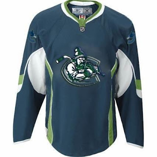
Now, don't be fooled, Canucks fans. What you're looking at will only make its way onto the ice they day you ride a unicorn to games. But I thought it was an interesting design, with colors we haven't seen before. I came across it on the Miami Herald's Florida Panthers blog while looking up information I posted earlier today.
It's like a tougher version of Johnny Canuck inside the orca "C." The designer also placed the current orca logo on the shoulders (backwards on one side for some reason).
Once again, don't freak out. It's not something that's been leaked by the team (or I'd hope not). It's obviously artwork designed by a fan and clearly not the work of a graphics professional (no offense to the person who came up with the idea). Having said that, what do you think of it? Would you like to see something similar on jerseys for the fall?


Reader Comments (6)
when will people learn that any 'concept' or 'leaked' image is NOT GOING TO BE BASED OFF THE FUCKING ALLSTAR JERSEYS.
christ.
You seem annoyed. Shouldn't take things so seriously. For a long time, the all-star jerseys were all people had as far as what the Rbk EDGE uniforms would look like. And so forgive them, but that's the template these designers have had to work with for the last several months.
However, if you go through the blog, you'll see there are more than plenty of concepts that don't adhere to this overused template. Thanks for the comment.
Thanks, I'm glad you enjoy the blog. And to be fair, I do understand your frustration. It would be nice to see some originality in the images I post, but I'm just the messenger.
As it happens, I hadn't seen all of the images you posted. I did run across the Lightning jersey designs somewhere but this is the first time I'm seeing the rest.
For the record, I think it's impressive work. My favorites of that bunch are the Lightning, Sharks, Avs, Hurricanes and Islanders. We should be so lucky to see these designs on actual NHL jerseys in the future.
I'll post the images sometime this week for others to see, so I appreciate the heads-up. And as always, thanks again for visiting and posting your comments!
I really like this design. The color combination harkens a bit to the old Hartford Whalers and the logo itself is much cooler than the idiotic Orca.
I've never understood the whale in the Canucks logo so almost anything would be an improvement, but as for this, I have my doubts. I do like the colors, however. You don't see those all the time.
This version of the Johnny Canuck logo appeared in the Vancouver Sun shortly after the team introduced the whale logo. The designer made the logo public and also submitted it to the Canucks organization which was apparently well received by Brian Burke and the rest of the Canucks brass. There was speculation that it might be used in an alternate jersey design, but never was. A similar logo has since appeared and is currently being used by the Western Hockey League's Vancouver Giants. Similarly, the Giants' logo incorporates a lumberjack character carrying a hockey stick as if it's an axe.
Link:
http://www.vancouvergiants.com/