Tuesday
Jul242007
New Lightning Logo Concept Design
 Tuesday · Jul 24 · 2007 | 2:14 PM PDT
  7 Comments
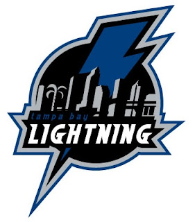
 I just came across this fan-created concept logo for the Tampa Bay Lightning while surfing the web.
It makes use of the skyline and a palm tree, which I like, only the Bolts can't do it because stinkin' Panther fans would cry foul and say it was stolen. (Though if you guys recall, you did steal the broken stick thing from the Sharks. Don't know if you remember that bit.)
Anyway, kudos for the sharp work by the artist, but it's not my favorite because of the wordmark in it, but I could see it as a shoulder patch or on a hat or something. What do you think?


Reader Comments (7)
I see it as being very original. Still hard to draw from a kid perspective, but a lot of logos are.
The lightning logo is waaaay due for a remake.
In a weird sort of way i like this alot...Chris whats your opinion since your a huge bolts fan!!!
Tom
Well, as a Lightning fan I think the words in the logo have gotten old. I think a logo should be a symbol that you don't have to read to know the team you're looking at. Still, the more I look at that logo, the more I like it... just not as a crest.
If the Bolts made hats or t-shirts with that logo or something similar, I'd buy them. I could even see this logo as a shoulder patch. It's just not right for the front of the jersey. The biggest reason is that it hides too much of the Lightning bolt. Thanks for asking, Tom!
http://www.modsquadhockey.com/pics/JR/TB_orig_logos_2007.jpg
Surprised you haven't noticed this...I leaked it along with the Sharks one.
/TB_orig_logos_2007.jpg
Actually, I http://nhllogos.blogspot.com/2007/07/possible-new-lightning-logo.html" REL="nofollow">posted that two weeks ago. Thanks for mentioning it, though!
I LOVE it, I live on Davis Island and have always loved the skyline