Sharks Unveil New Logo!
 Tuesday · Jul 24 · 2007 | 10:16 AM PDT
  12 Comments
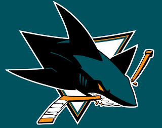
 It's here and it's real. The leak proved right. This is the new logo of the San Jose Sharks.
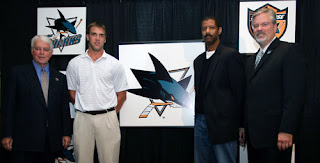
For my money, it's a huge improvement on a good logo that needed a little help. While I don't love the hockey stick in the logo, I understand the team didn't want to completely revamp their image, merely improve upon what they already had. At the press conference, the Sharks only unveiled the new logo set, no uniforms have been shown at this point.
The club also unveiled a bunch of secondary marks including the new shoulder patch and shield, seen above. All of these logos and more can be seen on the the Sharks new web site.
We've had a few weeks to ponder it thanks to the leak, but now that it's official, what are your thoughts? Did the Sharks make the right choice by updating what they had? Or would they have been better off revamping the look altogether? Comment below.


Reader Comments (12)
I don't know if I like it or not yet. I still feel shaked. I'm an avid collector of NHL jerseys. The present times are like...very disturbing to me.
I don't like the curve in the hockey stick. It's not natural, more Batman feel. I thought the old logo was cleaner with the stick right. Same for the up corner of the triangle.
I believe that I will get confortable with the logo in the long term. But for now I feel bizarre.
I think it looks great. A nice evolution on the previous logo with sharp colour choices. The Sharks have(had) the best looking jerseys last season in my opinion. Here's hoping the new ones look just as sharp.
Another thing that made the old jersey of the sharks great was the way letters were written. I hope they will retain that look for their new sweaters. I remember back in the time sharks arrived in the NHL. Everybody were crazy about their jerseys and colors.
Now It's evident that they will add orange as an alternative color. The color fit well with their pacific feel, but I still think people will not go crazy about that like in the 90's.
A big improvement is the 3D look of the shark. Compared to the old one logo, we clearly see that an upgrade was due.
Still not sure about this minor leaque logo...mmm
Thanks for the comments, all. The "Batman: The Animated Series" thing seems to be going around. I completely agree that this logo looks more like a cartoon than the last, but I do like the 3D effect. Not only that, but it uses more color than the old logo and that's a step in the right direction. It's not perfect but hardly anything ever is.
As for the unnatural curvature of the stick, I've been staring at it for a while and more and more I feel like the stick isn't curved so much as the curvy nature of the logo is causing an optical illusion. But then again that could be because I've been staring at it so long.
Once again, I appreciate the feedback on the blog and thanks for reading!
Another point in that story is the modern feeling of all these logos. I know it was time for a change, but as I see it taking shape I'm questionning the whole process.
I think the overall view of a logo is what stand at the mind the first time you see it. And it seem that all the new entries are going for the curved style.
This San Jose logo is in that mood. The old one was designed like the old Pittsburg one. As a kid, it was easy to remember. Triangles. Now if we look at the new direction (Buffaslug, capitals, sharks) all is now elliptic.
And the more I look at it, the more I like the one with the complete shark.
At first i wasnt a big fan of these, but i short of like it now...i really like the secondary logos..their awesome..
Tom
I'm a huge fan of the shoulder patch. It's so much better than the fin in the circle. The added color makes the Sharks' new logos look so much improved. Personally, I like the http://www.icebullshockey.com/chris/nhllogoslg/sjsalt1.png" REL="nofollow">full shark logo better than the one in the triangle. But that's just me. Thanks for the comments, as usual.
I will never be able to accept the orange as color beyond the stick (and eye) of the logo. Replacing the grey in the color scheme, to me, is a complete and utter travesty.
I like what they've done with the logo *itself*, but the orange as a trim and .. ugh.. "main" color in the fin and shield logos can't stay.
I can guarantee most fans won't stand for it in the long run, especially if orange is used in the jerseys.
While I understand change is difficult to accept for many, but being the farthest thing from a Sharks fan, I'm probably not the best judge of this. In fact, I liked the orange. Thought it added a lot to the color scheme. I'm sure you'll get used to it, right? Thanks for the comment, Glenny!
what i dont get is that everyone knows that when a shark attacks it closes its eyes, so why can we see the eyes if he's biting. the shark looks great, i just think that the stick should go that way the eye makes more sence. if not and you keep the stick the eye should be closed and uou lose the orange color. it makes more sence to loose the stick and keep more color by an open eye.
I'm worried you might be overthinking things at this point. Most hockey fans probably aren't shark experts and therefore aren't bothered. Yet having said that, I'm with you on removing the stick. It's kind of an eye sore. Thanks for reading!
I personally think this is great change. The new Sharks primary logo and its secondary logos are a marked improvement, in my opinion. I agree with you Chris, that shoulder logo containing the new shark fin is really sharp. As far as the orange as a new color is concerned, fans that are not warming up should realize this is an accent color. It's not as if it is a primary color like the darker teal. I think it's a nice addition as long as it is not overused. I want to see the new Sharks jersey to be unveiled soon be similar to the original jersey, a simple but sharp look. I couldn't stand the jerseys they wore last year (except the alternate). The numbering and lettering hopefully will be back to what was on the original jerseys, too. With this new logo, there's so much potential for it on a jersey, I just hope the Sharks don't blow it.