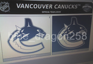
Possible New Canucks Logo?
 Wednesday · Jul 25 · 2007 | 10:23 AM PDT
  14 Comments
 Try not to filet me, Canucks fans, but I may have stumbled upon your team's new logo.
I can't speak to the veracity of this image. It may well be the work of a fan toying with rumors learned of on various web sites and message boards. Still, it's something to consider.
This image appears to be a cell phone photo of a computer screen showing the logos on official NHL stationery. But don't be so quick to take it as fact. From what I've seen of these design sheets, the fonts don't quite match and that makes me question whether this is someone just trying to have a go at the hockey world. However, there's no reason why the league couldn't change the font on the stationery. So it at least seems to be a possibility for us all to consider.
Now my feeble analysis: I feel it's more a downgrade than an upgrade on a logo I thought was great as it was. To lose the maroon and light blue only serves to hurt the symbol which now no longer has the feel of the Pacific Northwest that it once did. I might eat my words if the maroon or light blue was simply replaced with the classic Canucks green. But it remains to be seen whether this is the real deal or not.
According to various sports retailers, the Canucks have apparently told them that there will be changes to the logo and uniforms for the new season. They've evidently also been told to expect an announcement regarding such changes on August 1. That is a controversial date to Canucks fans who would prefer to hear it from the horse's mouth. But team executives have their lips sealed tighter than a cow's ass in fly season (which is to say they aren't talking).
What do you guys think of all this? Speculate below in the comments.


Reader Comments (14)
PLEASE I HOPE THIS IS NOT IT!!!!!
Tom
I'm with you, Tom!!!
That looks pretty bad. The current logo is much better than that.
I'm clearly afraid it's the real one.
It was for me the most anticipated unveiling of all jerseys.
It's growing on me that it's the true one.
This morning I just came across my yellow skating jersey (home one, after the V era, who was great by the way). It seem to me that the canucks had great jerseys in that time, but I'm a curious person.
I never judge a jersey before having one in my hands.
This is my philosophy as well. You gotta let things ride out sometimes. I'm eager to see whether the Canucks will go monochrome (with colors quite far removed from the ones you spoke of) or make a change for the better (two completely different things if you ask me).
But as a lifelong Tampa native and Lightning fan, the most anticipated unveiling in my world will be for the Bolts. As always, thanks for the input!
fuck that stupid chugg whale nobody wants a damn native freakin symbol. if they do decide to keep it tho i wouldnt mind the blue,green,white concept of the whale on this site i saw that looks way better!!
tthe only UPside to this logo, is that the jerseys might look decent...
is it just me, or when i see these colors, i think 'ice'..
That's good point. Despite the lack of color, it does have a distinct icy feel to it. Thanks for the comments, all!
The mouth of this killer whale is poorly done. It can be adressed easily.
The new colors (ice baby) are mutch fitting than the old ones.
Still not a logo that I love, especially for the beloved Canucks.
So, sephiroth, who is your team? I'm just curious as you seem to hold many very dearly. It's a nice trait to see in a hockey fan. I happen to like the face of the whale on this logo. I think the Haida art style is very visually interesting. But that's me. Thanks for the comments!
Well, I started watching hockey since my birth. I have so many teams that I like. The logos were a great part of witch team I liked, and witch team I don't.
I fell in love with Pittsburg early, Vancouver (their yellow V was for me an ideal and an item to find absolutely) I got one V jersey for my 8 anniversary. Also Montreal, because of the dominance of Guy Lafleur and their beating of the poor Nordiques.
So many teams I like. Calgary (1989), when I cried of joy. Los Angeles (miracle), Winnipeg also.
All these teams were so great I had to have their jerseys. Now my house is paint with the colors of all these teams, one per room.
It's why the current times are very disturbing to me.
That's really cool, sephiroth. But don't think of these times as disturbing. Think of them as creating more classics. Today's jerseys will one day be looked upon that way as we enter the new Reebok era. Personally, as much as I respect the past and tradition, I'm a fan of what's new and different. Unlike many people, I like change and I look forward to seeing the new look of the NHL this fall. Thanks for reading!
Taken From Canucks.com
Rbk
View Member Profile Jul 20 2007, 04:48 PM Post #1
Member
Group: Members
Posts: 270
Joined: 24-July 05
Member No.: 23,287
Just got some details from my uncle about the new Canucks jerseys that are unveiling next month. He got a first glimpse at it because he works for a printing company that prints those Authenix catalogues for the Canucks. He didn't get a peak of the actual jerseys, but he saw pictures of them being worn my models. The only details I got from him is:
-colour scheme remains the same minus the maroon
-the orca whale is still there
-one new logo
-no signs of vintage logos or themes
-traditional Canucks' trims are gone
-trims on the socks changed
-added an NHL logo on the collar
-tighter fit
The only thing he refuses to tell me is whether the new logo is on the front crest or on the shoulders, I guess we will have to wait to find out.
Take his words for what they are worth....
Anybody brave enough to put together what this guy is sayin?
If this is truly the Canucks new logo (well current logo with a new colour scheme), I am not totally impressed nor totally disgusted. By itself it doesn't look that impressive but I think it could look very classy on a jersey! Although I very much hope that green has not been eliminated from the clubs colours. I'm not a huge fan of the whale, however with that said I have always liked the Heidi styling in the teeth and dorsal fin, and the simple swirl of the eye. Living in Vancouver we hear almost daily about what the new jerseys will look like. It's crazy how much speculation and hearsay is going on. But all we can really do is just wait for the official unveiling to know for sure.