Rangers Unveil New Uniforms!
 Thursday · Jul 26 · 2007 | 12:43 PM PDT
  33 Comments
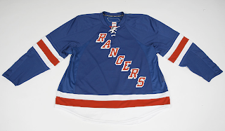
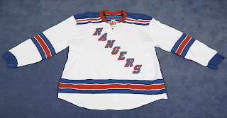
 There was no fanfare or big unveiling ceremony, but the New York Rangers now officially have their Rbk EDGE uniforms. They are up for pre-order on the Rangers' official web site along with photos!
As you can see, the jersey designs were not changed, merely adapted to the new cut. So that's that. Hope you Rangers fans like them. Now those among you annoyed with my posting of frivolous matter such as jersey designs in the template of the all-star uniforms can finally rest.
By the way, HUGE thanks to a reader for letting me know about this! You guys are great!
UPDATE (5:20 PM): I've just been informed the Rangers have since taken these photos off of their official web site. Like the Flyers they now only have a page up where you can pre-order the jerseys — without being able to see them. Luckily for us, we've already seen them and there were really no changes made. So if you have friends who are Rangers fans who would like to buy a jersey, let them know that if they want to see pictures, we've got them here.


Reader Comments (33)
Still there are no large black Reebok tags on these NY jerseys.
The white panels along the bottom under the stripes is gonna look ridiculous against the red pants. Too much white. I agree with other posters, the late 80's & early 90's "Cosby" jerseys were the nicest. They looked awesome, especially in person. I used to go to alot of away games and always heard opposing fans comment on how nice they were.
Does anyone here find it odd that an official unveiling of a jersey for a professional organization would consist of two photos of a jersey thrown on the floor. These jersey's are a joke and better be nothing more then a prototype / publicity stunt. im all for keeping the tradtional look but from a design standpoint these are disgusting.
itgs pretty sad how they are a professional team in the highest level of hockey you can play and yet they dont even have a logo...words of your city on a jersey is pretty lame
Brett... First off, the jerseys say "RANGERS", not New York. Secondly, they have been this way for 80 years (aside from a brief period in the 70's) and are much classier than the vast majority of logos out there. Lastly, they DO have a logo but don't have it on their jersey...no different than the Yankees "top hat" logo. Then again, you probably think that the Yankees just using the NY is pretty lame as well...
"Anonymous said...
Still there are no large black Reebok tags on these NY jerseys."
The Reebok logo is on the back of the jersey at the neck - you can clearly see the stitching outline of the 'parallelogram' Reebok logo through the other side that we can see in the photos. At least in these promo pics...
Also, you can see the NHL logo at the "V neck" - right beneath the neck lacing of the jersey.
I just received my authentic blue Rangers jersey today. I have to say I like them. Not much change to them than previous. A more vertical lettering on the front. Of course the NHL logo is now above the draw strings instead of the tail. The jersey is more of the wavy design on the hem instead of straight. The only changes to the size is a little noticable in the arms and chest. I got a 56 to keep it loose so if you are getting an authentic jersey then you might consider getting a size larger than you normally wear. These new styles are really cool, but I still like the older style better. Anyway, I have both now.