Thursday
Jul262007
Some Rangers Jersey Design Concepts
 Thursday · Jul 26 · 2007 | 11:28 AM PDT
  8 Comments
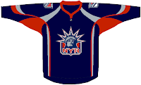
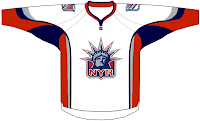
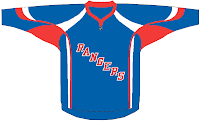
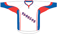
 Earlier I posted some Wild designs but along with them I found these for the New York Rangers. Have a look.
I'm not expecting the Rangers new duds to look anything like these designs, but I'm of the opinion they should switch to the Lady Liberty logo full time and save the jerseys with "RANGERS" written across the front for special occasions like a vintage jersey. What do you guys think? Keep with tradition or move forward?


Reader Comments (8)
Same deal as the Wild concept seen below. Why bother?
They should clearly move along and take that new logo with the lady.
Totally agree with you
actually the new Rangers jersey's were in fact revealed today:
http://www.nyrangers.com/fanzone/0708Jersey.asp
Thanks so much for the comment! I'll post it right away. You guys are awesome!
yeah i just looked they are exactly the same as what they were
I hate the Rangers, but their jerseys are among the best in the league and it's good that they didn't go to a Lady Liberty look (though, it does look good on the darker 3rd jersey), or do anything else to them.
No way.. You keep the diagonal logo and stay with tradition..
Just not feelin' it with those Rangers concepts. This is an Original Six team and thankfully they didn't adopt that Reebok look the way Predators and Panthers have. I do love the "Lady Liberty" alternate crest logo. I wonder what it would look like on a royal blue jersey though. Same for an alternate red version of what they have now. Another thing, that off-centering of the diagnol "RANGERS" across the front of the new jerseys better not look bad when a player wears them or I won't be happy to say the least.