Rangers Unveil New Uniforms!
 Thursday · Jul 26 · 2007 | 12:43 PM PDT
  33 Comments
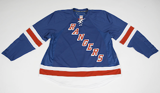
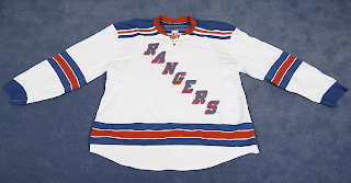
 There was no fanfare or big unveiling ceremony, but the New York Rangers now officially have their Rbk EDGE uniforms. They are up for pre-order on the Rangers' official web site along with photos!
As you can see, the jersey designs were not changed, merely adapted to the new cut. So that's that. Hope you Rangers fans like them. Now those among you annoyed with my posting of frivolous matter such as jersey designs in the template of the all-star uniforms can finally rest.
By the way, HUGE thanks to a reader for letting me know about this! You guys are great!
UPDATE (5:20 PM): I've just been informed the Rangers have since taken these photos off of their official web site. Like the Flyers they now only have a page up where you can pre-order the jerseys — without being able to see them. Luckily for us, we've already seen them and there were really no changes made. So if you have friends who are Rangers fans who would like to buy a jersey, let them know that if they want to see pictures, we've got them here.


Reader Comments (33)
The wording seem more vertical to me. I think the Rangers could do more. Especially with the team they are going to have this year.
Good catch guys... Especially since the Rangers have taken the links off the official site. Hmm... I guess they didn't mean to leak those photos just yet.
Wow, you're right. I just went to their site and the photos I posted which I originally got there are now gone! But don't worry, I won't be taking them down. It was a good thing I grabbed them when I did.
no wonder there was no big announcement
good job Chris at getting these now..i just went on the website and their gone...this is exactly what i thought they would look like.
Tom
Is it just me or is the lettering too much to the right on the blue jersey? Looks fine on the white.
I think the lettering is positioned the same on both jerseys, but there appears to be a lot more space in the lower left corner than the upper right. That may not be the case when the jersey is actually on a player though.
As for the comment about the lettering being more vertical, I noticed that too. I think they're trying to tighten things up since these jerseys aren't as wide.
Thanks, guys!
The lettering is more upright since they do not want to put letters on the stretch material panel that goes from close to the collar and down under the arms. Thats why the lettering does not look centered. The jersey is actually wider at the bottom than under the arms so they end up with more space as the lettering goes down and across.
Did anyone else notice that the white jersey has tails (rounded bottom) while the blue jersey is straight cut?
My mistake. The blue jersey also has a round bottom. I just could not see it against the background.
A straight cut would look better on retro style jerseys like these.
i freaking hate the fact no third jerseys are used this year.
i honestly dont get it either, it seems rediculous. the liberty jerseys were amazing too.
The Bruins "modernized" their logo a little bit.
The Bruins kept their jerseys basically the same.
Here's hoping ALL Original 6 teams don't touch their uniform designs.
found new canucks jersey!http://thecanucksreport.blogspot.com/2007/07/possible-new-uniforms.html
I can't believe they ditched the 3rd jersey with the Liberty Head
They didn't. Bettman did. Blame him. I was sad to see it go too. But fear not, I'm sure it will make its glorious return, possibly as soon as 2008-09.
This only makes the Sabres look worse, as "managing partner" Larry Quinn insisted that traditional striping and logos wouldn't work with the new Edge system.
Props to the Rangers and Bruins for staying true.
As I said on Chris' previous post on those Rangers jersey concepts, I just hope the diagnol "RANGERS" across the front of the new jerseys that are off-center don't look that way when a player wears it. If it still looks off-center, I won't be happy. But, we'll just have to see come next month.
Hate to burst anyone's bubble, but that's the way the jerseys are gonna look. Period.. If you zoom in you can see that the top of the 'R' is on the edge of the center section on the jersey. There's no way they can move the logo around in the middle because of the new RBK design.. As a die hard Ranger fan, I can't say I mind. I like the classy look. Better that that awful new jersey the Isles have.
I like the old ones better. being a ranger fan, we really pay attention to stuff like this. The lettering is closer together and more diaginal. personally i like the ones we had last year better, but these were customized for the NHL players to wear. As long as they help the rangers i'm happy. this is our year!
I appreciate the traditional Ranger look but gotta go along with those who are concerned about the lettering starting too close to the center of the jersey!!! Looks off, I sure hope that's not how the final design will be. Damn.
I don't know guys, I feel like these may be prototypes still. Think about it, they were on the Rangers website for like 5 hours (which I happened to see), but then were taken down. Also, look at the hemlines on the two jerseys. They are completely different, and that is why the R is closer to the center on the blue jersey than the white one. I think they would use the same template for both, no? I hope so at least, I want to see the rangers typeface centered!
That ain't a logo. I don't get why they don't use the other logo..but the jersey looks good.
As noted in Jake Duhaime's column in "Inside Hockey" (http://insidehockey.com/columns/811), the letters had to be brought in a little tighter because of the "sweater" design. As for the "R" being more centered on the blue vs the white, if you look closely the seams are slightly different because the Rangers have the blue shoulder design on the white jerseys. They had to sew a slightly different seam pattern on the whites in order to keep the original blue shoulder design of the white jersey. With the blue jersey it doesn't matter because everything - with the exception of the bottom hem - is all one color. I prefer the CCM heavyweight mesh jerseys of the late 80's to mid 90's. As any true Ranger fan would tell you, these were the Gerry Cosby jerseys! The recent jerseys had material and construction no different than the cheap Starter replicas of the 90's.
These are not the new New York Rangers jerseys. If you look closely at the pictures you can clearly see the tag in the back has a Canadian flag like the old CCM jerseys. The new RBK Edge jerseys do not. Take a look at the
ex. Red Wings new jersey the tag in the back is black/grey with the NHL logo to the left.
If you look at the released jerseys at the official nhl shop, you'll see that none of the new jerseys have a Canadian flag. That means that I not only hope you're right, but you could well be as well.
Go to: http://www.icejerseys.com/enlarge_flash_popup.php?id=5365
And zoom in and you will see that some of the new jerseys DO have a Canadian flag.