New Oilers Jersey Design Concept
 Friday · Jul 27 · 2007 | 11:25 AM PDT
  13 Comments
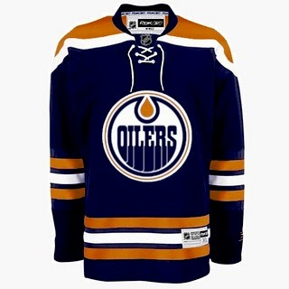
 Thanks to another reader who came across this image of a dark jersey for the Edmonton Oilers. At first, it seems to be the real deal, but as with all jerseys yet to be publicly unveiled, you have to look at the ones that have been unveiled to compare. Take a look.
As far as changes, this one is rather different from what the Oilers have been wearing. It dumps the bronze and red altogether for a return to straight-up orange and blue like in the old days. The one thing I did hear prior to this post is that they'd be doing away with the oil man shoulder patch logo and this design does take that into account.
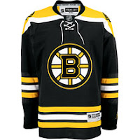
 However, now that you've had a minute to look at that design, compare it to the Bruins jersey here to the left — a jersey which has already been unveiled to the public. See any similarities? How about the fact that the entire layout is verbatim, the stripes and everything — the only alterations being the colors and logo. But the designer did one thing cleverly to try and throw us off the path. The strings hanging from the collar have been slightly modified. Compare the strings hanging on the right side.
Anyway, take this image for what it's worth, but it seems clear to me that this is the work of one of our friendly Photoshop artists.
For the record, the Oilers have yet to make an official announcement regarding uniforms. I'll let you know if I hear anything. In the meantime, what do we think of all this?


Reader Comments (13)
I would actually love it if the Oilers did this, though it'd be similar to the Islanders jerseys in terms of colors.
This is true but I think the bronze and red are rather cool and would hate to see them go. That being said, I'm not an Oilers fan so I shouldn't really get a say.
As far as it looking like the Islanders jersey, I think it would be cool if the Isles went with an orange home uniform — not quite like the http://bp1.blogger.com/_r8tWGVHrjGI/RnwmnrzZcII/AAAAAAAAArA/Q1XS0-W2h1E/s800-h/NYI2008.jpg" REL="nofollow">eye sore that I posted a while back, but something close.
As always, I appreciate the comments!
A more muted color version (replacing the orange with more of a dulled out copper), has been posted over at modsquadhockey and I have to admit I thought it was the real deal at first too.. but I came here to check for any further news (I like to have more than one source before I take anything to heart), and saw your most recent post.
I have to agree, definitely looks like a photoshop, and with a lack of anything official from the oilers, then it'll remain in the "Darn, just when I was liking it too" arena.
Thing is, I *do* like it.
Chris, I'll try to find the article for you, but I remember ESPN doing a column around the all-star break, saying that home teams will start wearing white again this season.
fingers crossed on that one.
as far as the pens logo goes, the triangle symbolizes the confluence of the three rivers.
i'm glad the pens got a huge W against the Isles.
The Wild's logo is sick.
I never realized it until last summer, when a friend pointed out to me that the entire logo is actually the face of a bear or something.
And there is an "H" in the Hartford Whaler logo. Never noticed it before.
An "H" and a "W" as a matter of fact! The Whalers was one of my favorite logos ever.
I vaguely remember that ESPN column as well. Only thing is I also remember reading something on NHL.com which quoted Gary Bettman as saying the teams would continue to wear the dark colors at home for reasons undivulged.
Sounds like you're not a fan of that. Personally, I got bored of seeing white at home all the time. Not that the Lightning's black jerseys were that much better, but at least I could differentiate them from the ice with a little more ease.
Seriously though, I know that the initial reason for the switch to dark at home was so that teams traveling could save money. When the third jerseys were introduced, they weren't white but teams always wanted to wear them at home, meaning a team on a road trip would have to pack both sets.
Incidentally, only once did I ever see a game where neither team wore white. It was the Rangers and Bruins and both wore their third jerseys — dark blue and yellow, respectively.
Anyway, thanks for the comments as always!
I can tell by your catch of the strings in the jersey concept drawings that you're a stickler for detail, which means you have an insane memory.
hah me too.
The past two seasons, the Penguins have worn their dark jerseys on the road twice.
Both times have been against the Maple Leafs.
Ha, indeed, because what color is the Maple Leafs' third jersey? Very interesting. I think the Rangers are the only smart ones, having that Lady Liberty alternate jersey in both dark blue and white. That way they can wear it whenever they want without interfering with their opponents' duds.
Is it weird that stuff like this fascinates us? Even if it is, I'm okay with it.
I remember seeing during a home-and-home between the Sharks and Ducks last year that each team wore their dark jerseys on the road and their whites at home.
sorry folks, its darks at home, and will likely be that way for the forseeable future.
Also, there's one other catch that you missed Chris. On the Oilers jersey, the white trim that goes around the shoulders goes completely around, where on the Bruins, it stops. Not enough to keep it from being photoshopped, but might be enough to consider.
Found new canucks jersey!http://thecanucksreport.blogspot.com/2007/07/possible-new-uniforms.html
I'd rather the Oilers kept the red in their jersey. It's too much copper in that design.
That jersey is beautiful. My opinion is that they shoul just change the striping up a bit and add the Todd Macfarlane Oil logo as a shoulder patch and you'd have a perfect jersey.
Too bad the nhl 08 picture showed an almost plain whit uniform.
I believe a recent all star game featured RED/grey jerseys versus BLUE/grey jerseys. Add to that the atrociously poor quality CBC broadcast, and you literally couldn't tell who was on which team!
As far as the Oiler mock-up goes, as a long-time Oilfan, I love it. It's flawless. So is Boston's. Simple and clean is best. But that OXM leak of Roli scares me. Tubing is wrong. So very wrong.