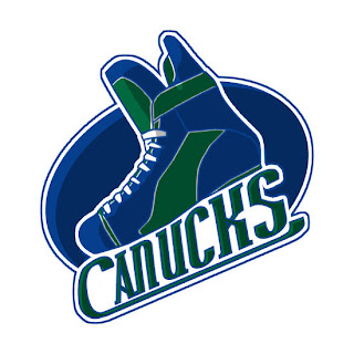
Fans Design Canucks Concept Logos
 Saturday · Jul 28 · 2007 | 2:33 PM PDT
  7 Comments
 I came across this fan-made design on a Vancouver Canucks message board. The artist put a new spin on the flying skate logo and combined it with the traditional blue and green color scheme. What do you think?
That's a skate all right. If you're curious to see what it would look like on a uniform, the designer took the liberty of putting it on the jersey template designed by John Slabyk to go with his logo redesign (which, frankly, I like a lot better).
Incidentally, with all this about the colors being altered for the Canucks logo in the coming season, another fan toyed with the idea of bringing in the green to go along with the blue. He also trades out silver for black. Have a look.
Anyway, that's all I've got for the Canucks today. Comment below if the spirit compels you. (By the way, I apologize for the late posts today. Got a late start due to prior commitments.)


Reader Comments (7)
argh... all this canucks stuff is driving me nutss cant wait for the bloody 1st of August lol... it just feels like there are soo many restrictions now to the jersey theres no telling what we ould expect... either way i just hope its cool so we can hold on to it for a long time... as well as looking good for when we win the cup this year!!
PS: any word on the Panthers jersey yet?
these are pretty cool, eh!!!
Tom
I'm not so sure about the blue and green skate logo. If it's between that and the vintage stick-in-rink logo, I'm going with the '70s look. As far as the orca in green and blue. That would probably work well with some deeper shades of those colors. I just hope they don't go with something like the blue and silver logo we saw the other day. Thanks again for the comment, Tom!
Found new Canucks jersey!http://thecanucksreport.blogspot.com/2007/07/possible-new-uniforms.html
I like the green jersey... I think that'd look great for the 'nucks.
I like the green jersey... I think that'd look great for the 'nucks.
I like the re-colored current "Orca" logo with the black in it. It looks really sharp and I think would look good as the crest logo on a new Canucks jersey. However, I'm not optimistic they'll use that considering all the leaks and speculation we've heard on what the logo and jersey update would be.