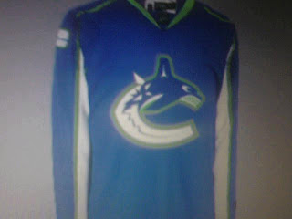
Possible New Canucks Jersey?
 Monday · Jul 30 · 2007 | 3:48 PM PDT
  18 Comments
 All right, so I thought I wasn't going to have anymore news tonight, but it turns out I stumbled upon something very interesting on the Vancouver Canucks official message board. This.
I didn't have time to read the full details in those posts, but obviously, the skeptics abound. You can go here if you want to learn more. First reactions are that it's a Photoshopped job based on the Washington Capitals or Columbus Blue Jackets jerseys since they've already been unveiled.
Still, I thought it was worth a look. And I don't think it'd be the worst thing in the world if that was the actual Canucks home jersey. The colors are all right and I say that despite the fact that I really did like the two-tone blues, silver and maroon from before.
Any thoughts? Is it a fake-out? Is it the real thing? The Canucks will supposedly answer that question on Wednesday.


Reader Comments (18)
This is okay, personally i think its a glorified photoshop job. I wouldnt mind seeing this tho...I hope they go back with the old look all together!!!
Tom
I wouldn't mind this. I know Orca Bay is out and the C/Orca look is likely gone but I've grown to like that logo. Oh well...
oooohhggggly...worst jersey in the league if they go with this!!!!drop the orca already since orca bay has nothing to do with the team anymore....a "canuck" is not a whale
False. The new jersey will have horizontal lines. The color scheme is correct. But i've also heard there will be less green than the vintage jersey. Source is credible.
the orca logo is staying.
and to the guy who said "a canuck is not a whale"
.....GET SMARTER
It's fake. It's a photoshop job...but they printed it out and took a camera phone pic of the print out. They probably did it behind glass to add some extra realism to the photo.
as per http://www.canuckscentral.com/forums/index.php?showtopic=9394&st=90
about 3/4 of the way down it shows a side by side of it and the new capitals jersey and all the shadows are the same. if you look closely its a pretty convincing argument
the fact that this was even posted here takes away any credibility this site had.
whats photoshop?
Kinda old news, but I don't think you had it on your site yet. The Canes unveiled their jerseys in EA's NHL 08 video game.
http://ps3media.ign.com/ps3/image/article/801/801682/nhl-08-20070705013409270.jpg" REL="nofollow">away
http://ps3media.ign.com/ps3/image/article/801/801682/nhl-08-20070705013410582.jpg" REL="nofollow">home
Ha! This site has no "credibility," Mr. Anonymous! Have you ever read any of my tournament junk? That right there should tell you I'm a schmuck with too much free time and a rather whacked out disposition. Credibility... you make me laugh, sir.
To the rest of you, I appreciate the comments. Thanks to Ben for the link to the http://www.canuckscentral.com/forums/index.php?showtopic=9394&st=90" REL="nofollow">Canucks Central board. It's a dead ringer for that Caps jersey, no doubt.
And finally, I like the "what's photoshop?" joke — if that was in fact a joke. If it wasn't then accept my apologies as I meant no insult. And... it's a computer software program that has powerful image manipulation technology and whose name we tend to throw around rather generically.
Is a Canuck a whale, anonymous guy? Hmm.
... and thanks for the video game image links. I have those along with several others but I haven't posted them as "official unveiling" photos because, well, they're video game screen grabs. I'd prefer to have a photo of the actual jersey itself. But with all the other crap on here, I guess there's no reason why I shouldn't post them. Thanks again and I'll start posting some of those later on.
I was just pointing out that the whale is more of a representation of pacific northwest hockey, than an actual "canuck"
some logos just represent the team better than the obvious. bluejackets for example.
Fair point. I was just giving you a hard time because you gave that other guy a hard time. Thanks for reading!
This jersey's just okay. I don't really care for thier new logo. I wish they would just stick to the vintage jersey. I love the feel of the retro skate/surf logo you get from it.
gross!
Jerseys should be a work of art and tasteful.
businessmen + hockey = tasteless
I would assume that this is pretty close, if not the real deal for what the 'nucks are going to be wearing this season. I work at a sports store and I got a shipment of Vancouver Draft hats with the new logo today and the 'C' is definitly white on the bottom half. Looks pretty sharp to me.
G
Keep in mind, guys, that (as we've all known all along) the league and Reebok are doing this to make money. Neither party would make all that much money if any of the jerseys in the league looked THAT similar to another team's. So even if this weren't a Photoshop job on a Caps jersey (which it clearly is), the league and Reebok would never allow it anyways.