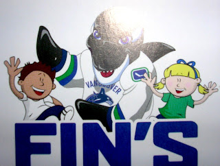
Yes, More Canucks Stuff
 Monday · Jul 30 · 2007 | 9:29 AM PDT
  12 Comments
 I saw this graphic on the Canucks Central message board. Aren't you guys impressed I remembered? I even snatched a link just to prove it. It's apparently artwork on some new kid-oriented promotional material from the Vancouver Canucks. It's called "Fin's Friends" as I understand it.
You see Canucks mascot Fin wearing a rather unique jersey. I can't speak to its veracity, but so far I haven't determined a real reason to doubt it. It has a lot of what we've heard including: dropping the maroon from the logo, the word "VANCOUVER" appearing over the crest on the road white sweaters, and the return to vintage colors blue and green.
Also, on the shoulder of Fin's jersey is this logo. It's kind of an edgier version of the vintage stick-in-rink logo. I think it works.
So... Canucks fans? What do you think of all this? You think this could be the real deal for your uniforms come the fall? Or is it just more annoying speculation?
Though the Canucks have made nothing publicly official, we've been hearing that a new logo/jersey unveiling is set for Wednesday. Whether or not it will actually happen remains to be seen.


Reader Comments (12)
I've been a nucks fan since i wuz only 5 years old (which is only 8 years) and when i heard that the canucks were changing there logo i wuz excited thinking that free willy would no longer be a part of the canucks logo
But then i thought to myself "the only way they're gonna change the orca whale is if that company sold the team"
Unfortunately the same company owns the team so i think that this thing is the real deal
I would kinda like to see that new stcik logo as the main crest though
The looks pretty sick
That better not be the jersey, it's hideous.
A wide variety of opinions. Thanks for your comments, guys!
"Found new canucks jersey! http://thecanucksreport.blogspot.com/2007/07/possible-new-uniforms.html"
Yeah, if that is the jersey I will be utterly appalled and will not purchase one. I will then continue to cheer in my vintage stick logo jersey.
Oh man.. if that's the Jersey, I can only continue to boggle.
They'll have taken something pretty classy and liked among a great deal of Vancouver fans, and then stripped it of its good points, and turned it into a practice jersey.
I have to agree that I like the update to the stick and rink logo, but that's it.
Vancouver written over the logo?! Let's hope that's only for that promotion. lol. How tacky. How so very tacky.
We'll find out on Wednesday.
Oh.. and on a further note, here's a concept taken from the Canucks boards that is based on that leaked Fin ad:
http://members.shaw.ca/pfizer3/rbk_nux_pfizer_white.jpg
The link for the thread it is in here:
http://forum.canucks.com/index.php?showtopic=169480&st=0
Cool stuff. Thanks for the links! I'll get some of that artwork posted here tomorrow.
fuk the damn chugg whale lol yah i noe it repersents the pacific northwest and yah the seahawks have the native hawk thing going on but fuck that shit. i think they shud go with the new stink in rink logo or they mite even jus tbe teasin us until they unveil the actual primary logo the teams gona use by usin the old one
That updated rink logo sucks. Leave the bleeding thing alone already. It's the older fans that generally like the rink logo so why change it to suit a bunch of 5 year olds?
fuck the damn whaleeeeeeeeeeeeeeeeeeeeeeeeeeeeeeeeeeeee
im going to puke, i love the orca logo the canucks have at the moment with its current colours. the current jersey they have is one of my favorites in the league. but IF they keep the orca logo and turn it white, blue and GREEEEEEN i will definatley puke my guts out...... if ur gunna go with the green and blue colours use the stick and rink logo, they go the best together.