Last Of The Canucks Surmising (Hopefully)
 Tuesday · Jul 31 · 2007 | 11:30 AM PDT
  8 Comments
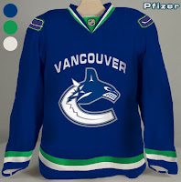
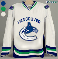
 We're anticipating the unveiling of the new Vancouver Canucks uniform tomorrow despite having no official word on that from the team itself. So having said that, there's a little more fan-created artwork I wanted to post prior to that because Canucks fans seem to be the most interested in what's going to happen to their club's uniforms this year.
This design is based off of what appears to be "Fin's Friends" promotional material posted yesterday. The only thing is we've been hearing that the bottom part of the "C" will be white, not blue like it has been in the past. You gotta figure this is at least worth a look anyway and may even possibly be close to what gets unveiled by the team.
Another fan came up with these designs.
Personally, I'm not a fan of "Vancouver" being written above the logo but I guess it's not for me to say. You Canucks fans have any opinion on that? Tacky? Cool? Doesn't matter?
If I come across anything else, I'll try to get it posted by the end of the day. Meantime, keep your fingers crossed for an official announcement tomorrow.


Reader Comments (8)
The text above the logo is hideous. I also much prefer the blue and silver colour scheme that the other rumors have suggested.
The text above the logo is highly uncalled for, the orca has established itself as a good representation of Vancouver, therefore eliminating the need for the wordmark, this one looks even more hideous than nashvilles
Hi there...
I'm the dude that did the rendering of the first jersey you posted up there.
My rationale for putting the ice part of the orca logo in blue is two fold: first, it is the same way in the Fin picture, and secondly, I have heard a rumour that the logo would be different colours for home and away. One would think that could mean white ice on the blue jersey, and blue ice on the white jersey, not unlike how the vintage uniforms have the inverted logo. If you look at the high res version of that Fin picture, you can clearly see two different shades of blue.
Having looked at the old version of that picture of Fin, the striping on his new jersey is exactly the same size and shape as it is on the old one, the only difference being the colour. Now, that might just be the designers cutting corners, but it does suggest the stripes might be similar to what is on the current jersey. Anyway... :)
- cantbeatcloutch
As a Canuck jersey purchaser, it's gonna be hard to believe that those would be them. I've seen some better rumoured jerseys than those. These ones are absolutely shocking.
Hey Chris Willie Mitchell just said on the team 1040 that he thinks the jerseys are going to be released tommorow. so the august 1st rumour is credible
Wow, thanks for all the comments, everybody. Big thanks to the guy who designed them, "cantbeatcloutch." I appreciate you coming to talk about your design choices. That's always a good get for this blog, in my opinion.
I get what you're saying about the bottom part of the "C" being blue in the Fin image. I saw that and I should've been clearer with what I wrote. However, as you said, it does make more sense that they'd fill the white in on a white jersey. As for looking like the Fin picture, your design is a dead ringer and I thank you for making it.
Also thanks to "giveitall" for letting us know about Willie Mitchell's appearance on the radio (is it an appearance if you can't see him?). Let's see if he's right. I'm excited!
YUCK!
So far, just about every team's new jersey is a step backwards.
RBK Edge is looking worse and worse by the day.
speechless.........and not in a good way