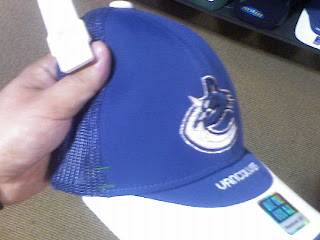
Canucks New Logo Leaked?
 Saturday · Aug 11 · 2007 | 6:02 PM PDT
  17 Comments
 Tonight I found what appears to be a sneaky picture of a hat with the new Vancouver Canucks logo on it. Take a look and tell me if you think it's real.
If it is fake, it's the best job I've ever seen. We've been getting conflicting reports over just how much green there will be in the new logo. At first we were hearing blue and silver then it was blue and silver and green. I just don't know what to believe. Anyway, on this hat, while the logo is blue and silver, it has a small bit of green stitching as you can see.
Incidentally, I added August 29 to the sidebar countdown for the Vancouver Canucks big unveiling event. This comes not from the team directly but rather someone apparently working for a graphics firm hired by the team. Said someone emailed me directly and told me I should post the date. That being said, take it for what its worth. I can't verify that claim any more than you but there it is.
I really hope that is the date for the sake of Canucks fans everywhere. You guys have been getting yanked around so bad this summer. It's not even right.


Reader Comments (17)
That has to be it or like you said, one hell of a fake
thats definitely the real deal. its hard to photoshop a hat in that view.
last year you could have brought some canucks' t-shirts or hats in black and silver, so it's possible that this could be real but not the only colours. I really do hope it's green and blue.
WTF?
That hat been in stores for over 2 years....
That's kind of what I was thinking ... just some hat they tried to make different -- like the Flyers 3rd jersey logo (bad). They have all kinds of hats that play with the logo. If this is the "new" logo, it leaves me wondering what's new about it.
isn't that this years draft hat? look on ebay or the NHL shop?
http://shop.canada.nhl.com/product/index.jsp?productId=2630668&cp=1919785&clickid=body_featitems_img
That's the cap they're selling as the Draft Day cap in the NHL shop.
But here's the cap that was on their first round pick:
http://cdn.nhl.com/canucks/images/upload/2007/07/stage_b.jpg
Clearly not the same cap. The cap on Patrick White is closer to the one in the photo you posted, with a white C. The blue, however is dark like the one in the shop.
hehe.
dude, your links dont work. i dont think you posted the entire url address. maybe you didnt copy the entire thing or this posting space is too small for the link?
They work for me, you just have to highlight and then go to the end of the blank white space.. it highlights what's missing, even if you can't see it.
However, in the interest of ease:
http://tinyurl.com/2ke65n
and
http://tinyurl.com/2tjuyl
I will say I have seen another hat in person which uses the EXACT same logo - dark blue whale, white C and silver outlines. No green appears in the logo, neither does the light blue of the hat. I will confirm that is the primary logo.
Unfortunately the actual colours of the sweater is going towards the blue and silver with no signs of green. About the date, Aug 29 is the right one since the Canucks made it official yesterday.
i've also seen a toque with the new logo on it and it matches what's being said here. dark whale, white ice, silver and vintage blue outline. the teeth are vintage blue as well.
bs. iv'e seen that hat b4, and wilie mitchell has said that it is a blue and green logo
it's not bs. i saw some licensed promotional clothing with all the new nhl logos. it IS the logo. willie mitchell was extremely vague, and hinted that he liked the vintage colours. i just said there's no green in the logo. there still could be in the jersey.
thay've been selling hats and shirts with the orca in diferint colours for years. It dosn't meen its the new logo.
i'm not saying that this hat wasn't sold in the past, i'm just saying the logo on it looks like the new one. all of these hats that i saw were heading to bud lite and they all had primary logos on them. that leaked hat from hhof is the real deal. i'd bet my life on it. you'll see on wednesday.