Concept Art For Sens, Kings
 Sunday · Aug 12 · 2007 | 9:30 AM PDT
  9 Comments
 Thanks to everyone who's placed their vote here on the first day of the Championship Tournament. Exciting stuff.
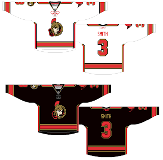
Anyway, I've still got fan artwork to share. We'll start out with the Ottawa Senators amidst all the news of their logo leaking. This concept ignores that logo (or was perhaps created prior to its leak).
It makes the current secondary logo the crest and sends the current primary to the shoulders, but beneath the shoulder elements. I'd be curious to see how something like that actually looks on a player. I think those are pretty sharp, even with the vertical stripes under the arms. Only, if it were me, I'd avoid doing vertical and horizontal stripes together. What do you guys think?
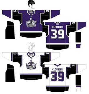
I was also emailed this concept for the Los Angeles Kings. I know they've already unveiled their new jerseys, but these aren't actual possibilites anyway, are they? It's just something fun to stare at while we wait for the hockey season to start again.
I think what the designer's done with the shoulders and sleeves is very interesting. It also seems he isn't a fan of the "LOS ANGELES" text across the bottom of the sweater. Seems a lot of Kings fans don't care much for that. I think it's unique. Is it a cool element or should they dump it?


Reader Comments (9)
The white one reminds me of the final between Montreal and Los Angeles, when the hockey stick of Marty Mcsorely was mesured, and the kings owned.
Mouhahahaha how they were owned that day.
I love Los Angeles at the bottom of the jersey, very unique and very cool. Its the kind of thing if every team did it, it wouldnt be so cool.
Both of those jersey sets are fantastic.
I really hope the Sens unveil something along those lines (I hate the team with a passion, but there's no reason why they can't look good while I'm despising them). Then they can take the ice against the Panthers and show them what hockey sweaters are supposed to look like.
I'm really digging the white version of that Kings jersey. It's remeniscient of the ones worn during the Gretzky-era, which rank alongside my all-time favorites.
Actually, I just notice the piping under the sleeves of the Sens' uniforms, which clash with the stripes on the hemline.
I retract about 45% of the praise in my previous post.
http://img383.imageshack.us/img383/9733/1382160097963037759456oa5.jpg
http://img383.imageshack.us/img383/9700/33658216009794570373469yh6.jpg
The Ottawa concept is weak. The logo looks good on the white jersey and that's about it. Definitely a couple of steps down from what they've been wearing.
The Kings on the other hand is very nice. A hell of a lot better than the craptacular jerseys they've been wearing the past few years with the 'Los Angeles' wording across the bottom.
They won't be black. Scotiabank has pumped up the "Be Red" campaign as part of the pitch they made when they bought the naming rights. The home jerseys will be red.
I don't mind the color combinations on the Senators concept jerseys, but I doubt it would be worn since it would be tougher to see on TV. That's mainly why the Flames had their original nameplates go from a black base color to white.
The current Kings jerseys are ugly and look like pajamas. I hate the numbering font and the lettering size is too big on their actual jerseys. If the crown logo was redesigned, I'd be more in favor of it. I wish the team didn't get rid of their Gretzky-era jerseys in the 1998 design (last season they were worn), but if a nicer crown logo was the crest logo, I'd be fine with that. If the Kings are adamant on keeping their look, but with a better jersey design than the new RBK Edge ones they unveiled, this concept would look better.
how does everyone do the jersey concept designs? on the computer using photoshop or wut?