Some Snazzy Leafs, Sabres Stuff
 Tuesday · Aug 14 · 2007 | 1:28 PM PDT
  13 Comments
 It just keeps getting better over here at the NHL Tournament of Logos. Hope you guys are all voting. If you haven't yet, there are three open polls that you can have your shot at.
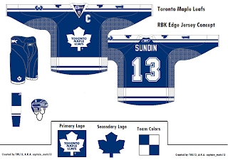
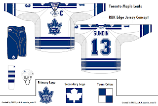
Anyhow, while we wait for all the votes to trickle in, I've got a few more concept designs to share with the class. Let's start with everyone's favorite Ontario-based team that isn't the Ottawa Senators — the Toronto Maple Leafs. A reader emailed some great designs I thought were cool and different. Behold.
He sent a handful but I felt like these two were the cream of the crop. They're pretty sharp and they do away with that "TML" logo that fans apparently hate with a passion. Personally, I thought it worked. It gave them a 21st century feel without altering a logo that hasn't been messed with for decades.
But what do I know? I'm just that Florida guy writing a hockey blog, right?
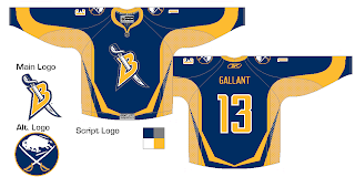
Let's cross the lake and see what's going on stateside. I have Buffalo Sabres artwork for you. Have a look.
What do you guys make of this? My belief is that if you're going to use the old logo, you've gotta use the old jerseys as well. I'm not sure this mixing and matching really works. Thoughts?
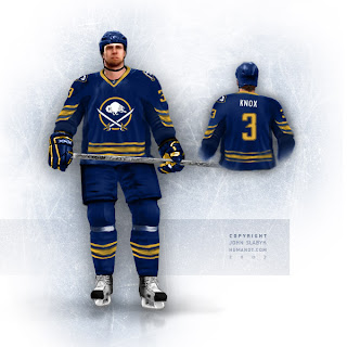
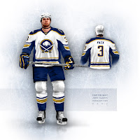 Plus, from hockey logo and uniform designer extraordinaire John Slabyk comes another look at his all too cool Blue & Gold Project on the backs of a dude in NHL 07 or something like that. It's quality work, really. You don't see that sort of thing every day.
If those were the Sabres' uniforms, stores wouldn't be able to keep them in stock, and not a single hockey fan in the greater Buffalo area would file a complaint — or at least that's my small-minded belief.
Should I stop going on about them now?
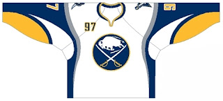
Also there's this design which makes us see why the "B" with sword through it should really be left on the shoulders.
I don't hate it, but at the same time, I feel like you could do so much better with the crest.
And as always, there's much more where that came from, but you don't want to spoil your supper now. I'll hang onto it for now... save it for later. Hope you're enjoying the tournament and all the Rbk EDGE speculation.
It fills the empty hours.



Reader Comments (13)
where do you make these concept jerseys?
I don't make them. I find them or get them emailed to me by readers of NHLToL. They're pretty cool, right? I've thought about making some of my own but I just don't have the time. (I wish I did.)
Thanks for reading!
I have a question for you. Recently, I post youu some designs for the blues, the flames, the hurricanes and the coyotes. I want to know why they're not on your blog.
Also, congratulations for your blog.
Sorry, i meant where does everyone make the jerseys? Like what website, or what program?
to the guy asking how/where you do the designs. i'm the guy that made the the Leafs concepts your looking at and i just did those on ms paint last night. i found all the templates on chris creamers nhllogos forums.
what program to people use to make these concepts?
Hey Chris-
Do you happen to have a vector template of the RBK EDGE jersey that I could get a copy of? Even an older template would be good too.
I'd love to make some concepts up for you to post if you liked them enough.
Thanks!
-doug-
Chris,
i may have missed it but i haven't seen you post this picture of what may be the http://i15.tinypic.com/6g9jfuv.jpg" REL="nofollow">islanders jerseys
canaan
thepensblog
i really like the classic logo on the new unis, close to what they should have done. whered you get that nhl 07 thing with the slabyk designs? those arent his usual ones (the one hes eventually planning on selling or so im told) they have a script B with a sabre as opposed to those which have buffalo coming out of a sword
The guy from the 'Blue & Gold Project' does some nice stuff, but I don't like the jersey's pictured. Why have the horizontal stripes on the bottom interupted by the side panels? It soesn't look good at all. Besides, the Bruins already proved you can have the horizontal stripes at the bottom.
Slabyk made those images based on the Rbk EDGE jerseys, taking into account that the material down the sides is different and may not work well with complete stripes. However, it's worked for the Rangers and Bruins so I can't really say.
I'm not entirely sure why he changed the shoulder logo, though. Persoally, I kind of like it. Thanks for the comments, guys!
Those Maple Leafs jersey are nice. But those sleeve numbers should fit within the inside and outside stripes running down to the cuff, but overlap the edge of the stripes.
If Sabres insist that if the classic primary logo returns and they'd agree to it that it would be on their current jersey template design, I'd be okay with it. However, I'd rather see Buffalo just bring back their original uniforms but with some modern detailing upgrade (but without changing the intergrity of the design itself). And no doubt, I'll pass on that B logo on the front.
Whats the latest word on the LEAFS!!!!!! Any idea at all about their jerseys? ive heard there taking out the silver in the numbers and going back to just blue and white. any truth to this? what about the logo ! u think they will go with New York and Detroit and keep it all the same ????
also ive seen screen shots on the ea sports website for NHL 08 and only teams that have released their jerseys to the public are in these shots. but with stall as the cover the canes jersey is relived. I know its no big deal but I only mention this because I saw the pic in ur blog of the buffalo player standing up in both blue and white and it looks like its from nhl 08 cause of the detail in the gloves and skates .... just a guess